


Carte D’Or
Classici, Soft & Crunchy and Affogati: a restyling that brings together product innovation, sustainability and packaging designed to stand out
An icon of Italian taste, across packaging and constantly evolving ranges
Working on packaging design for Cornetto, one of the world’s most recognisable ice creams, means carefully balancing creative freedom with consistency. Every new product needs to stand out without compromising the distinctive assets that make it instantly identifiable from a distance: the logo, the angle of the product on the front of pack and the chocolate-filled tip. Project after project, we have created space for creativity for the Algida brand and its special editions, while always enhancing the key assets of its visual identity.
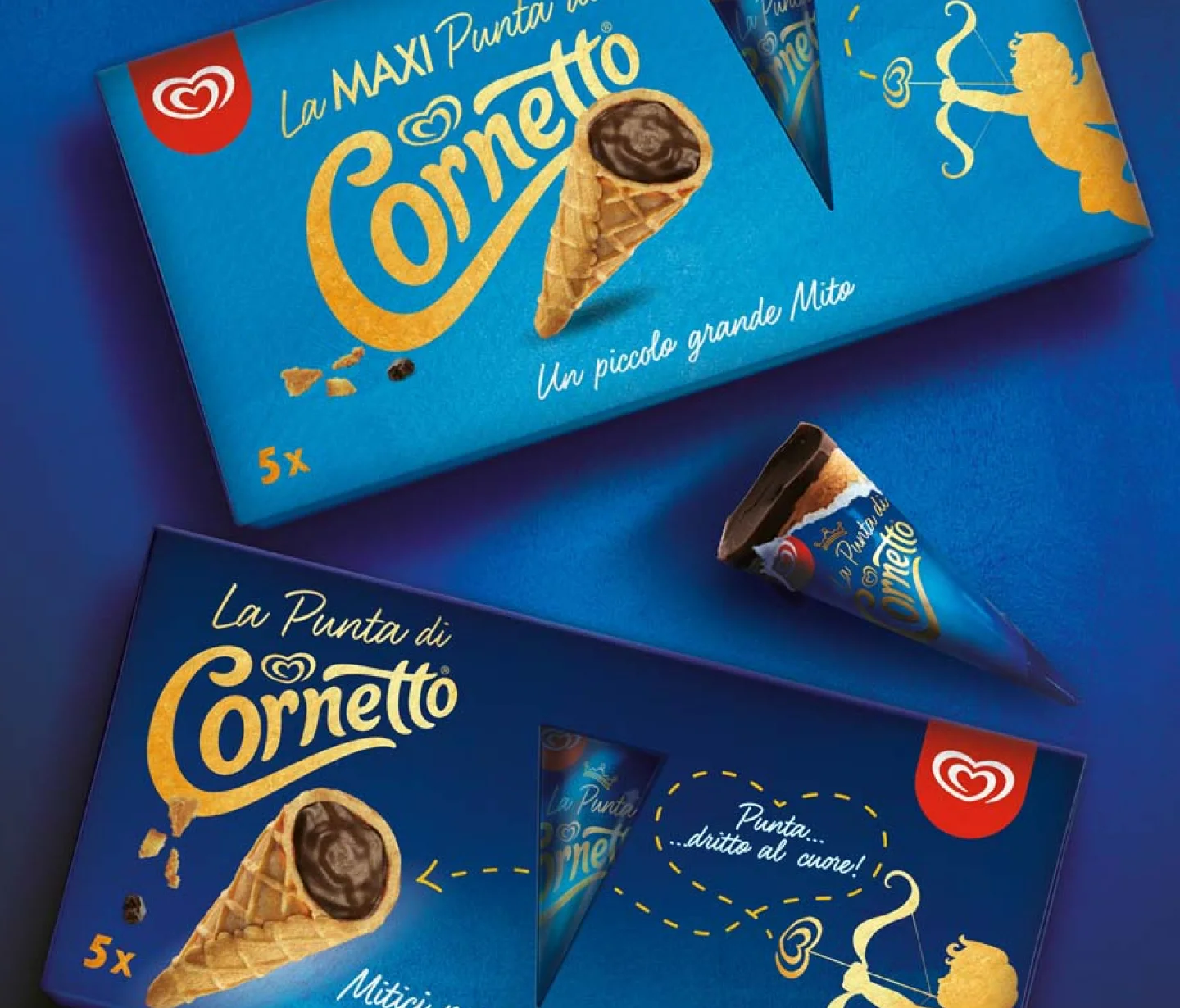
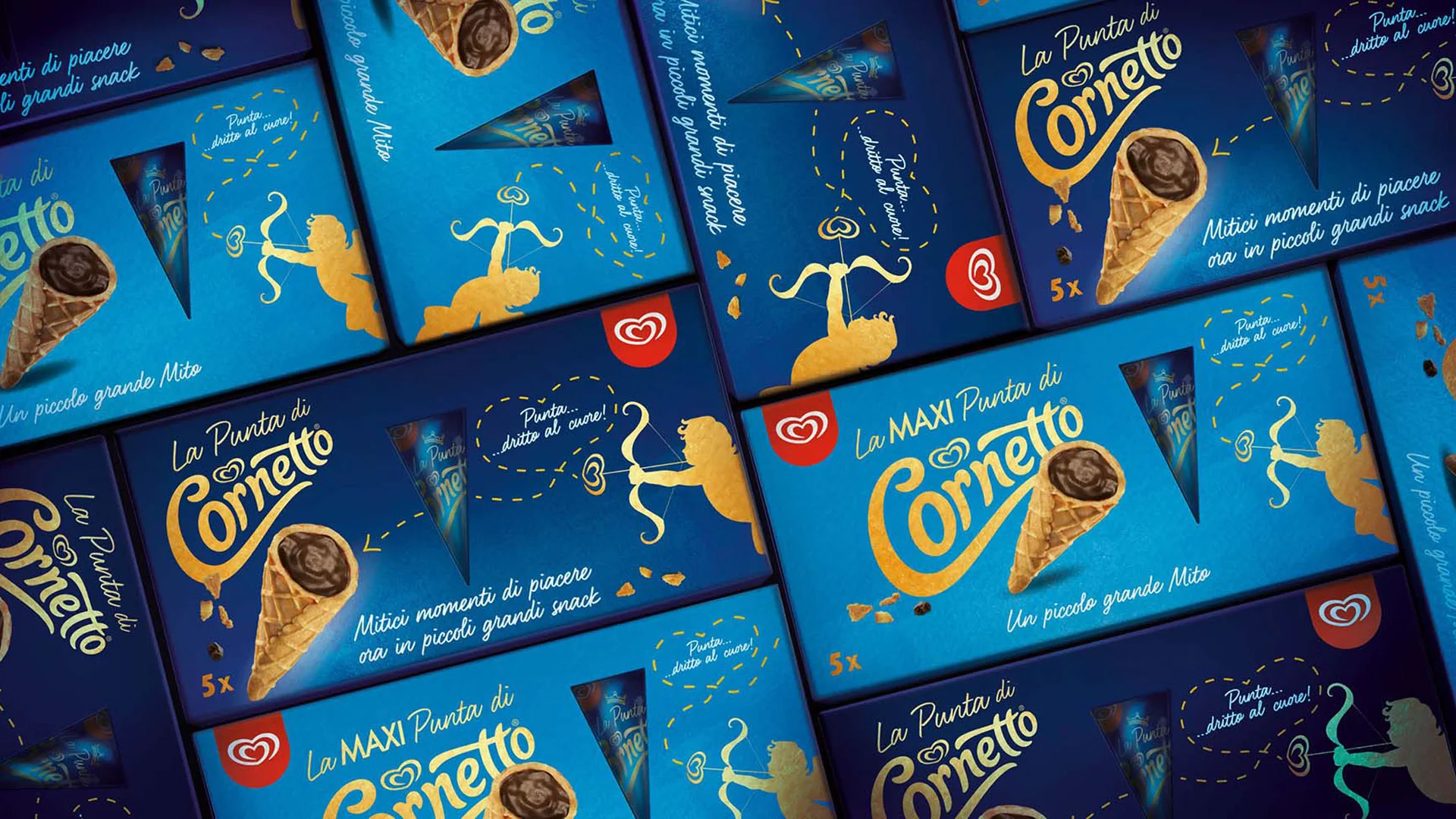
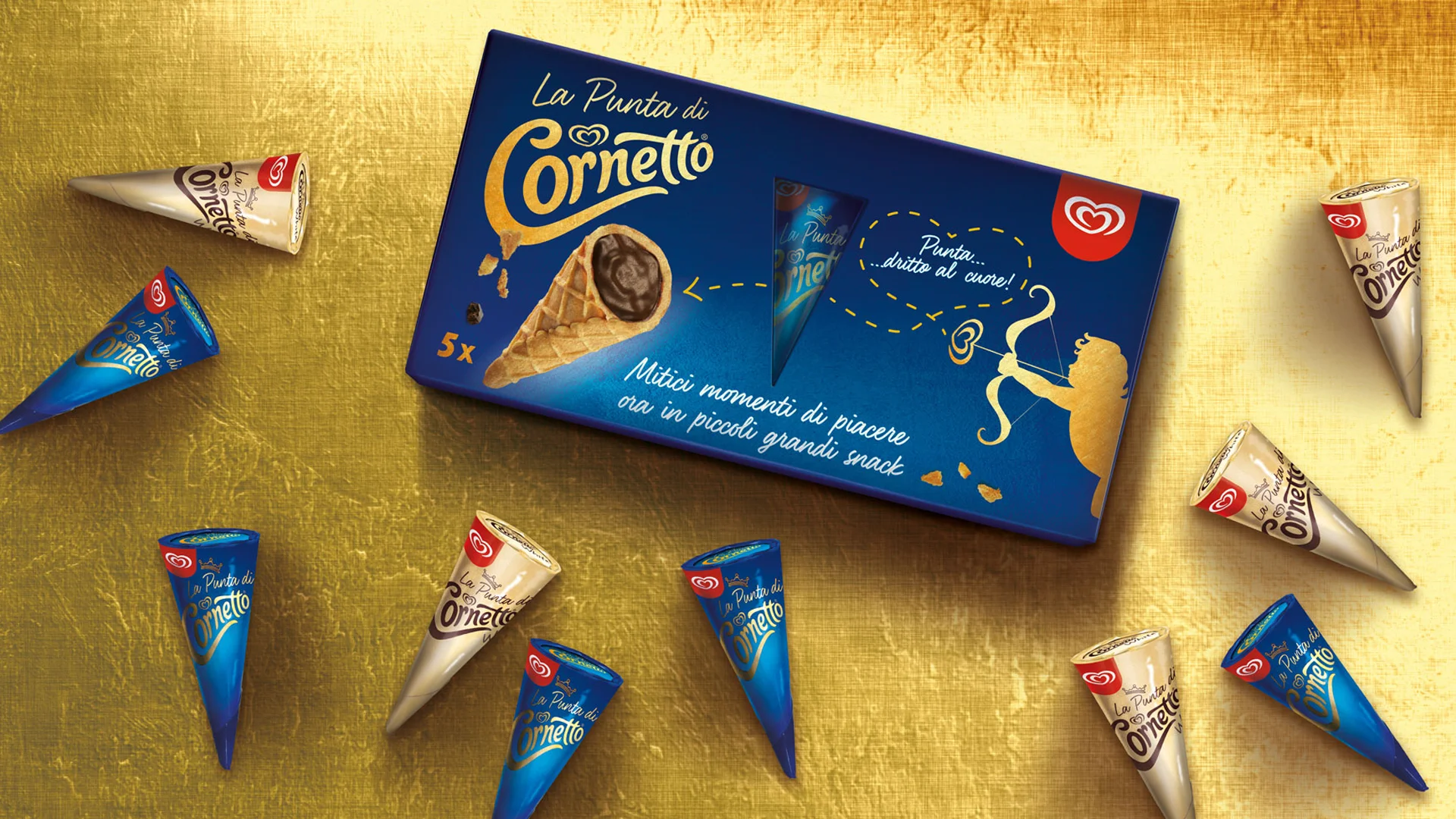
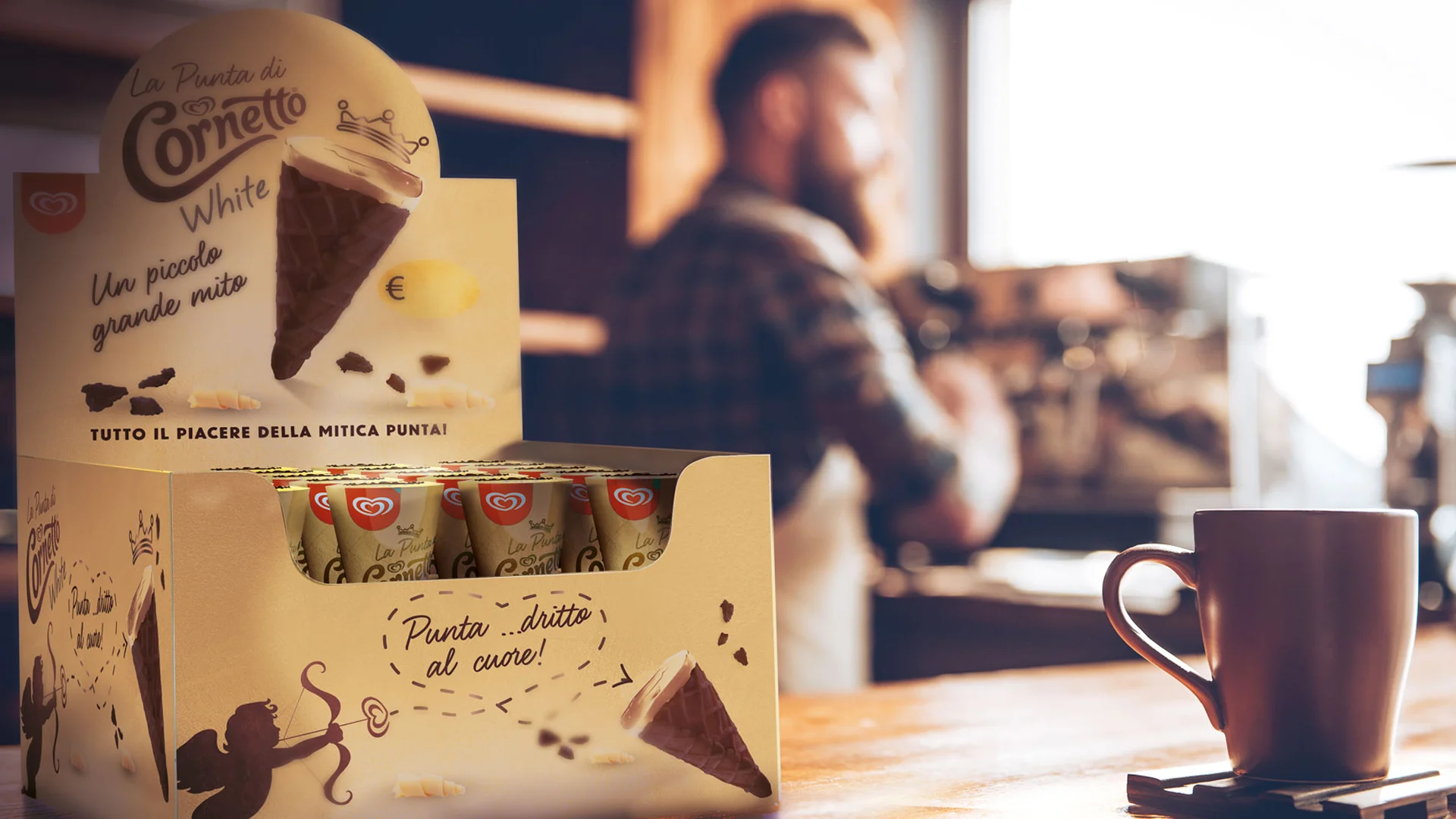
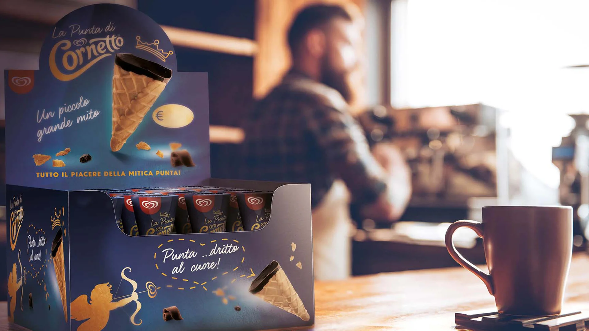
With La Punta di Cornetto, the scope expands into a line extension, where the most iconic part of the ice cream becomes a standalone snack, available in both ambient and chilled formats, for bars and at home. We developed the brand design, packaging and copywriting, preserving the Cornetto brand while introducing a dedicated logotype linked to the line name. The pack positions the product within the premium segment through a deep blue palette and gold foil detailing, while the displays extend the story onto the bar counter.
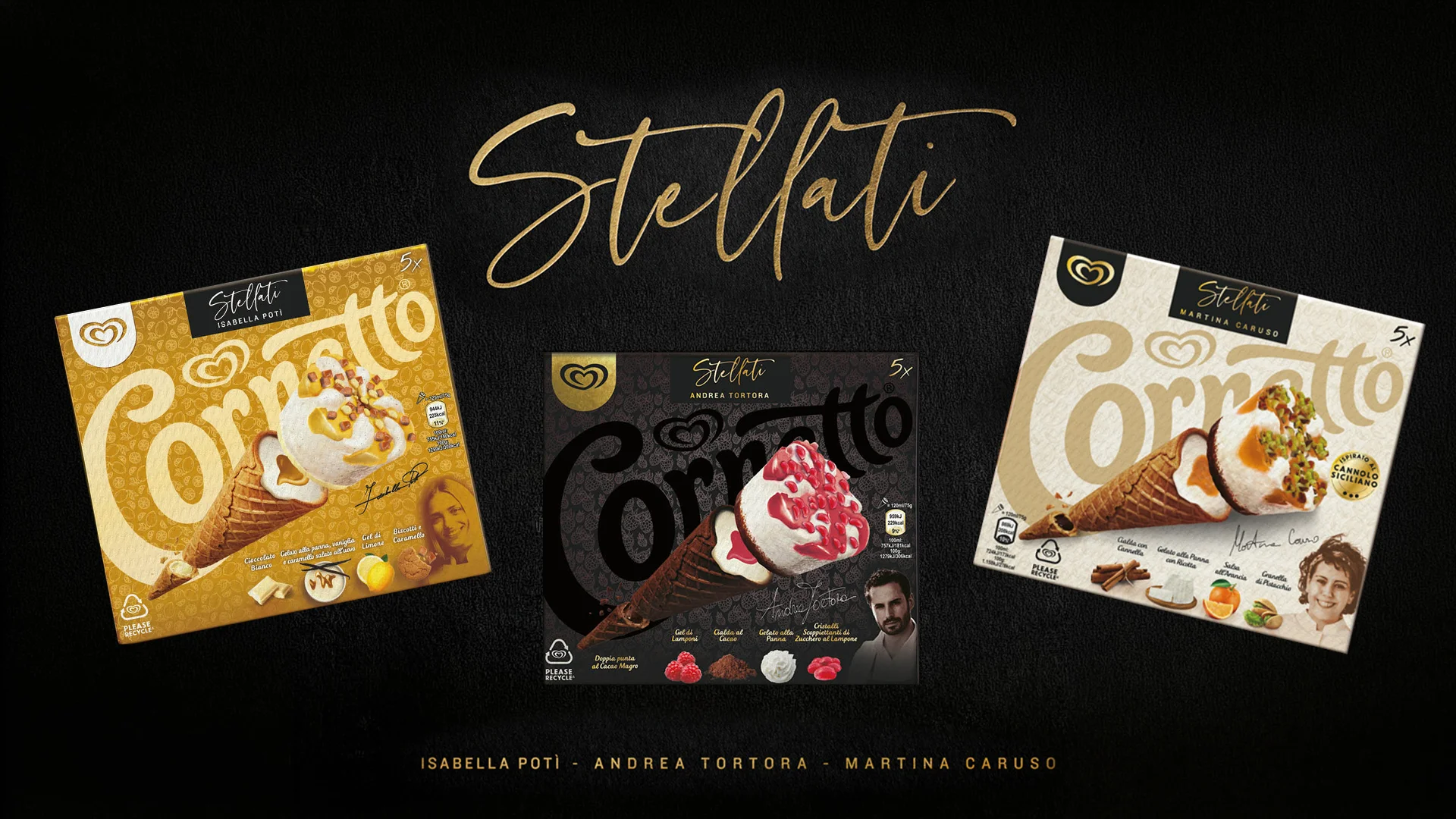
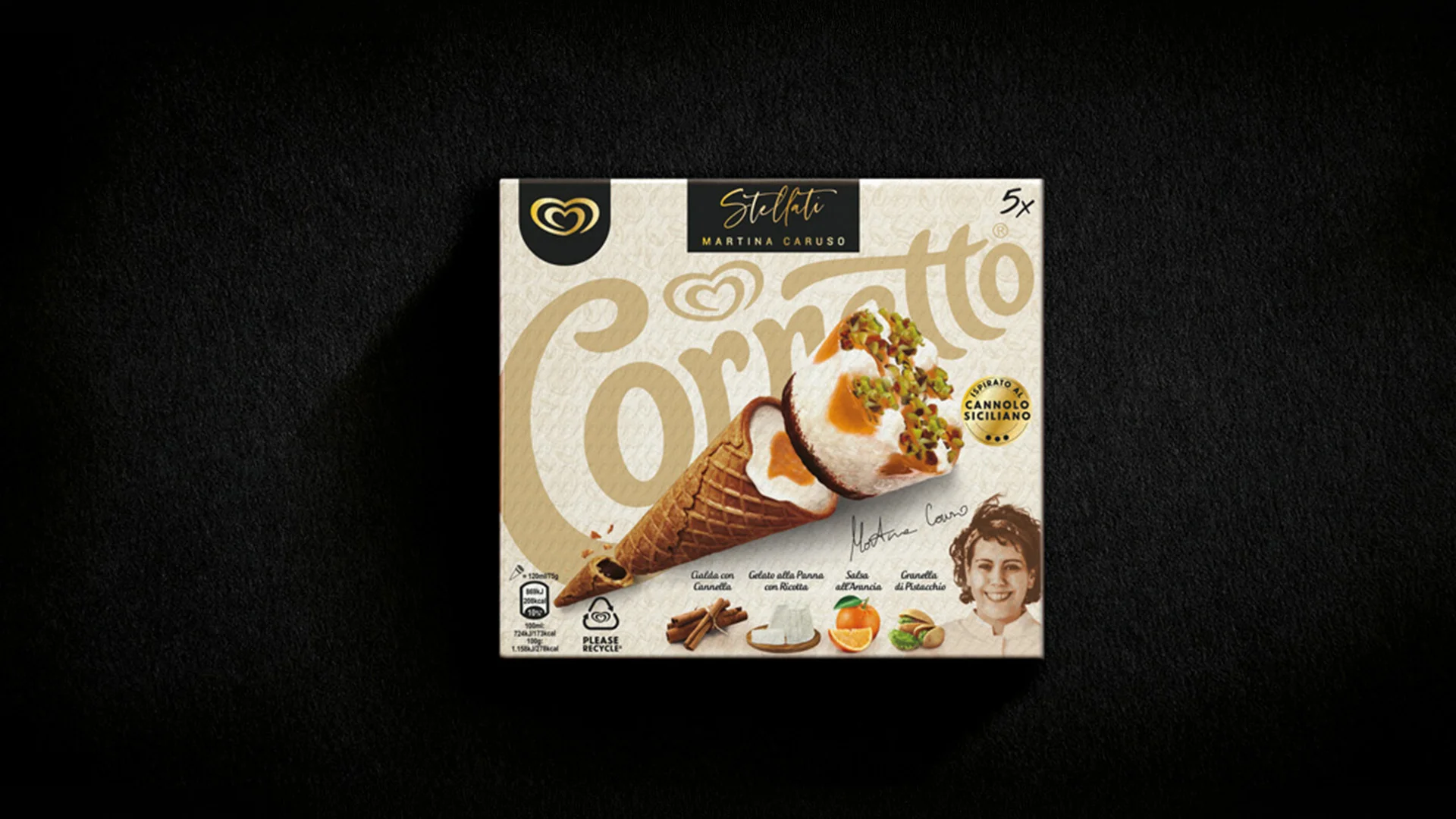
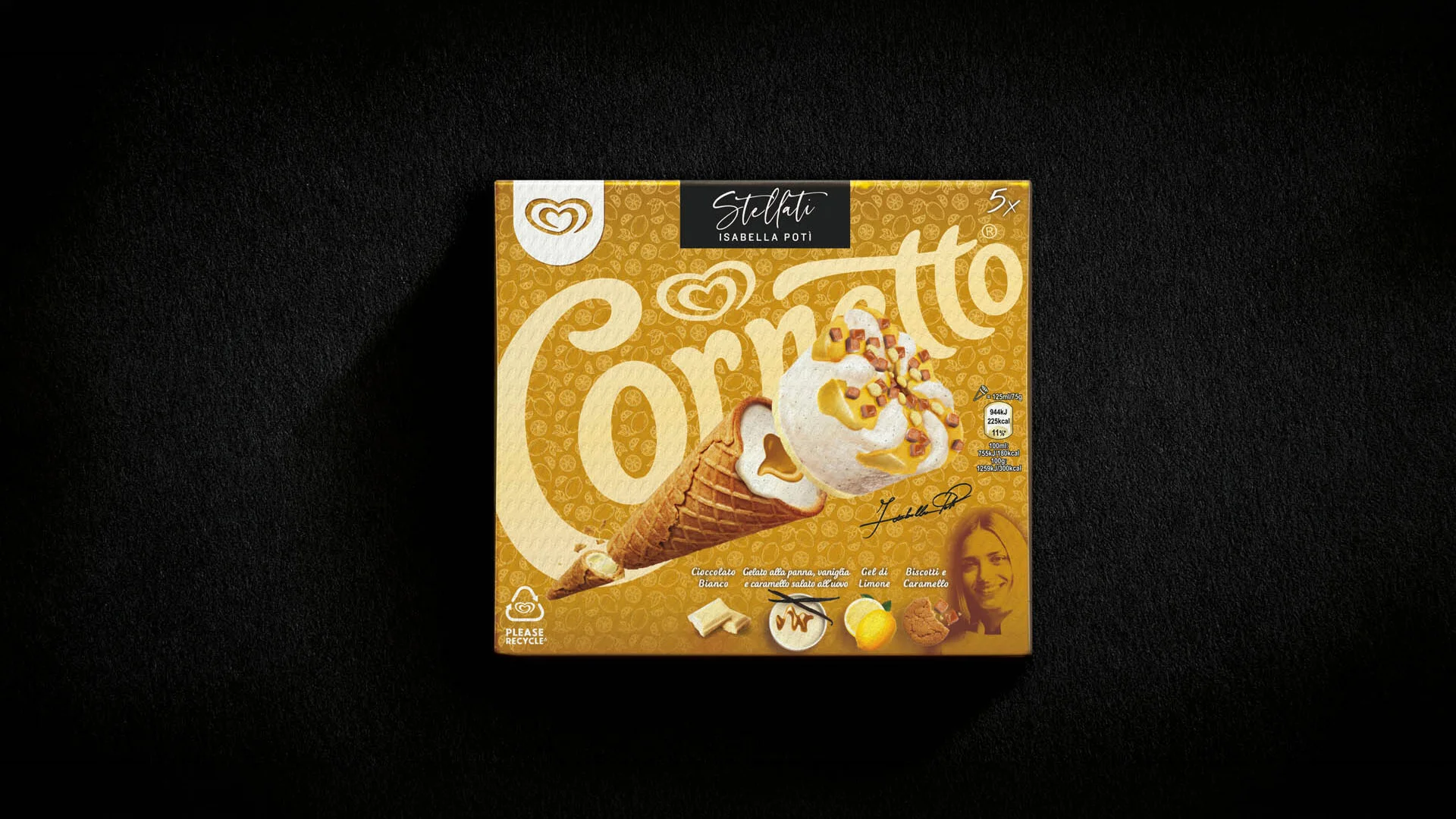
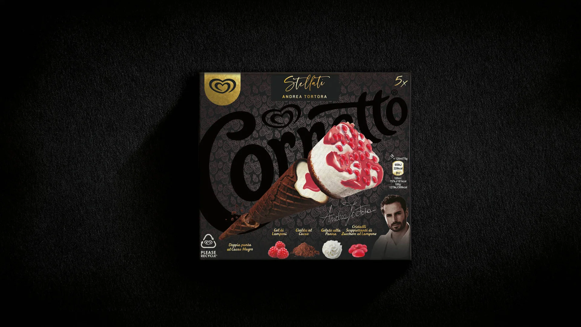
The limited editions follow a different logic, as they need to signal their exceptional nature while remaining firmly within the brand family. For the Stellati range, creativity focused on illustration. The Cornetto is deconstructed and opened up so that the ingredients can be read from the crown to the tip, supported by a tone-on-tone texture and a different colour code for each variant. The line name appears on a black tag with calligraphic lettering, almost like a signature.
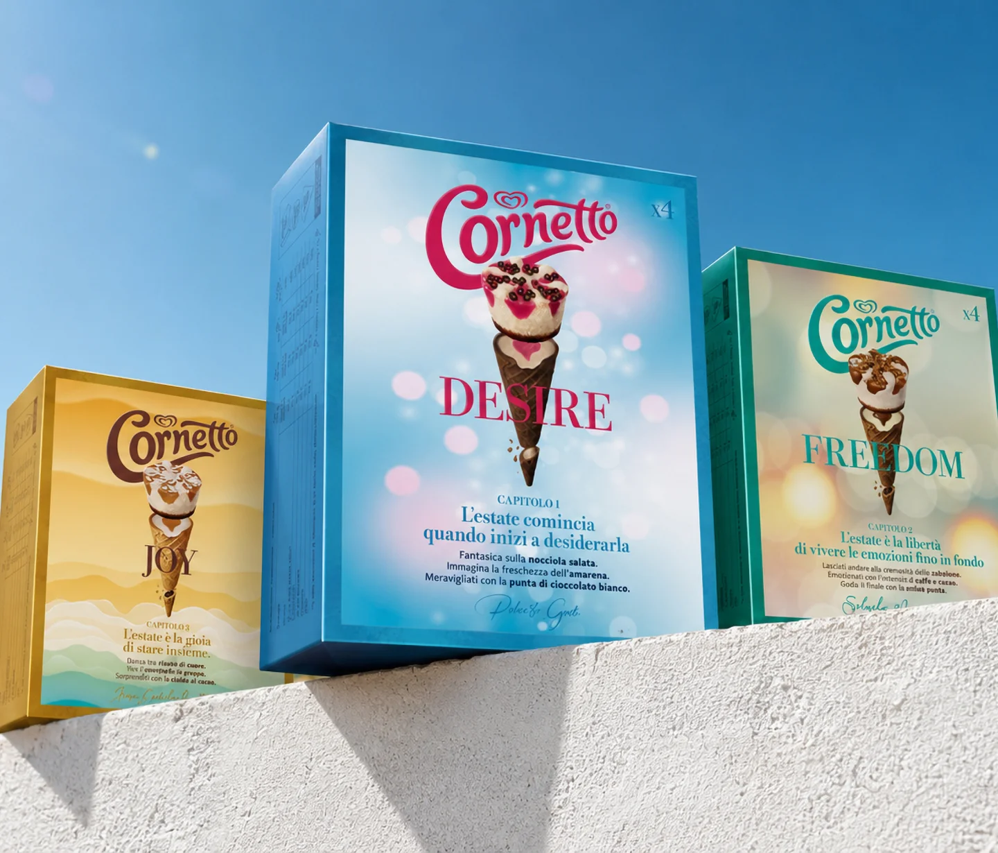
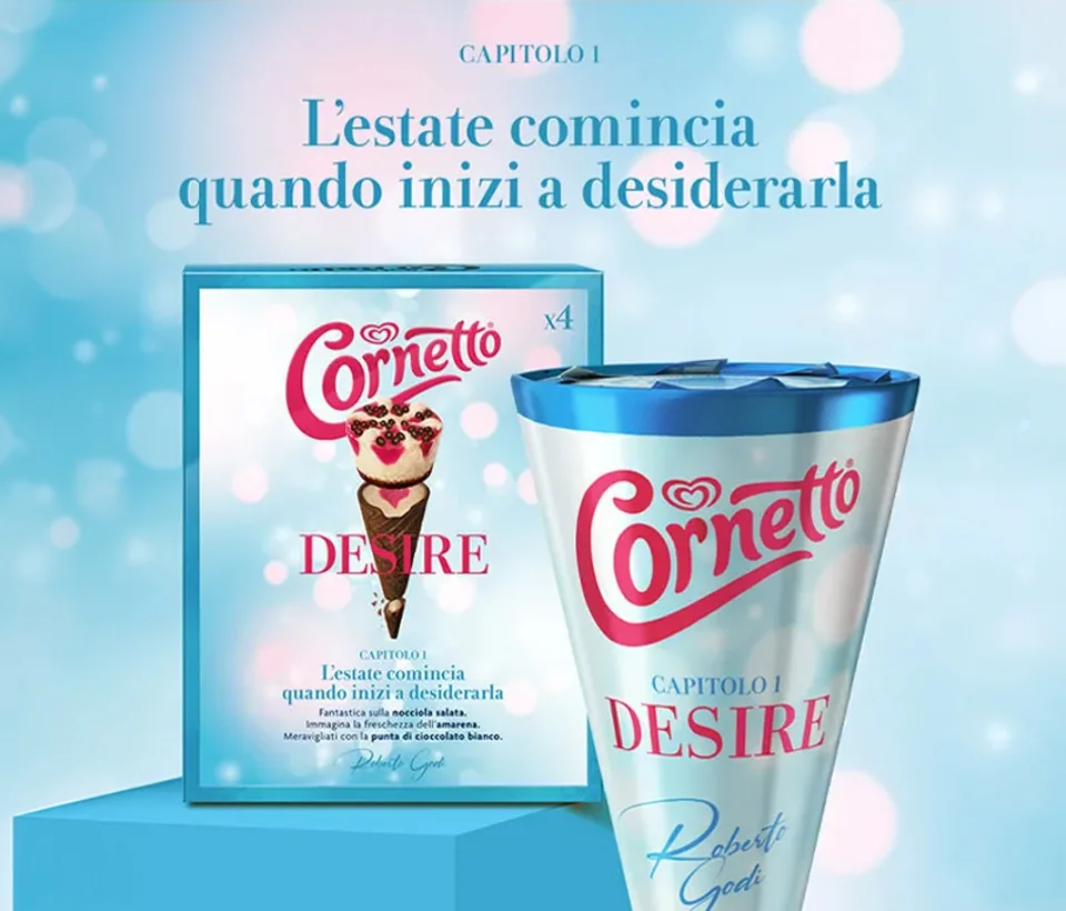
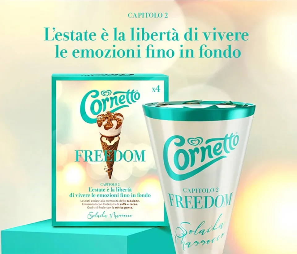
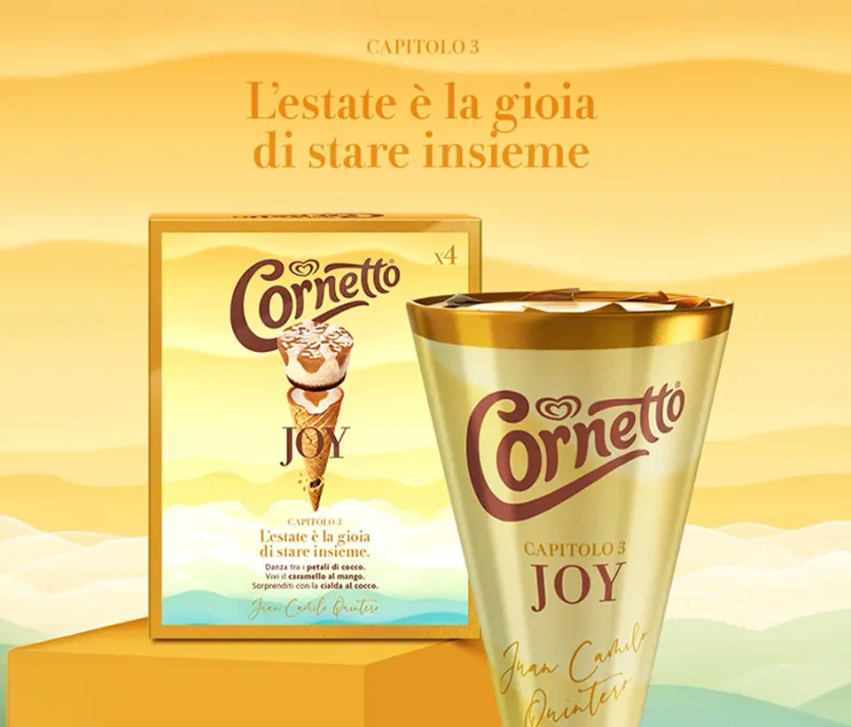
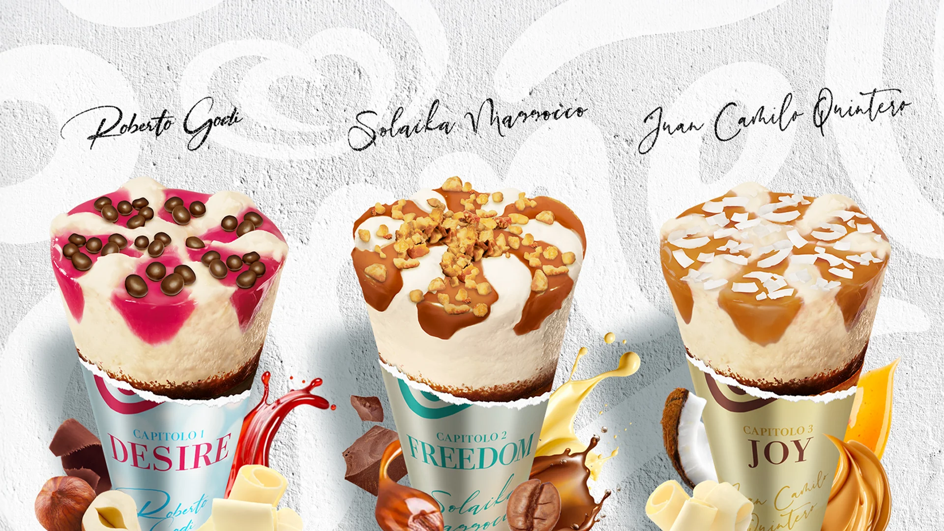
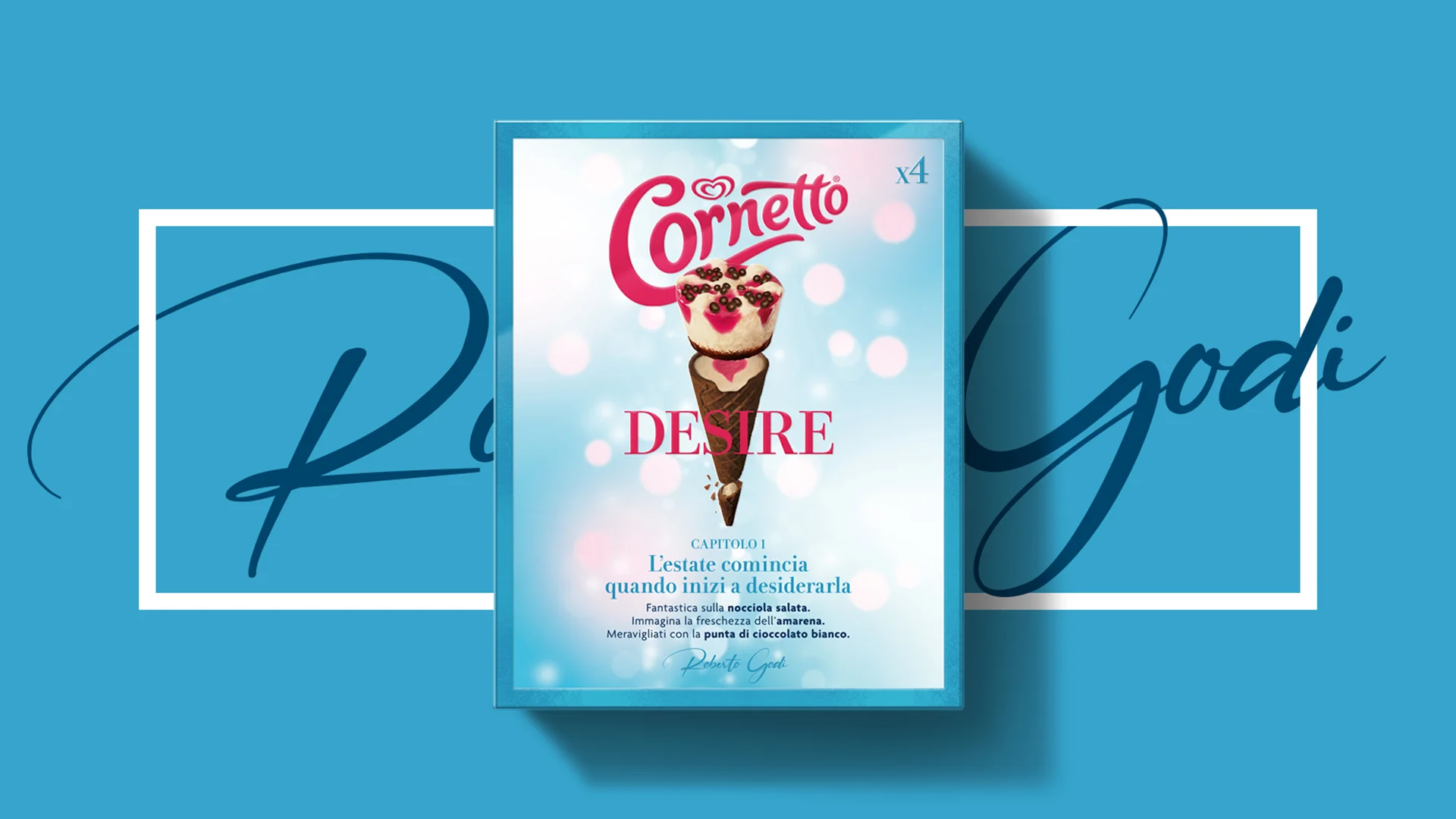
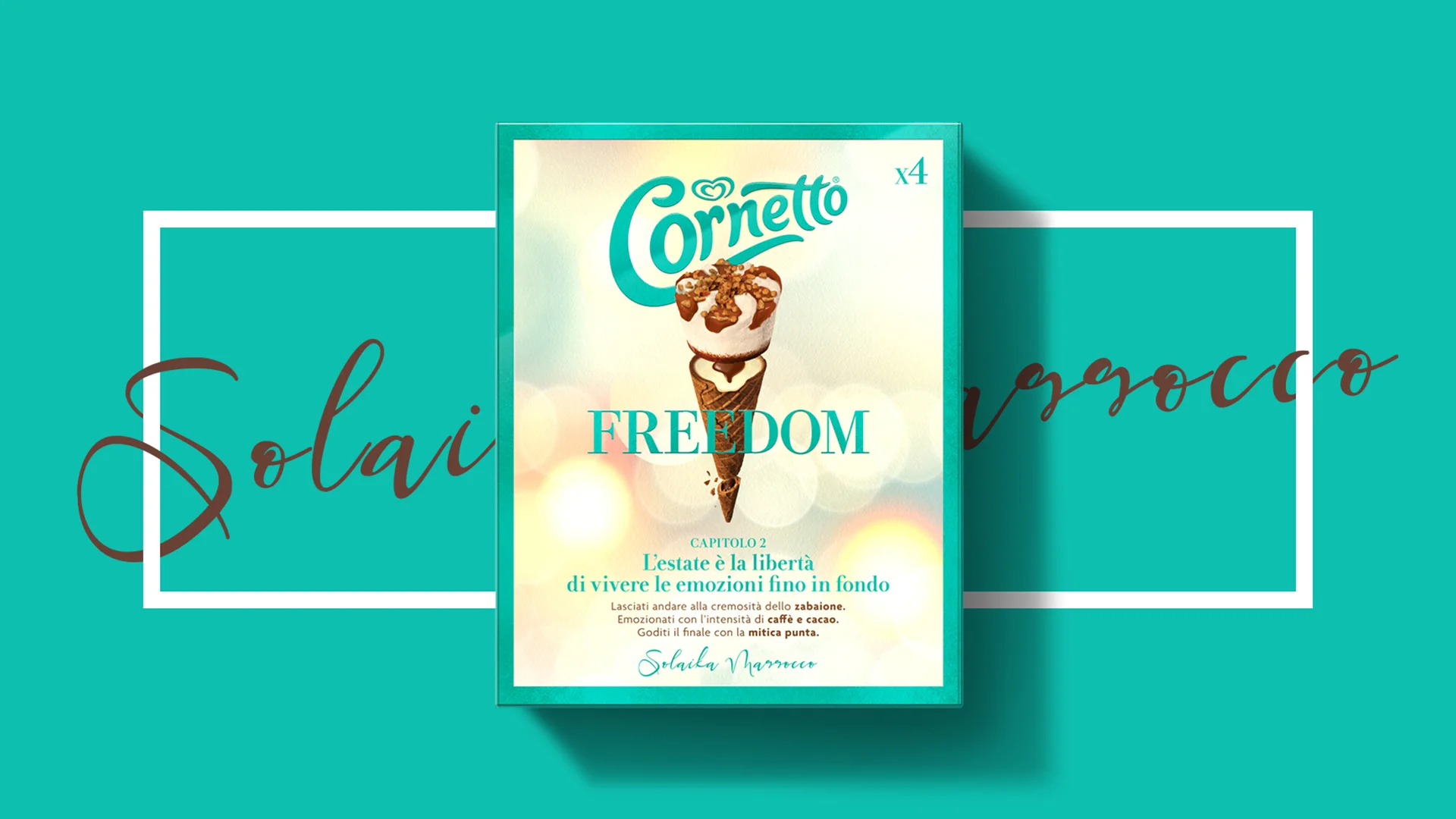
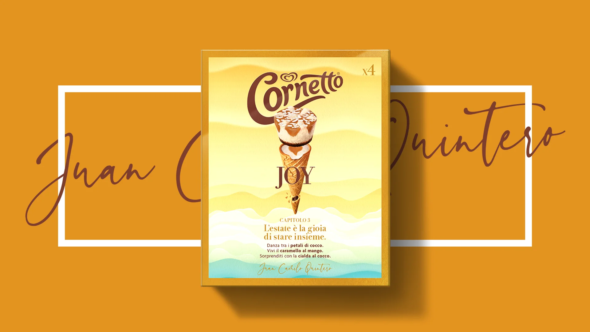
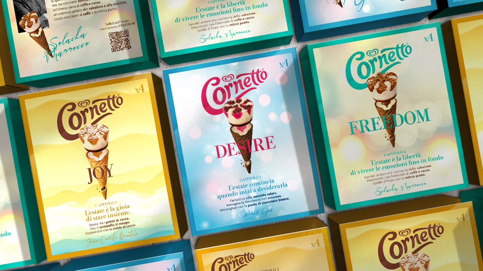
For the Summer Emotions special edition, the creative language shifts again, borrowing from the codes of fashion. Brand assets are reduced to a minimum and the logo becomes smaller, while a frame around the edge of the pack isolates the product and enhances its shelf visibility. The three packs follow the progression of summer through light and colour, moving from a pale background with cherry-red details to a warm pearlescent finish with Persian green, and finally to a palette of ochre, cream and green.
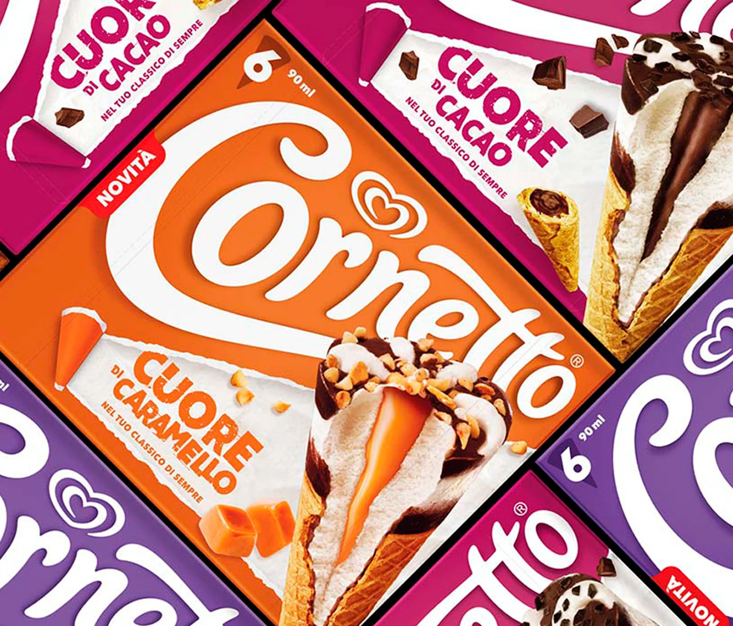
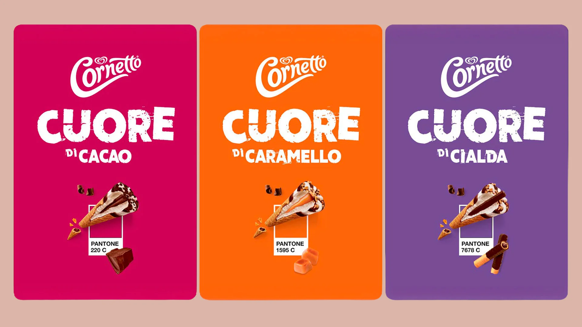
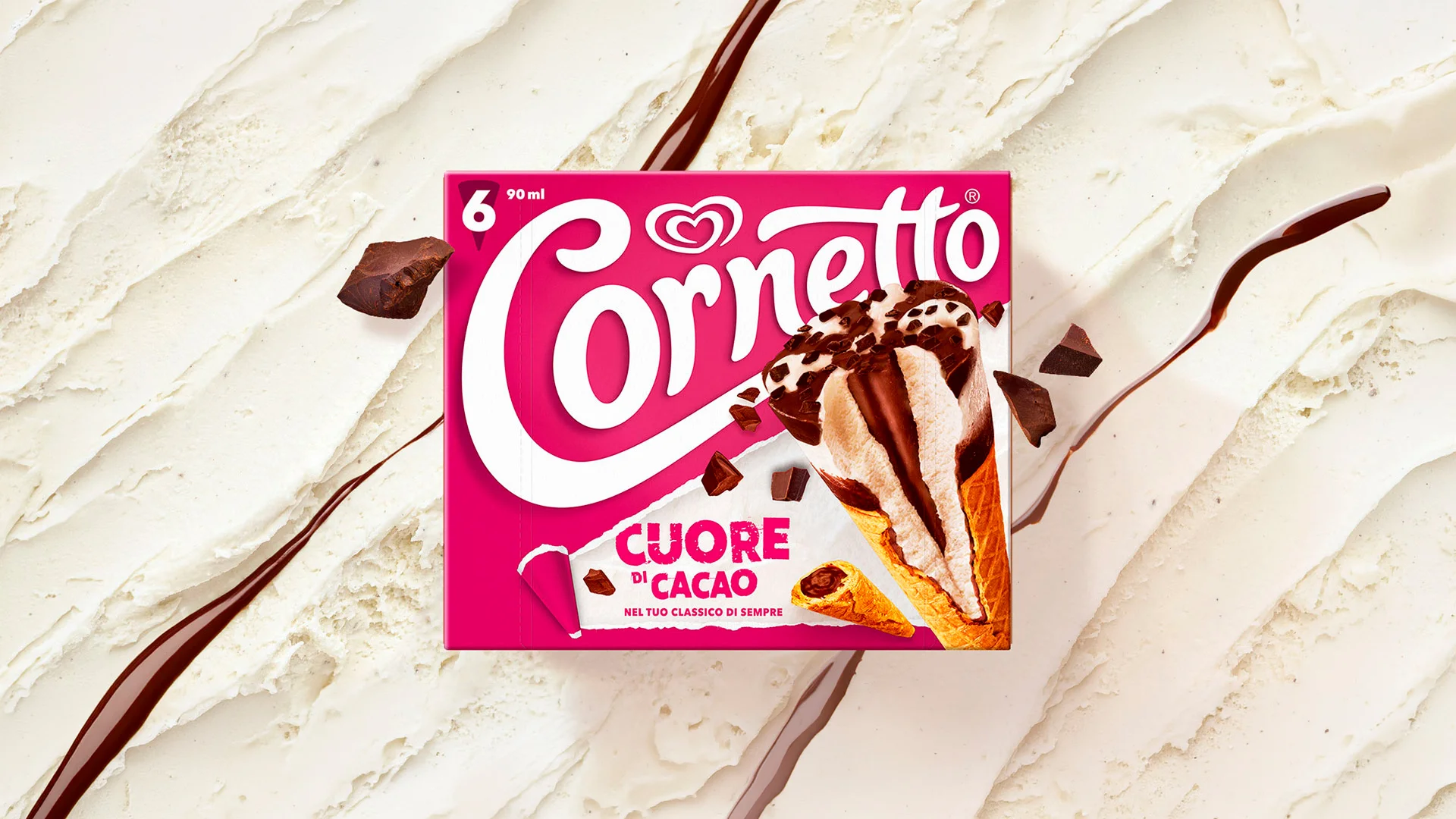
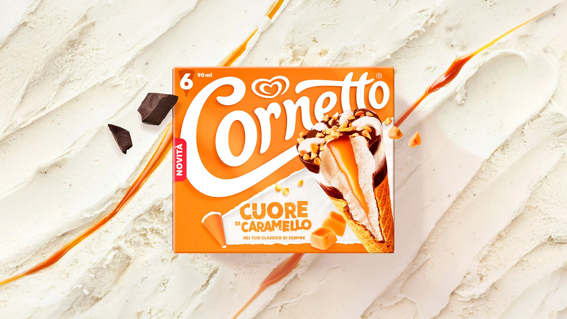
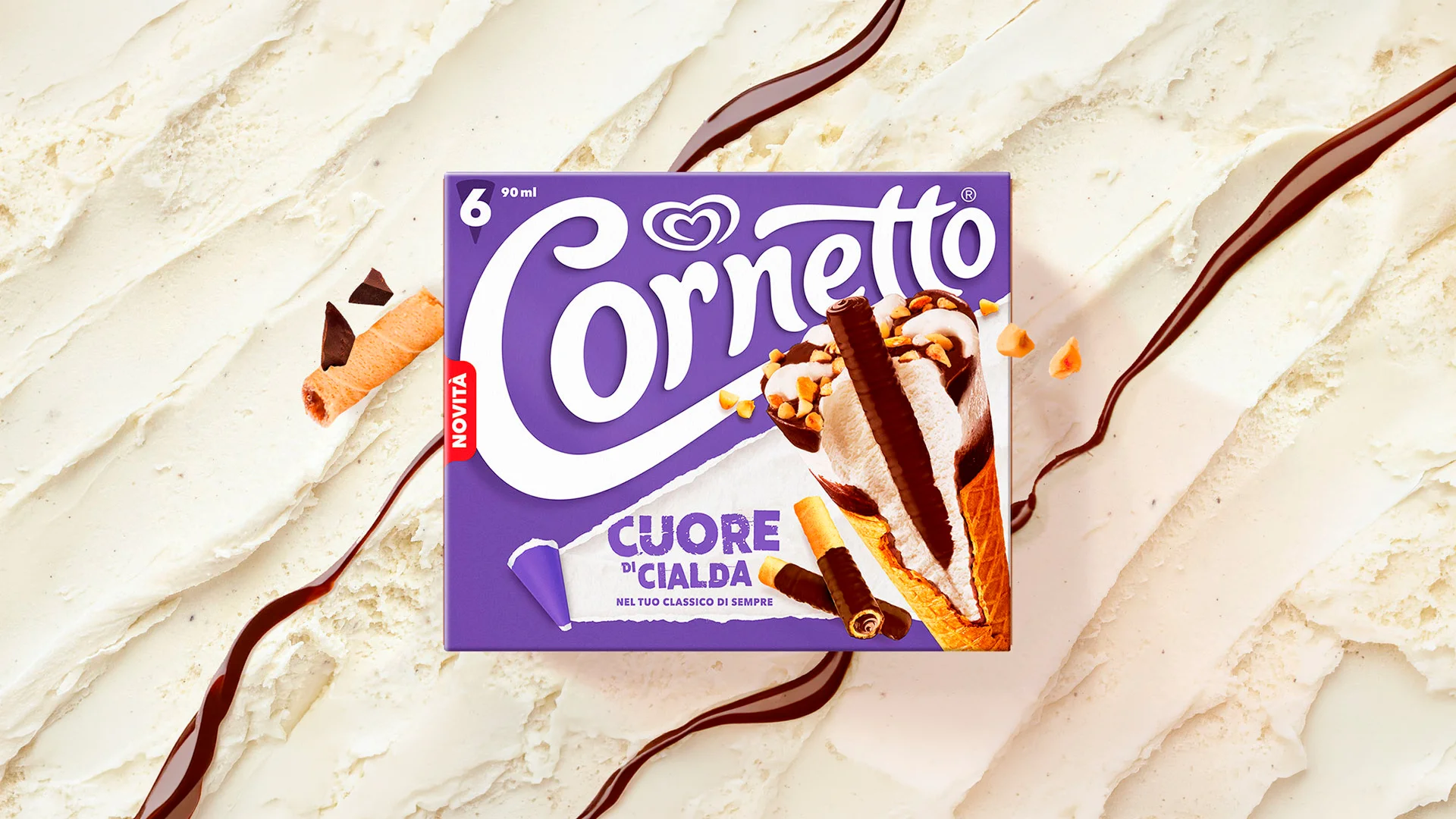
The renewal of the Cuore range, on the other hand, has a more direct visibility objective within the out of home channel. By moving the product image into an unconventional position and combining it with a brighter palette, the visual system makes the Cacao, Caramello and Cialda variants instantly distinguishable and strengthens the range identity, without altering the assets consumers already recognise.
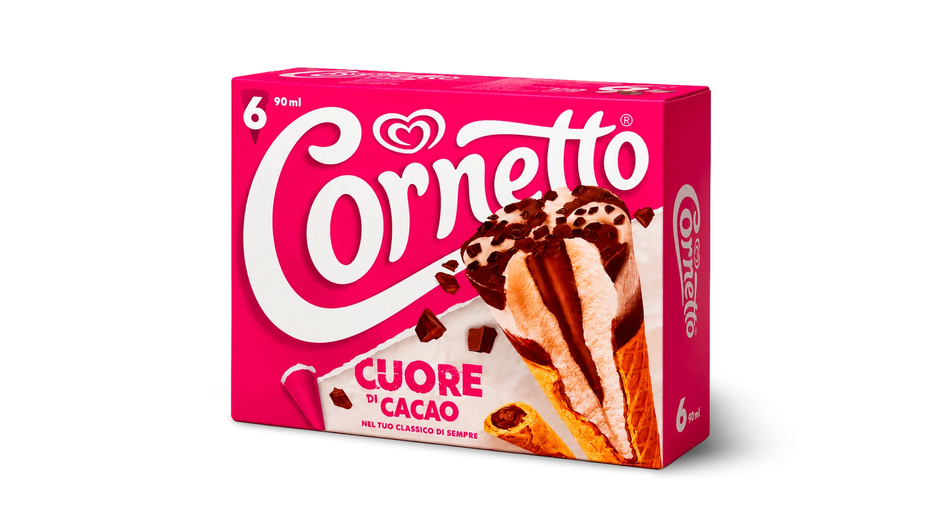
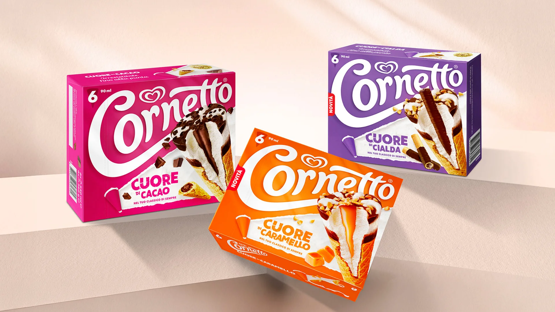
A new visual system for Cornetto Cuore brings the product to the foreground and makes each variant more immediate and distinctive, strengthening the range’s shelf impact.
For the Stellati limited edition, we opened up the Cornetto and turned its composition into a visual story, from crown to tip, building a premium identity for each variant.
A limited edition that lightens the brand’s historic codes, working with frames, light, colour and finishes to interpret three different emotions associated with summer.
The most recognisable part of the Cornetto, the tip, becomes a standalone snack: brand design, packaging and copywriting build a new premium range, translating the brand’s distinctive codes into a new format.

info@allthingscommunicate.it
+39 026556771
Via Paullo 9/A – 20135 Milano