

Cornetto
Un’icona di gusto italiano tra packaging e linee in continua evoluzione
Classici, Soft & Crunchy and Affogati: a restyling that brings together product innovation, sustainability and packaging designed to stand out
Designing packaging means finding the point of balance between innovation, brand identity and product desirability. This is the challenge addressed in the development of the packaging design for Carte D’Or, where the renewal of the range brings together aesthetic evolution, product innovation and sustainable packaging to strengthen the brand’s premium positioning in the ice cream market.
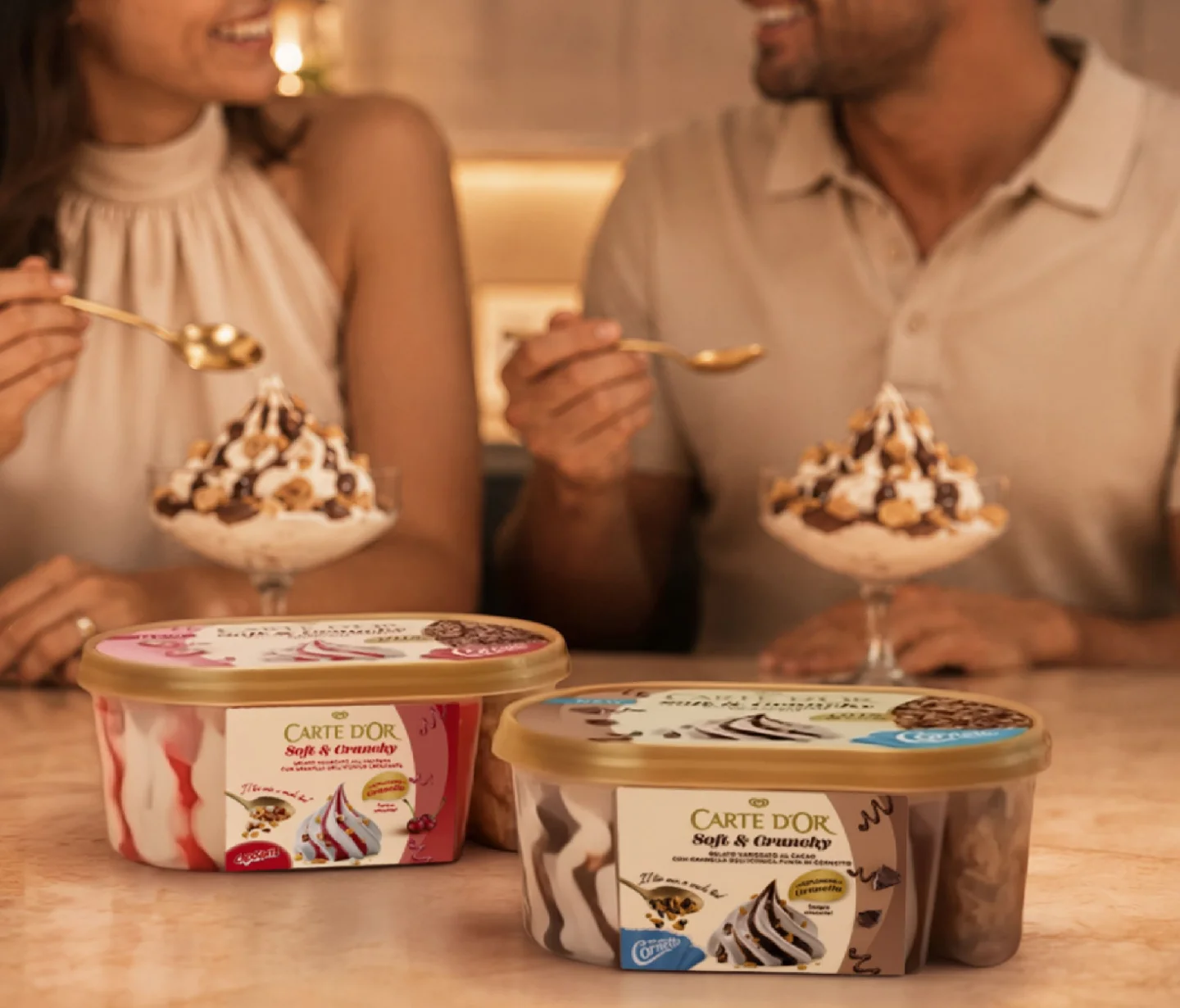
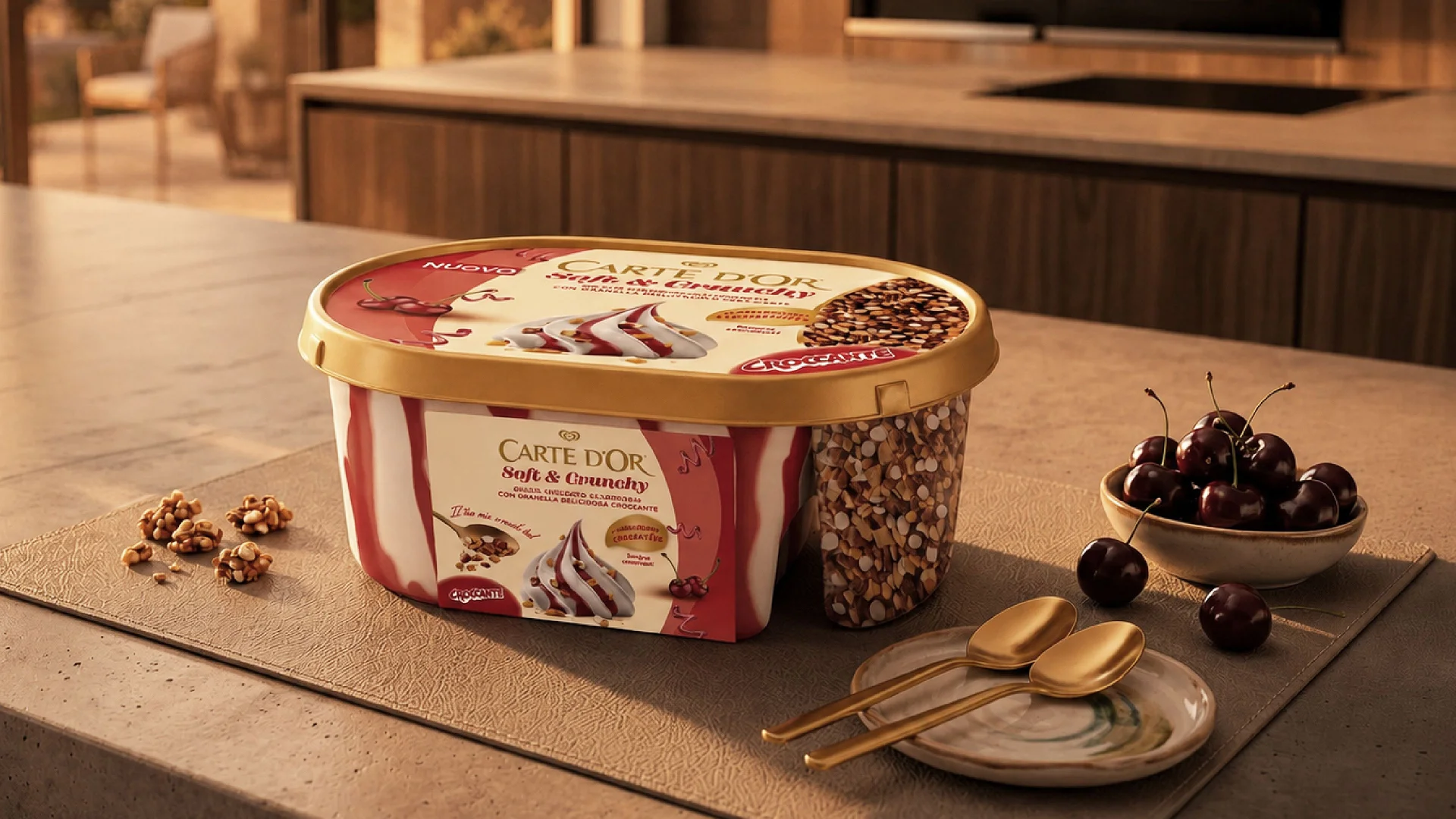
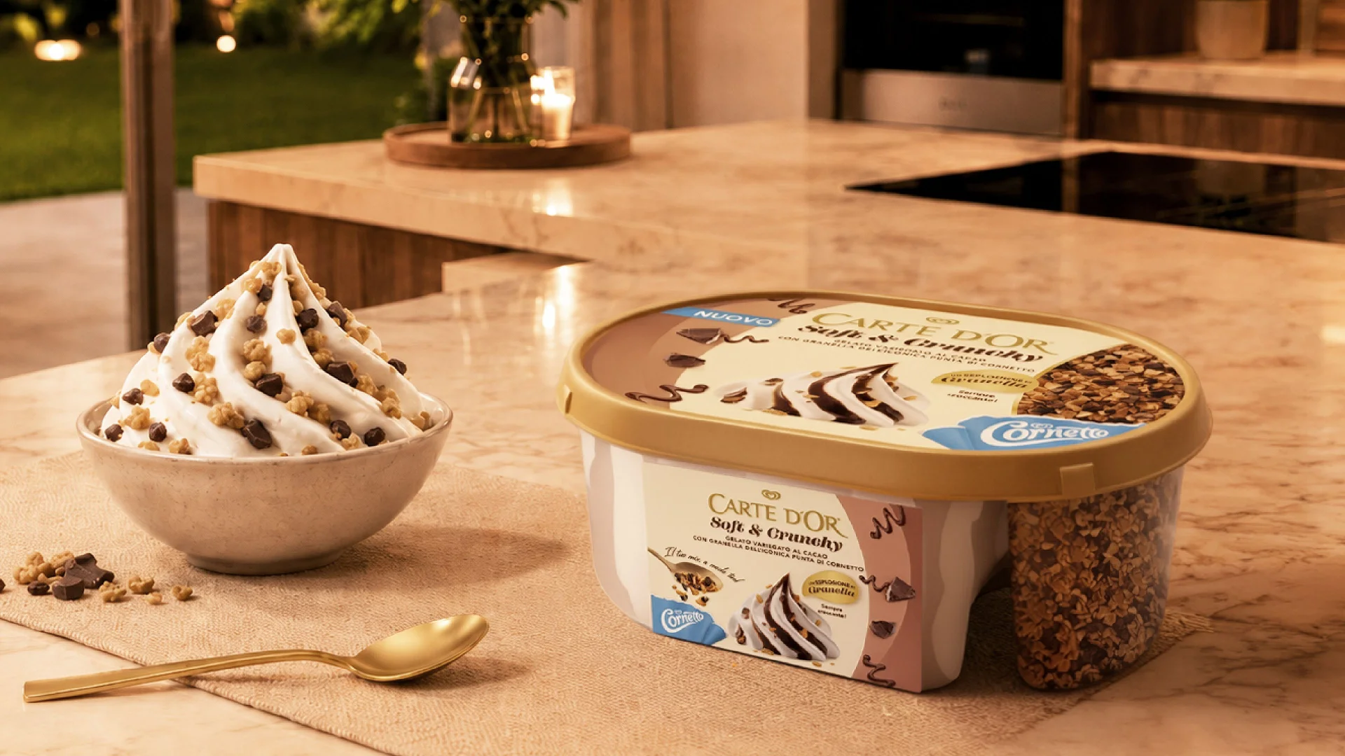
The collaboration spans the new Soft & Crunchy range, the established Classici line and the Affogati range, all united by a graphic system designed to enhance the product’s sensory experience while maintaining strong shelf recognition. With Soft & Crunchy, the challenge is structural even before it is graphic: the tub is divided into two sections, keeping the crunchy topping separate from the ice cream until the moment of consumption so that its texture remains intact. The packaging design translates this structure into an immediate visual story, building the contrast between the creamy base and the crunchy component on the front of pack, while clearly communicating a new consumption ritual: creating your own mix. The colour system distinguishes the two variants, which feature Algida’s topping icons on the front, without compromising the overall family feel of the range.
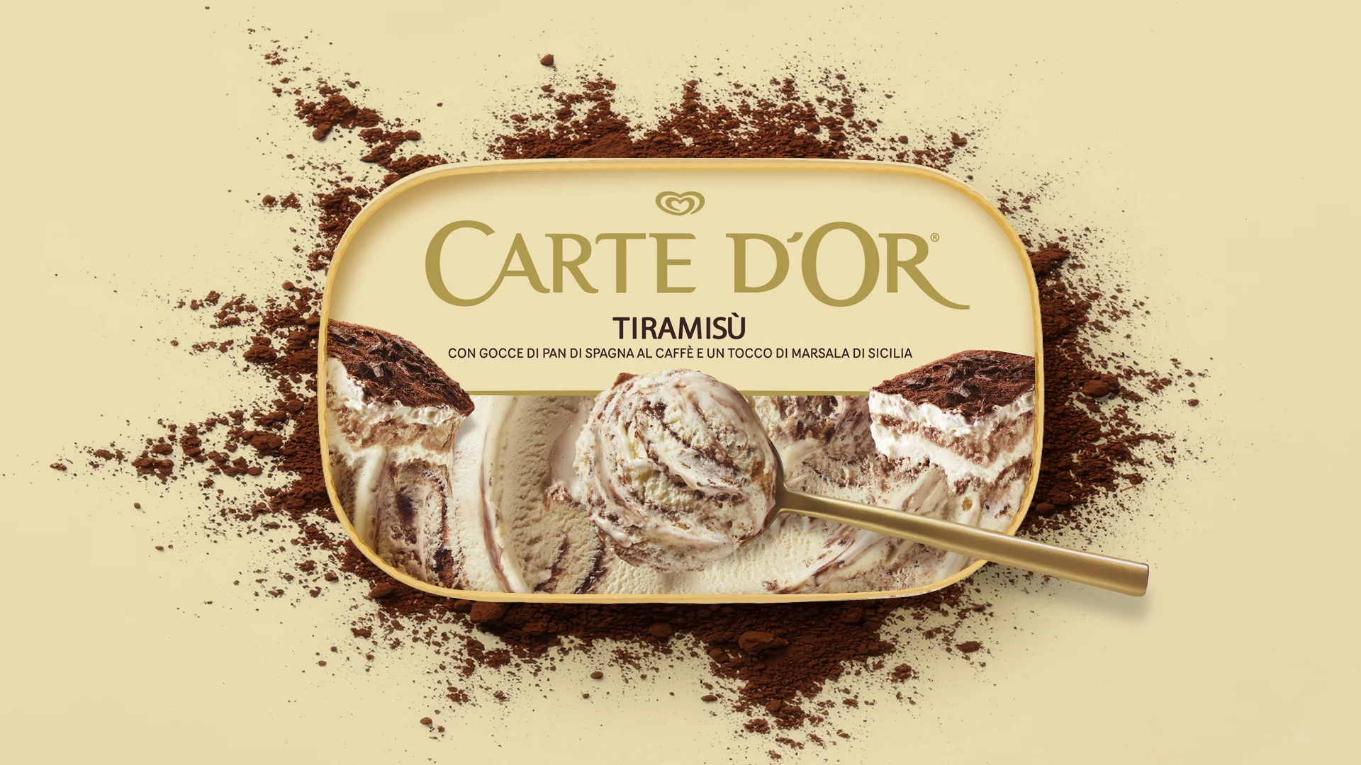
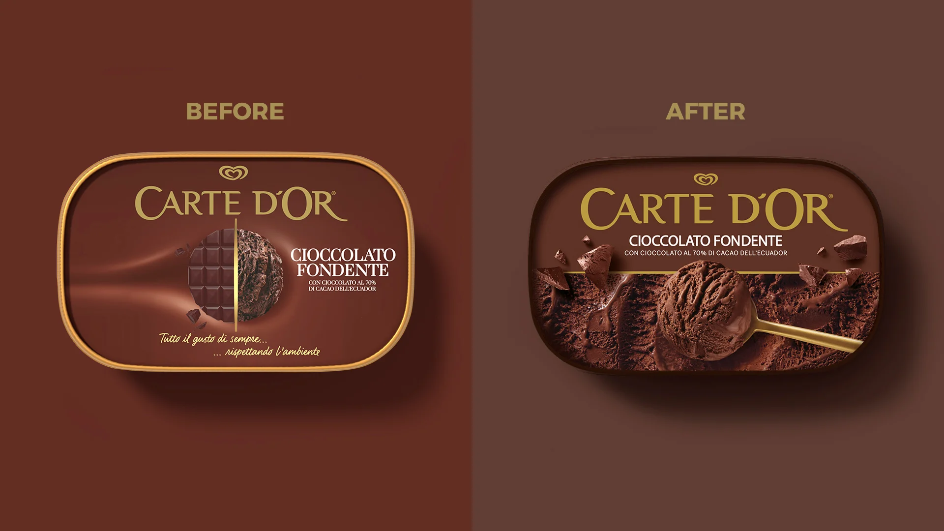
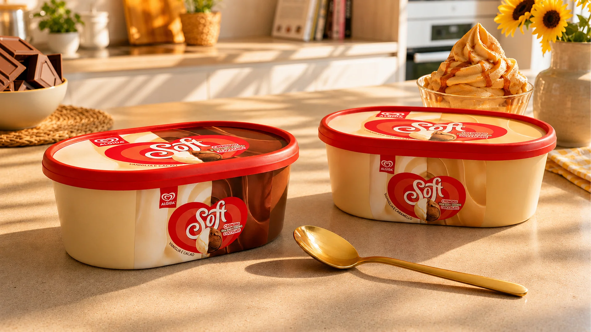
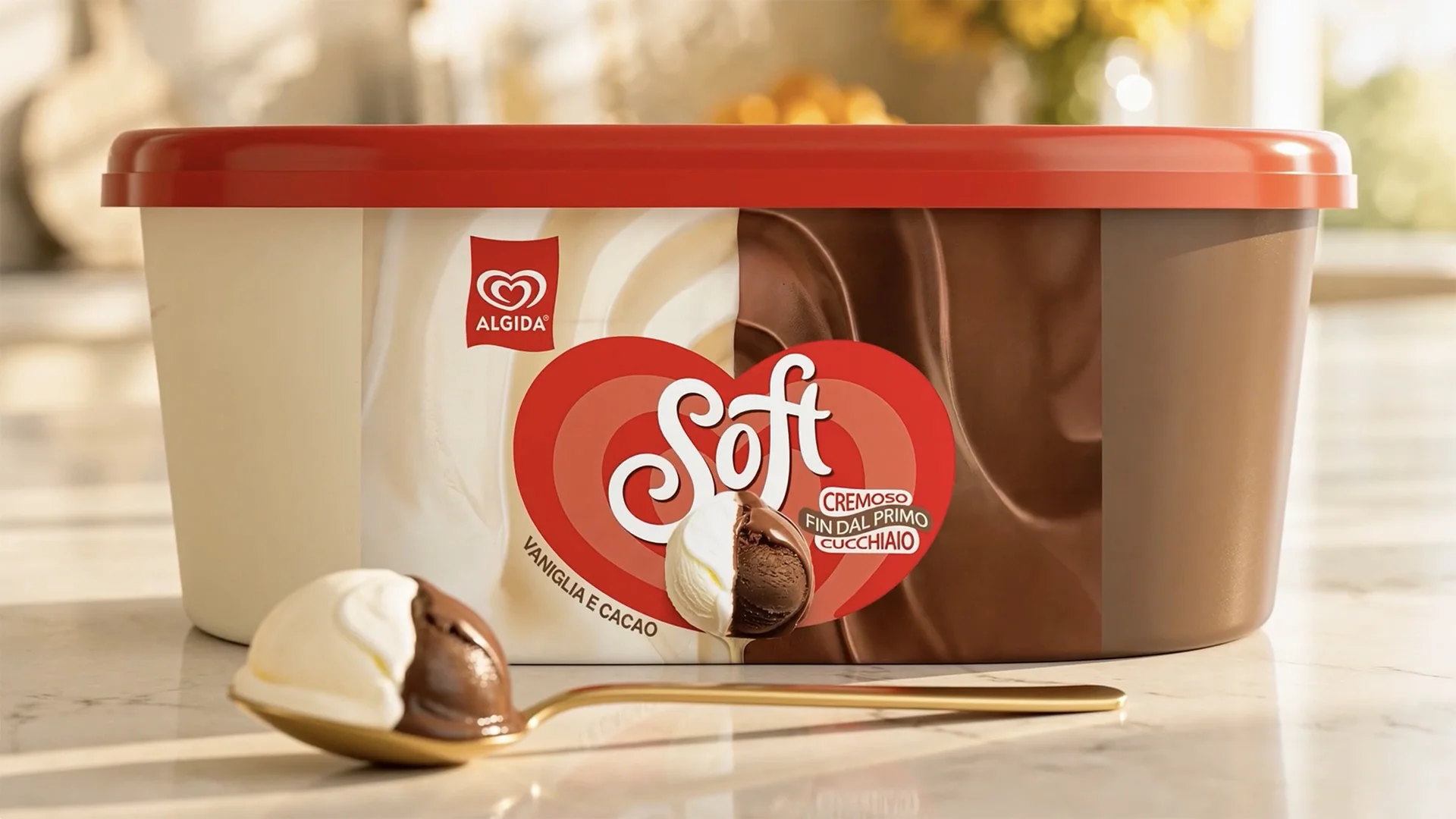
For the Classici, the redesign introduces a more contemporary visual language, capable of engaging new consumers without losing the brand’s distinctive brand assets. The graphic system connects logo and flavour through a clear, recognisable structure from every angle, while high-impact photographic imagery enhances the ingredients, textures and creaminess of the ice cream. Gold, an iconic element of Carte D’Or’s identity, is reinterpreted through a more contemporary balance, allowing the product itself to take centre stage.
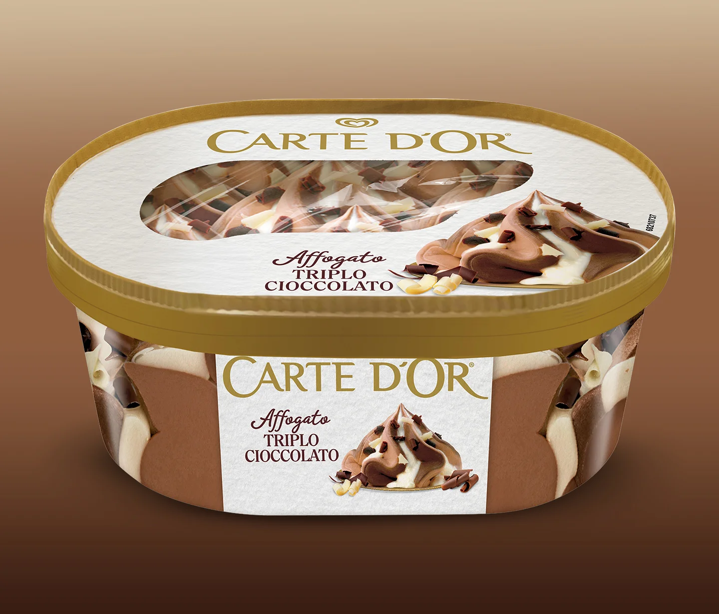
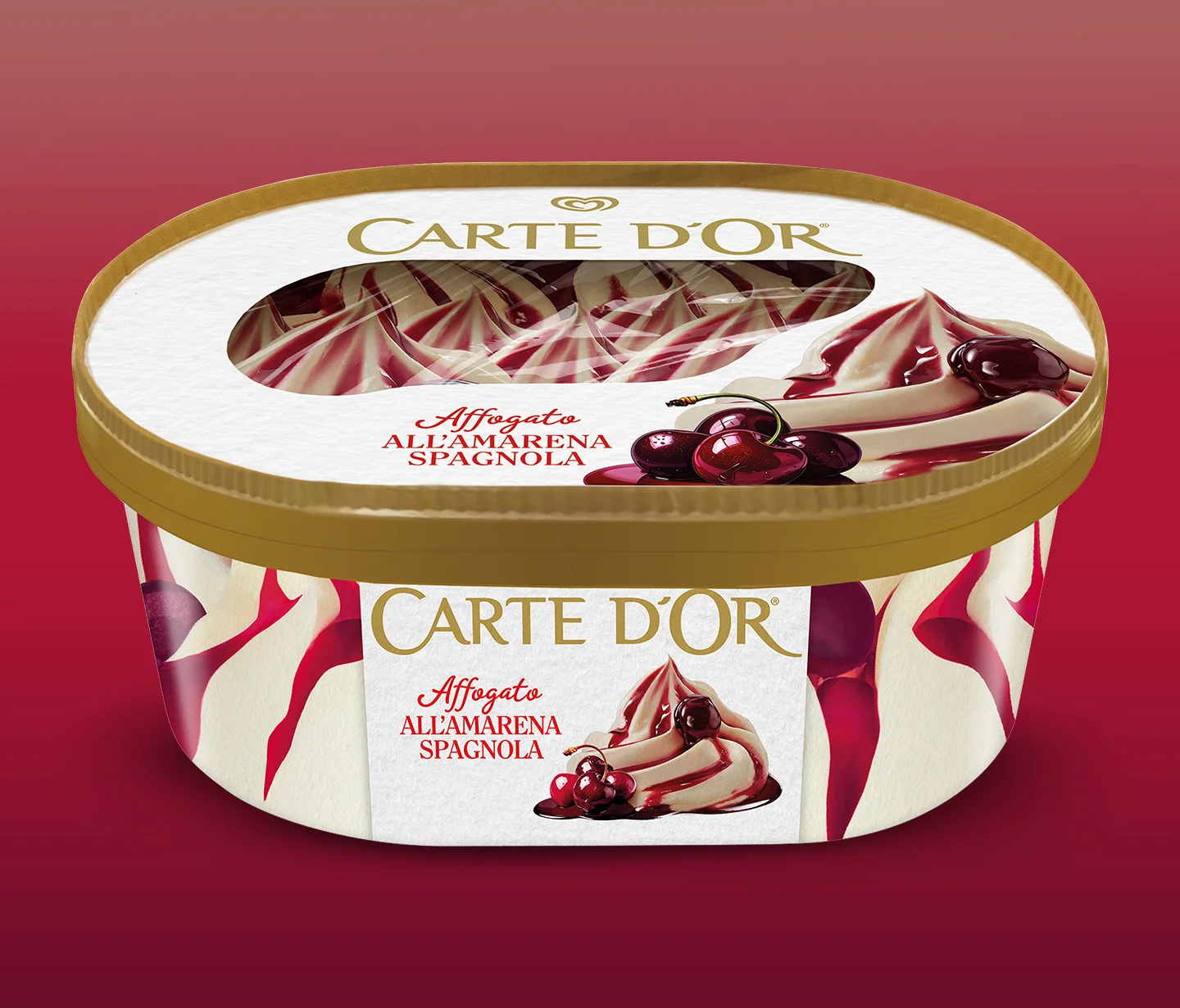
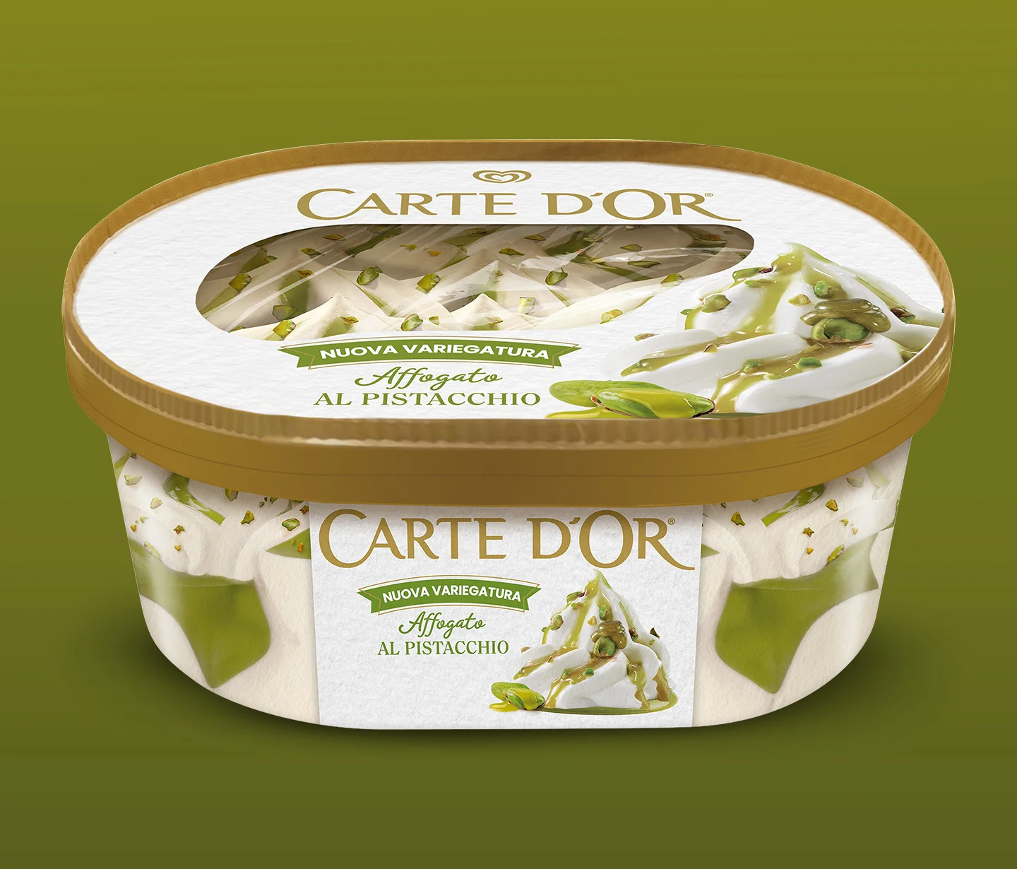
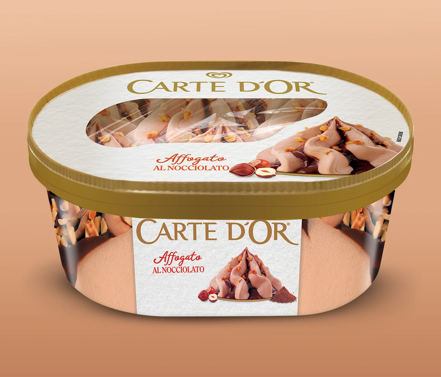
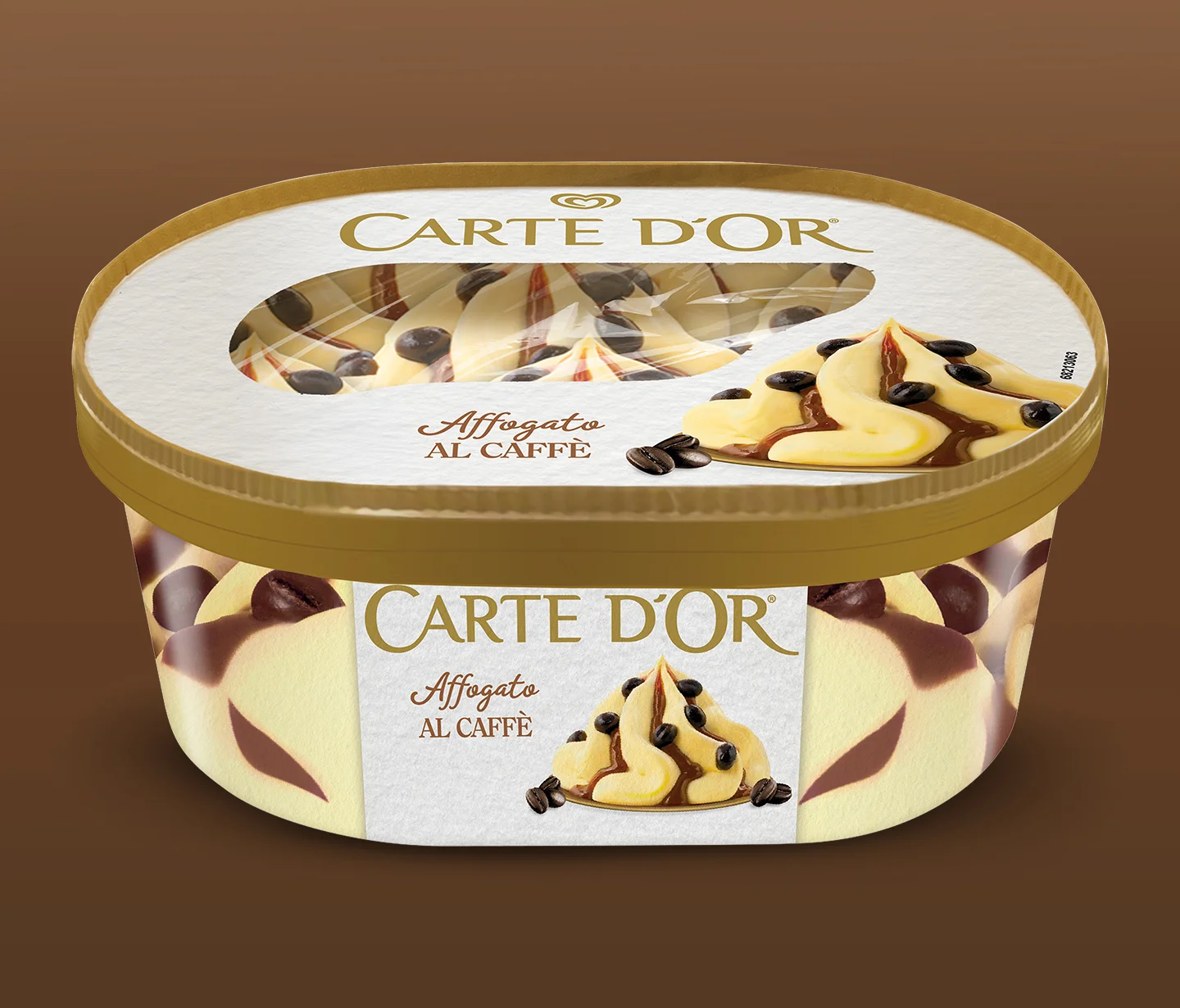
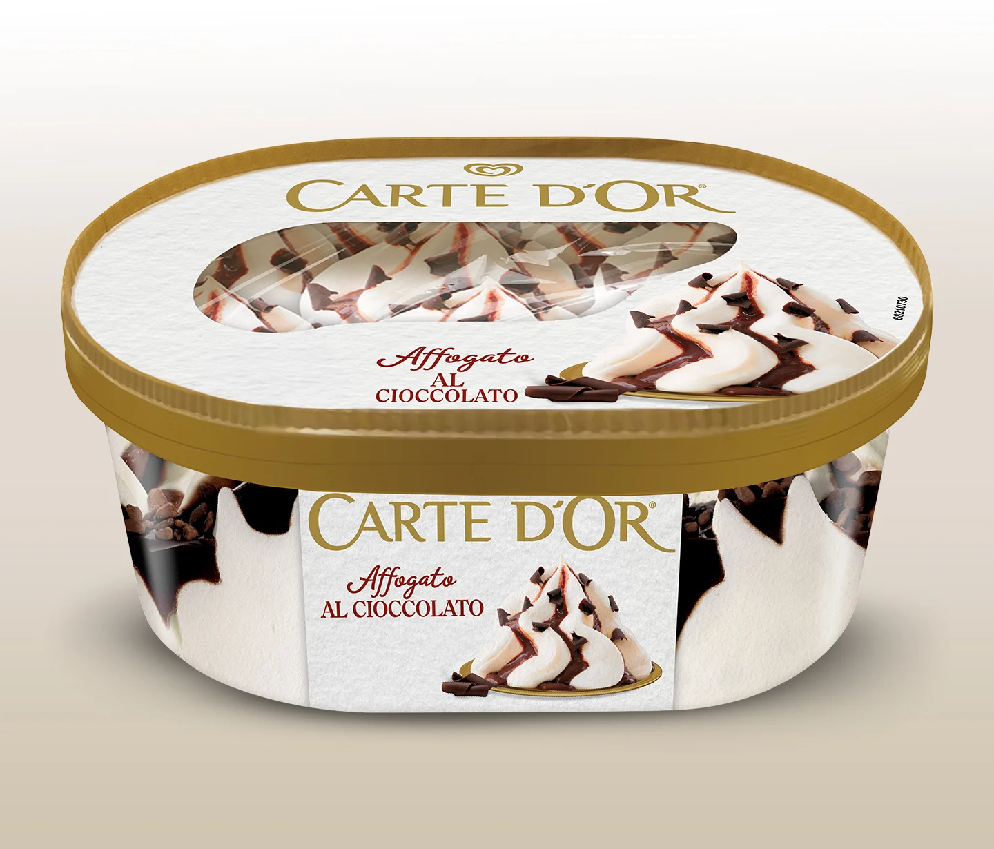
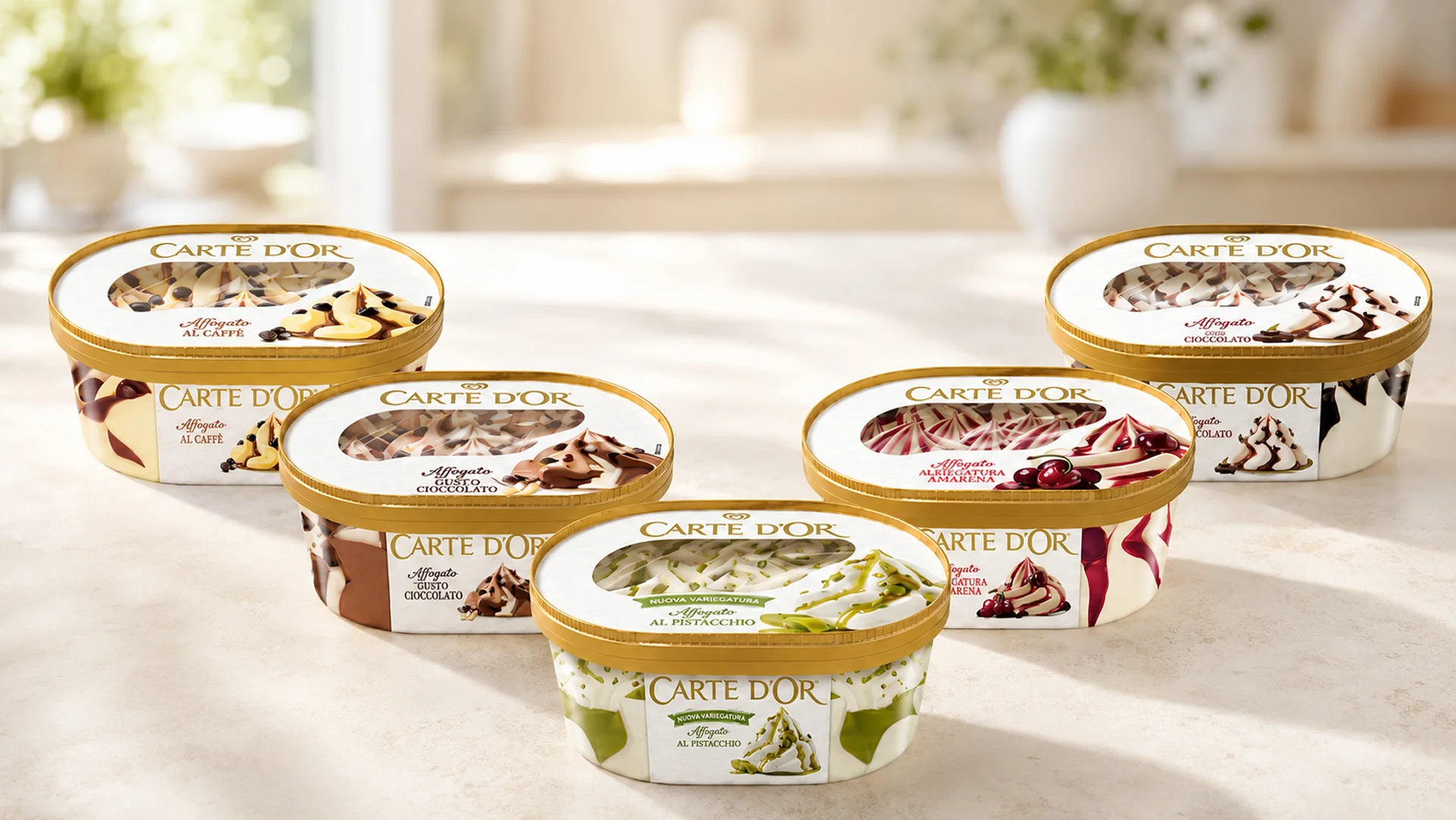
The same focus on brand evolution guides the redesign of the Affogati range, developed as part of Unilever’s global No/Less/Better Plastic strategy. The new tub in PEFC-certified paper, with compostable and recyclable components, demonstrates how sustainable design can become an opportunity for innovation without compromising the range’s visual impact or premium perception. The window made from 100% compostable ecofilm preserves product visibility, while the graphic system maintains strong appetite appeal, recognisability and commercial impact in the freezer cabinet. A project that brings together packaging design, sustainable packaging and product innovation within a coherent vision, also recognised by the market with the Product of the Year award, confirming that sustainability and performance can coexist within a single brand experience.
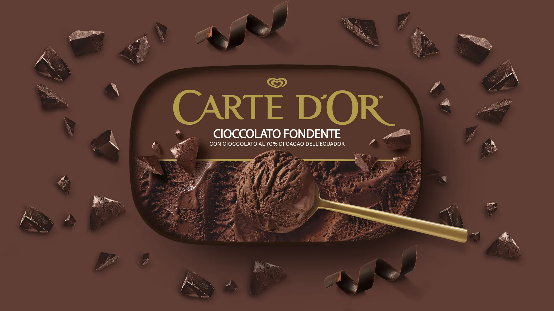
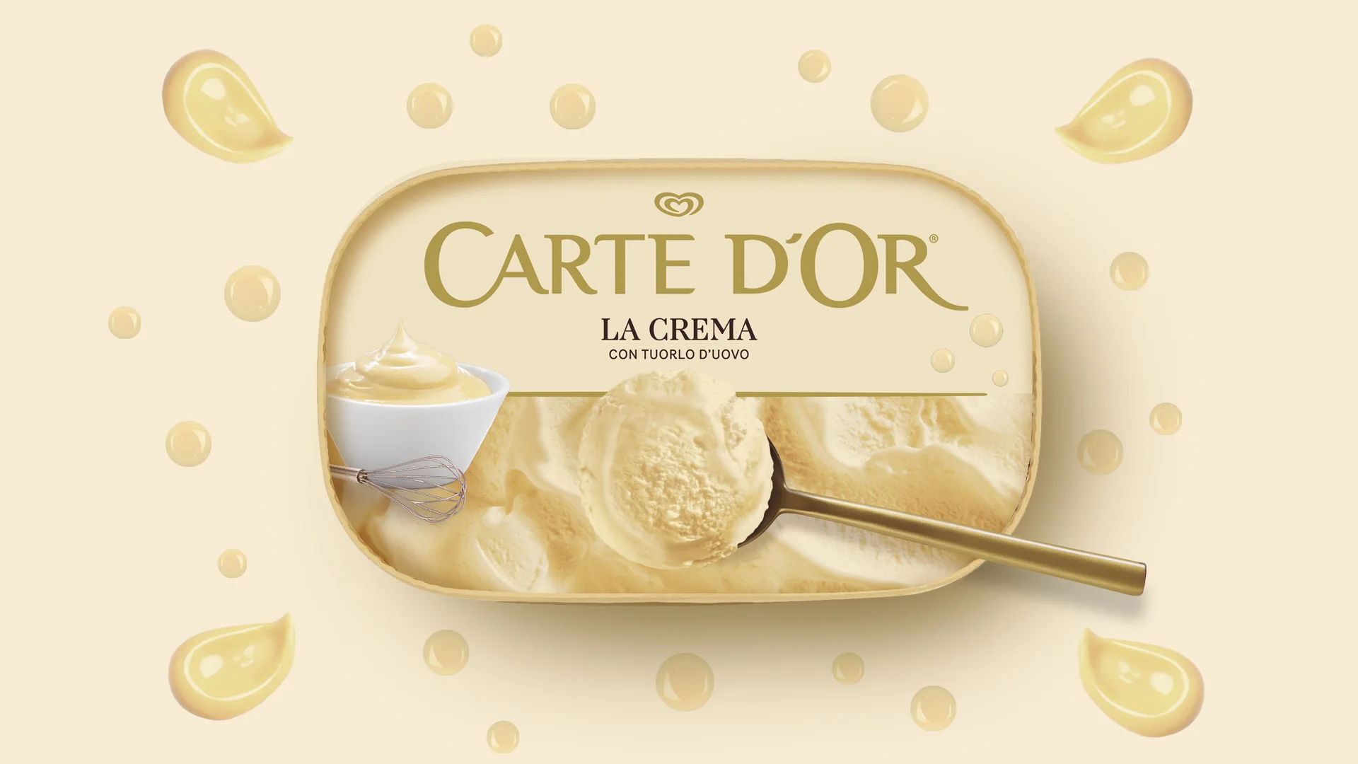
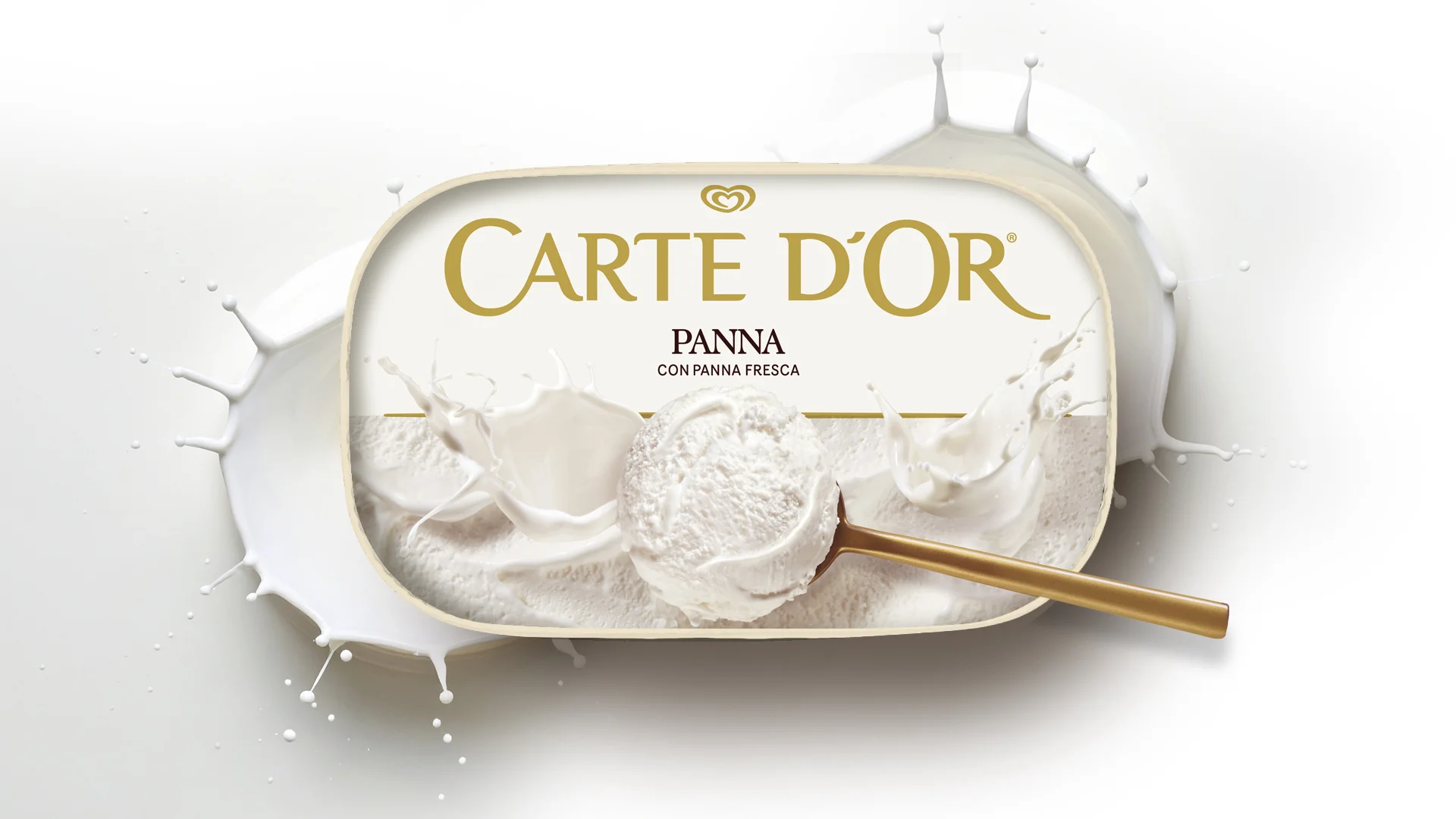
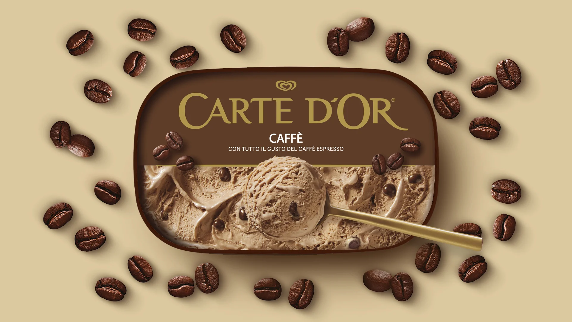
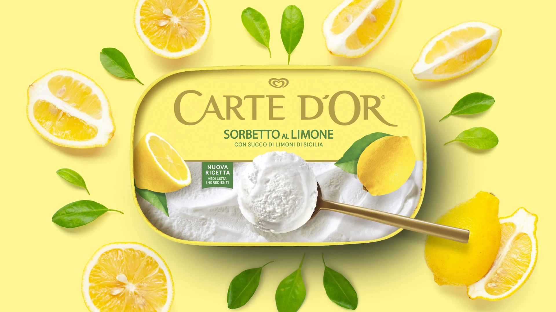
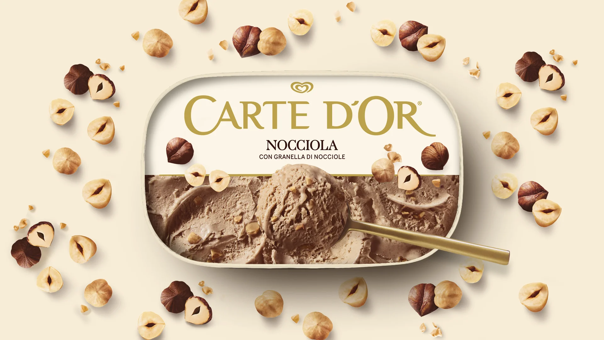
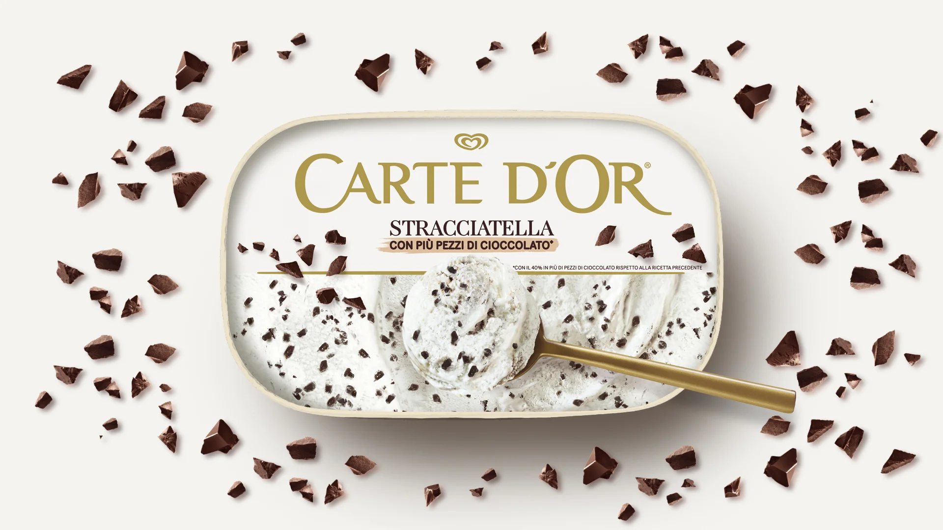
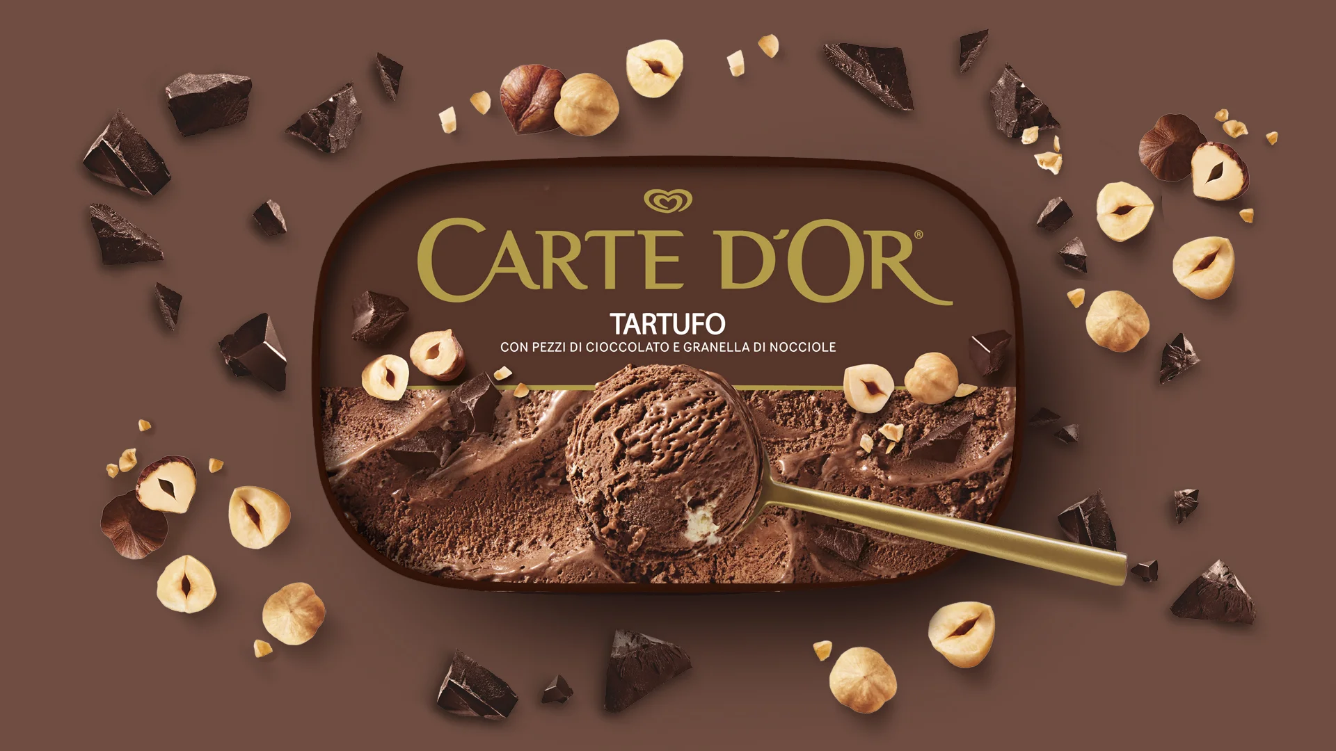
An innovative structure keeps the ice cream and crunchy topping separate until the moment of consumption, while the design immediately conveys the contrast between creaminess and crunch, introducing a new tasting ritual
The redesign introduces a tub made from PEFC-certified paper and compostable and recyclable materials: sustainability becomes an integral part of the project without compromising appetite appeal, recognisability or perceived value

info@allthingscommunicate.it
+39 026556771
Via Paullo 9/A – 20135 Milano