
Sanpellegrino Italian Sparkling Drinks
Global consistency, local flexibility: a toolkit for retail, out-of-home and e-commerce
A brand identity designed around the Valtellina territory
For wineries, building an identity means making the connection with their place of origin immediately recognisable. This was the starting point for our work with Società Agricola Lupencia, a Valtellina winery founded with the aim of producing quality wines while preserving the area’s winemaking culture and traditions.
That connection is already present in the name: “Lupencia” comes from the local dialect name for Villapinta, the hamlet where the winery and vineyards are located. We turned this origin into the guiding principle of the entire visual identity, making the territory a central part of the brand story rather than a simple backdrop.
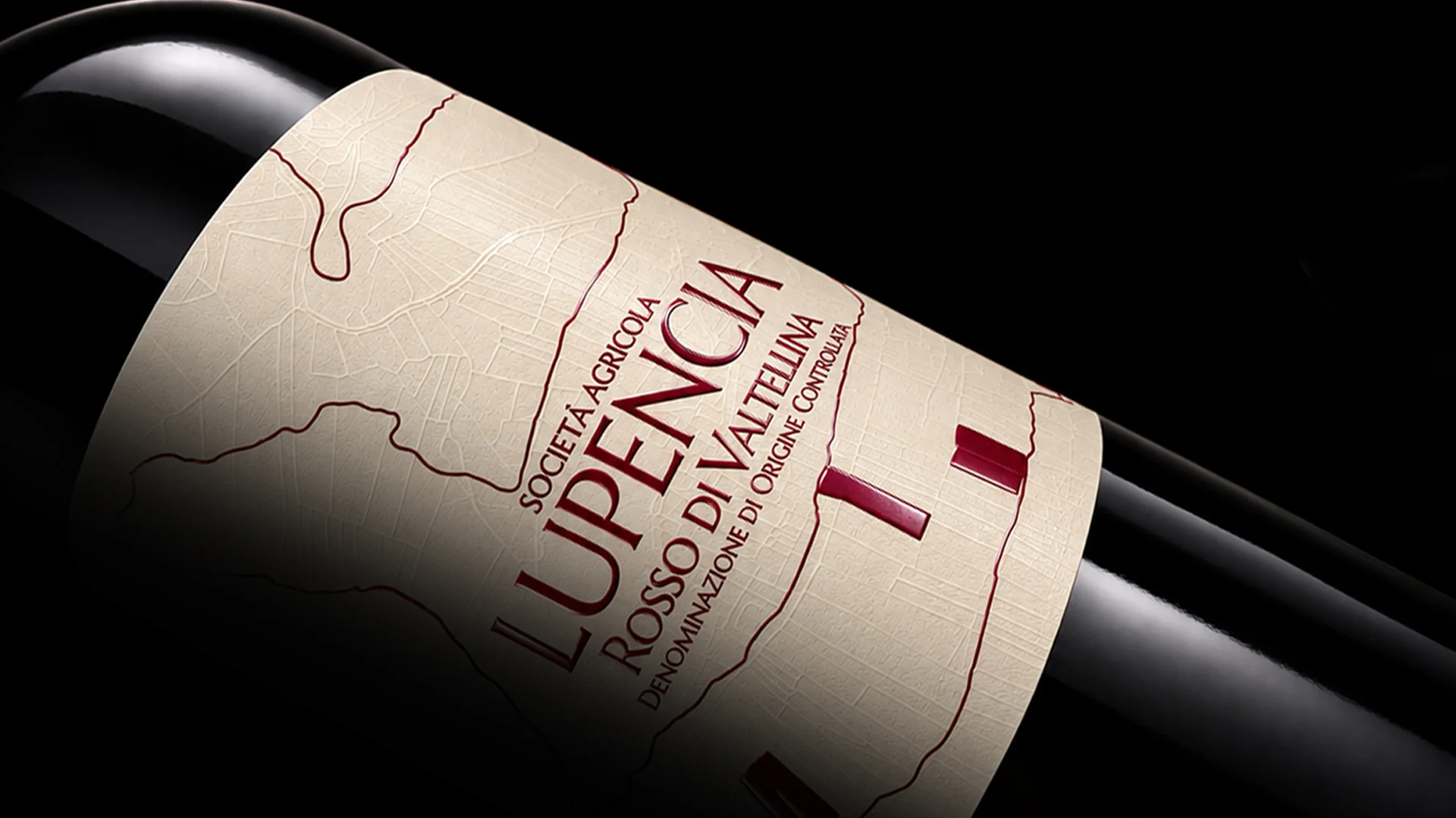
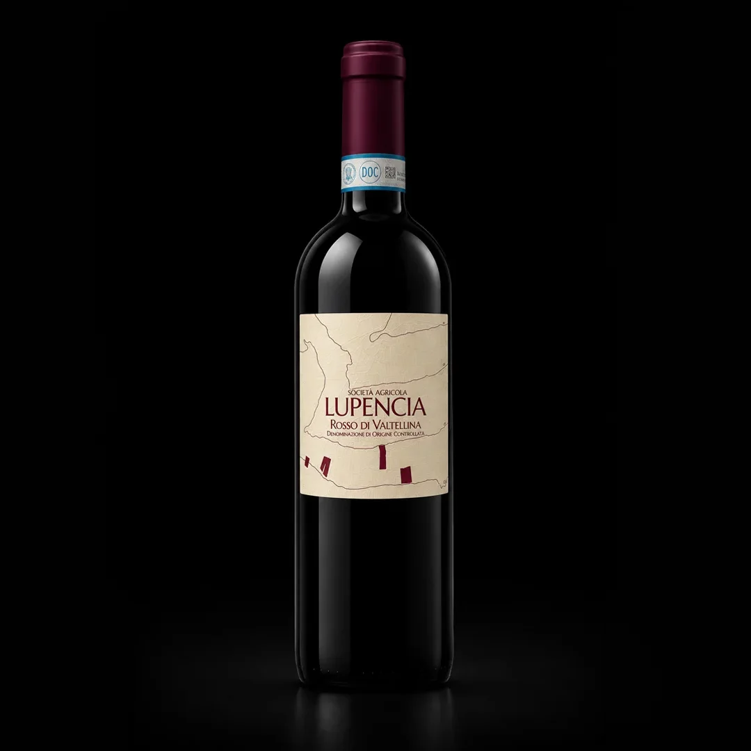
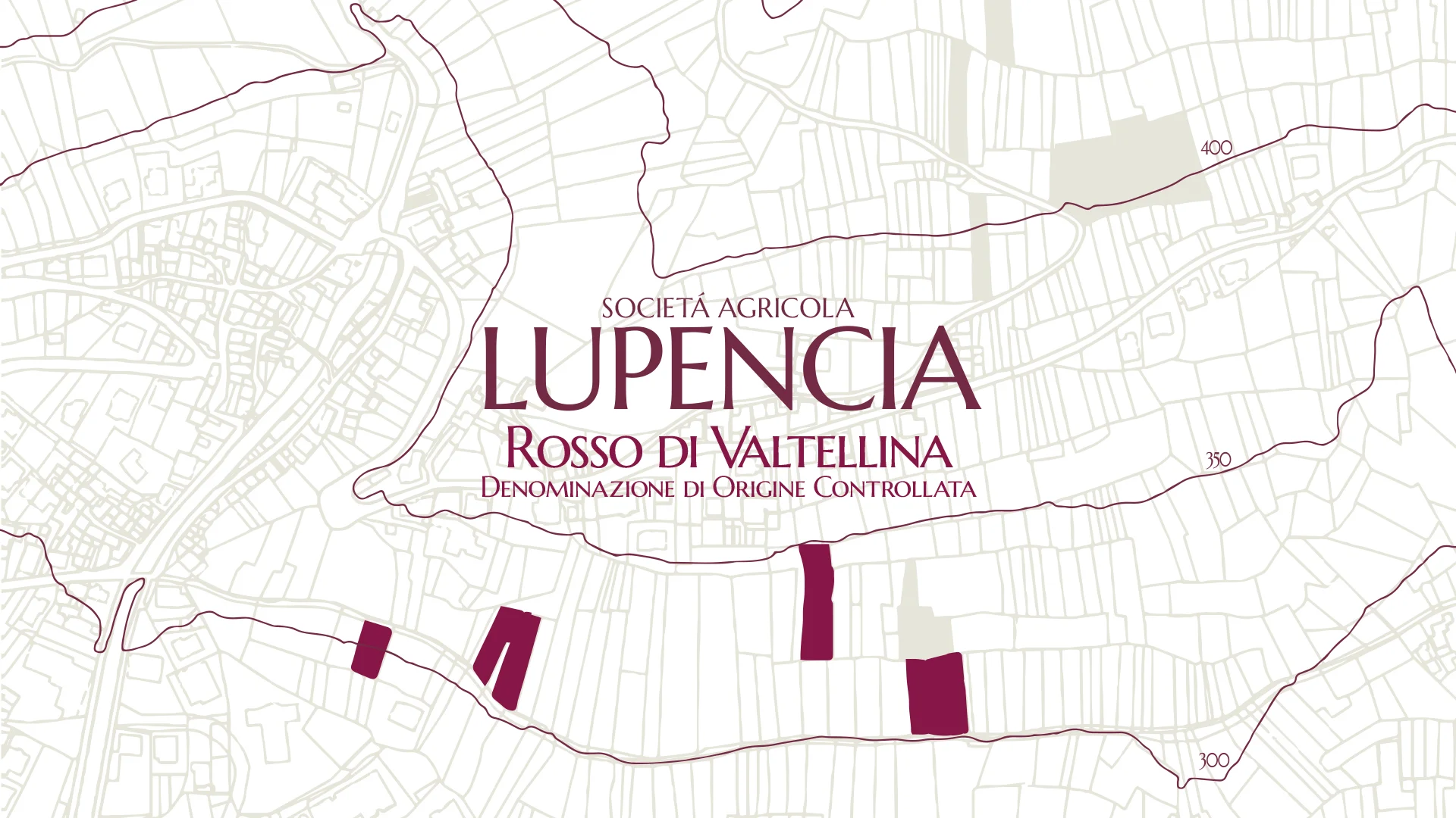
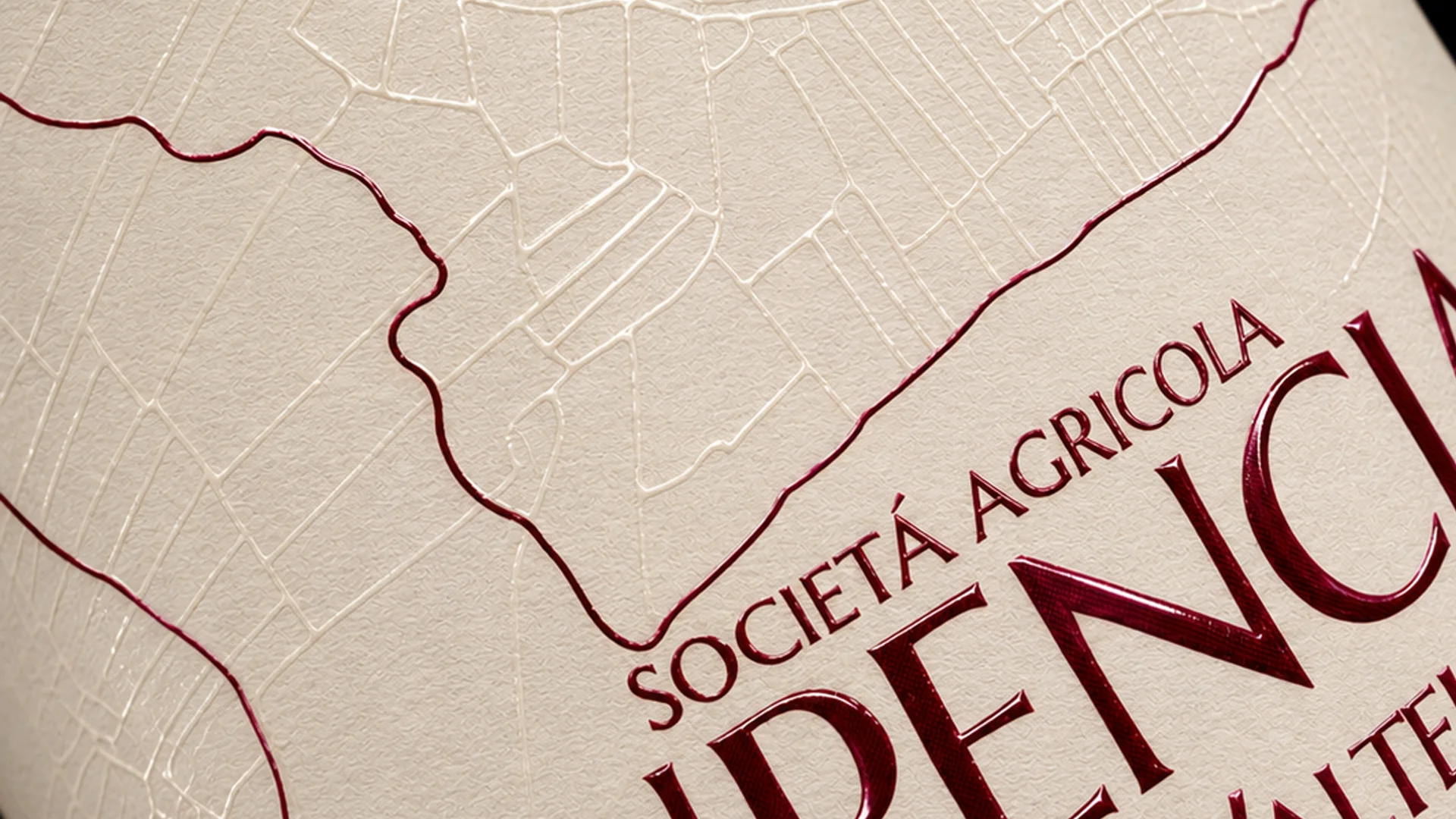
On the labels, the mapping of the land becomes the distinctive feature of the visual system. A transparent gloss pattern reproduces the subdivision of the production area into individual land parcels, while selected areas identify the plots cultivated by the winery. The contour lines map the altitude of the Valtellina landscape, while the areas highlighted in red pinpoint the vineyards from which the grapes used for each wine originate.
The label thus becomes a map of provenance: a graphic code that connects every bottle to its place of origin and translates the values of territory, authenticity and winemaking culture that underpin Lupencia’s work.
The same visual language extends beyond the packaging through corporate and communication materials that use the brand’s cartography, colour palette and distinctive graphic elements. From business cards to display materials, each application contributes to a coherent system in which Lupencia’s identity remains firmly rooted in Valtellina, the place where it all begins.
Lupencia’s visual identity draws on real elements of the territory: vineyard mapping, land parcels and contour lines become graphic elements, while materials and finishes enhance their presence on the label.


info@allthingscommunicate.it
+39 026556771
Via Paullo 9/A – 20135 Milano