
Segafredo
An ambitious relaunch for the historic Italian brand, with a consistent positioning and brand system across every touchpoint
A super-premium identity shaped through design, materials and details
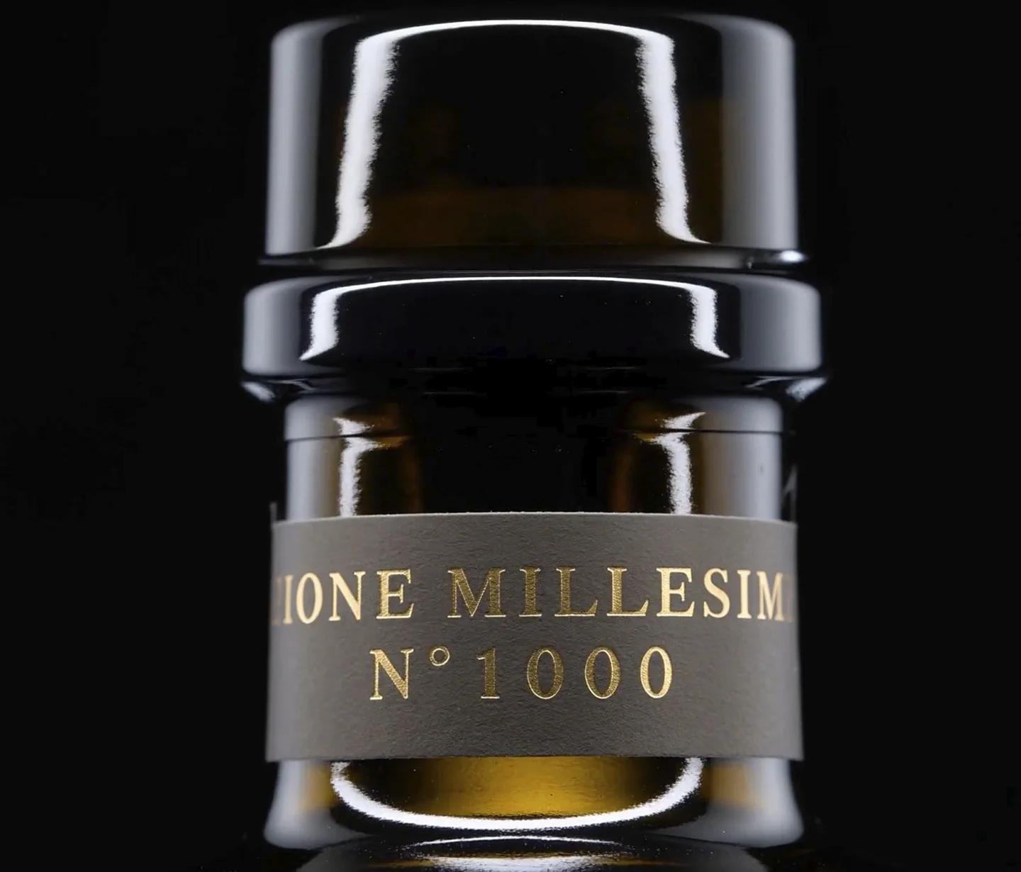
Turning an outstanding product into a brand experience means creating an identity capable of communicating its value even before the first taste. For Tevo, a limited-edition extra virgin olive oil featuring individually numbered bottles, ATC developed an identity system designed to make its super-premium positioning immediately recognizable and tangible.
Tevo was created by “I Giardini di Alice”, a Tuscan farm also committed to recovering ancient grains and heritage seed varieties.
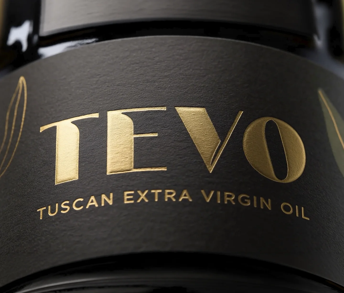
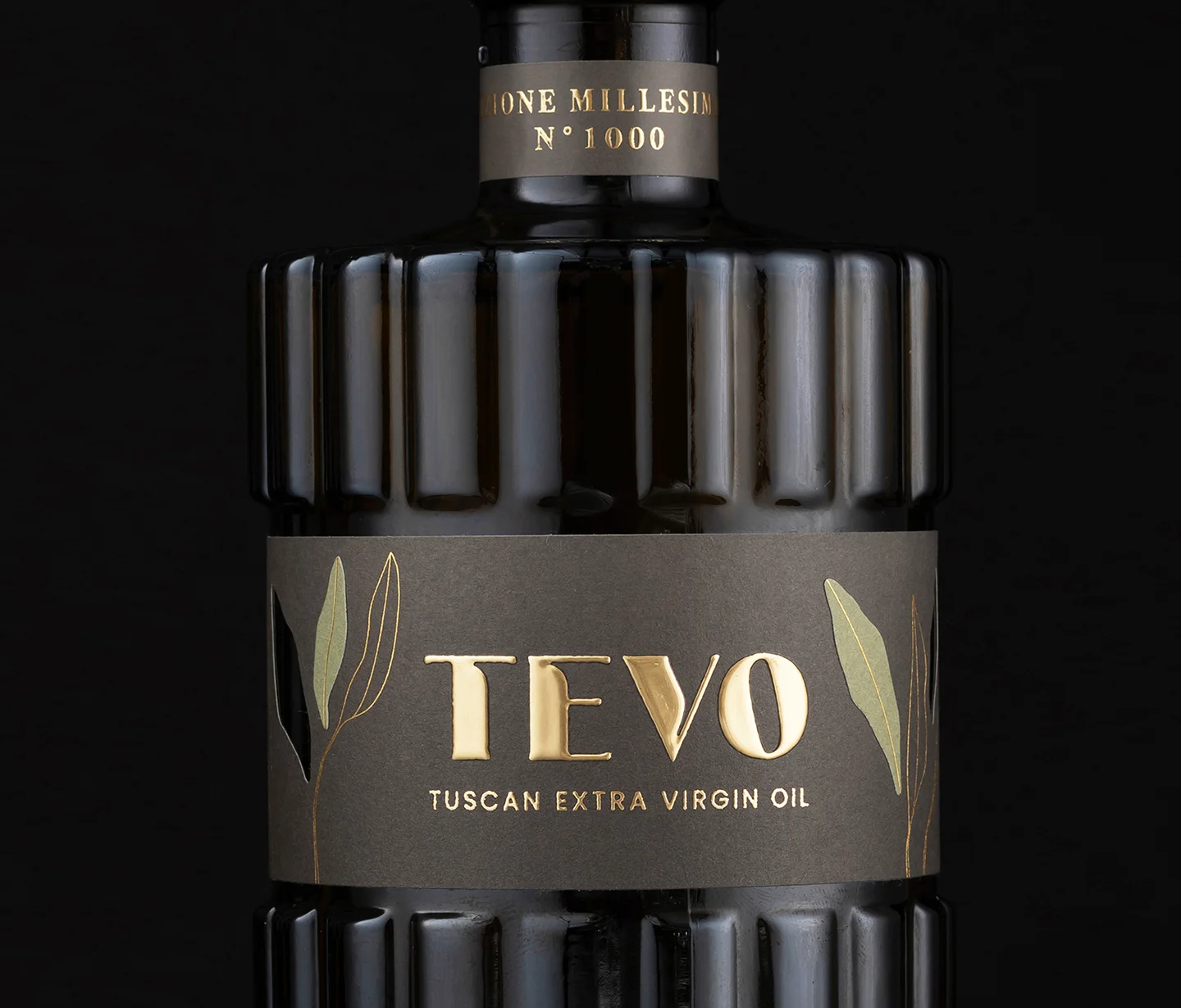
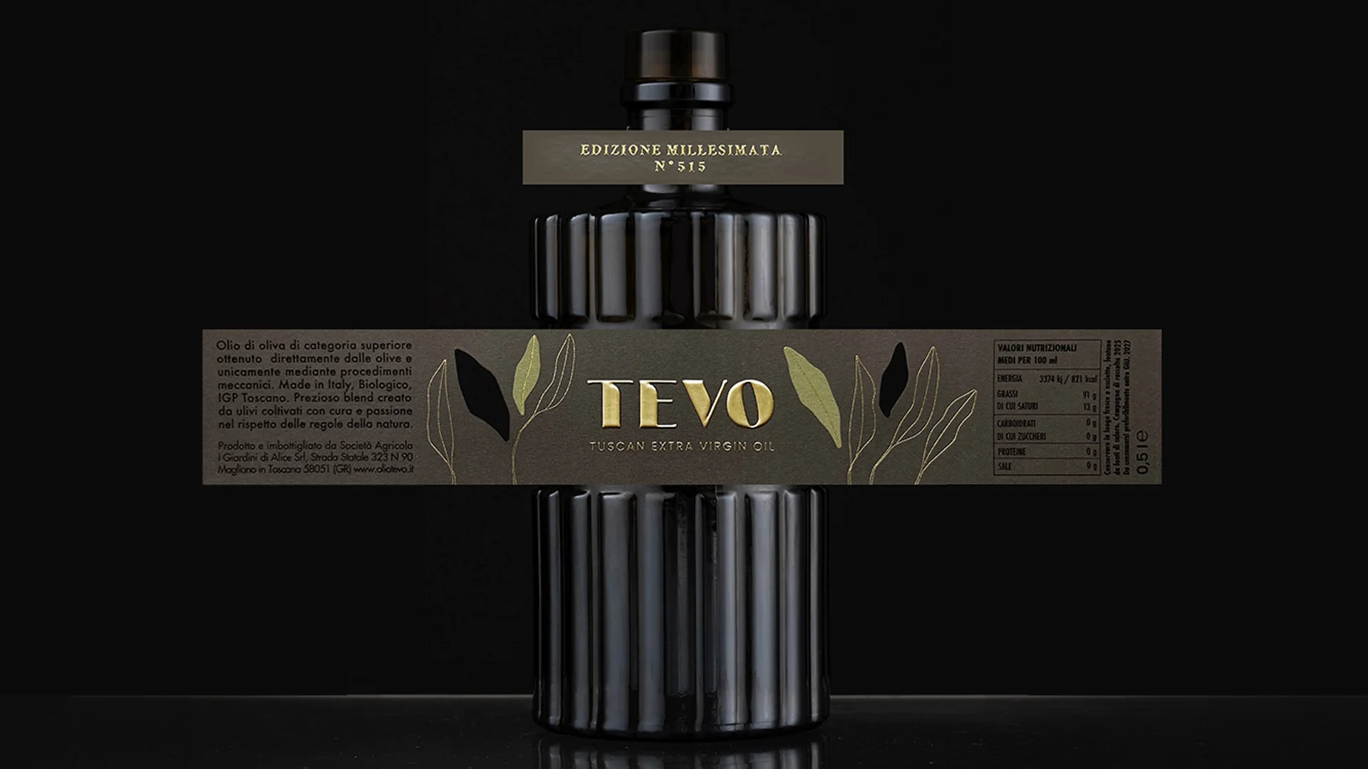
The brand mark was designed to convey authority and understated elegance, without relying on excessive decoration. Gold foil hot stamping becomes a distinctive part of the identity: it catches the light, enhances the product from a distance and, at closer range, makes the logo perceptible to the touch, taking the identity beyond the purely visual dimension of the image.
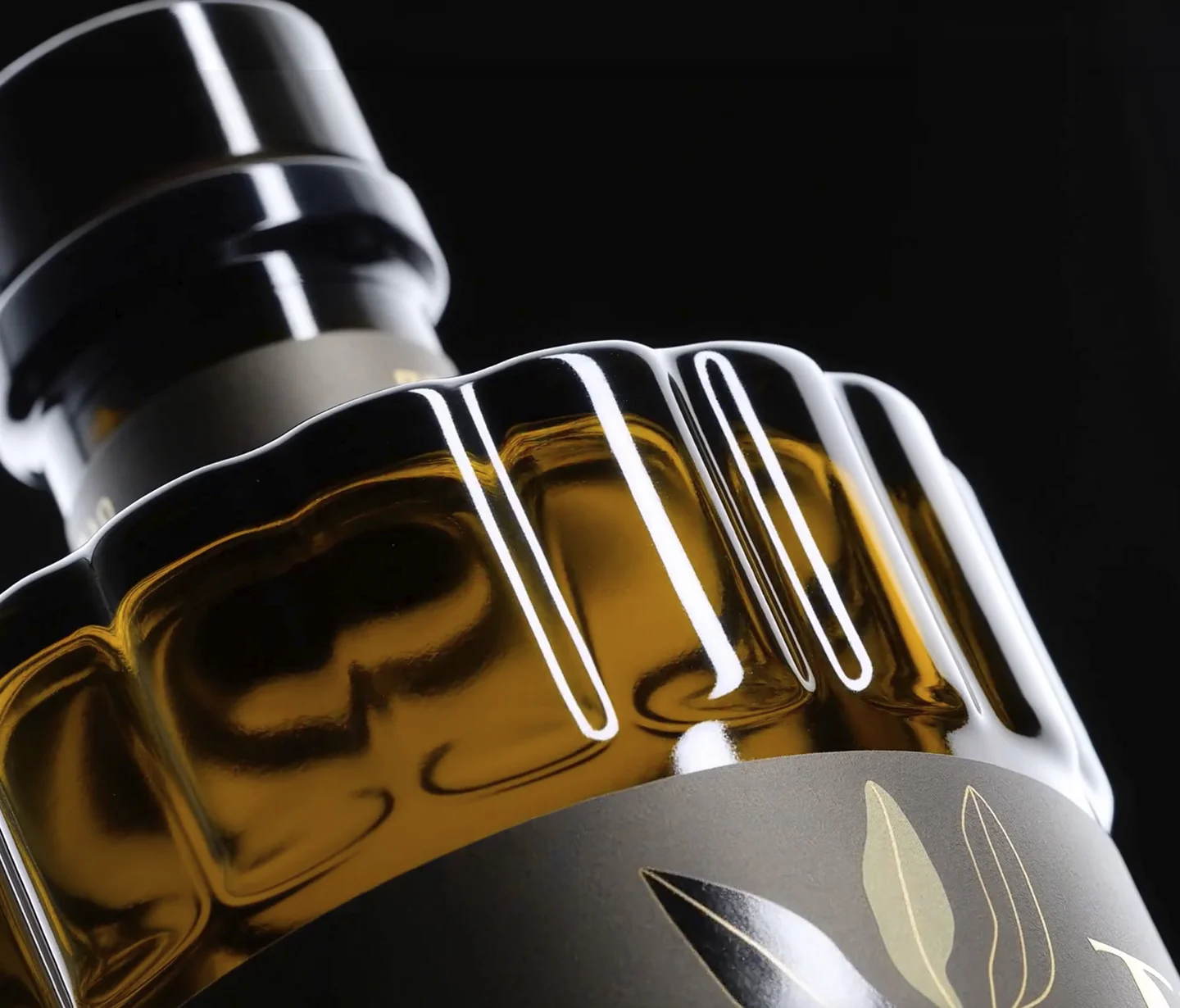
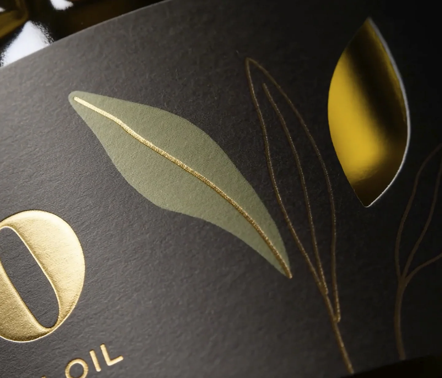
The same attention to detail defines the label, developed through layering and materiality. The olive leaf, the central element of the concept, is enriched with gold ink embedded within its texture, while a special die-cut combines two different paper stocks and reveals part of the glass beneath. A design choice that brings the natural colour of the oil into the graphic system, creating an original balance between filled and empty spaces that is rarely seen in food packaging.
The unboxing experience also becomes an integral part of the project. Conceived as a precious case, the cuvette opens through two symmetrical panels and features a dry embossed texture inspired by olive leaves, adding another tactile dimension, while a dedicated copy-storytelling narrative about the land where Tevo originates and the ritual of tasting completes the experience.
A system in which identity, materials and details work together to build perceived value: an approach recognised with the Vinitaly Design Award, celebrating our interpretation of the strategic role of packaging design in transforming a product into a true brand experience.
From the brand mark to the label, every detail contributes to an essential, tactile and distinctive visual language, conveying the value of Tevo through shapes, surfaces and on-pack finishes.
info@allthingscommunicate.it
+39 026556771
Via Paullo 9/A – 20135 Milano