
TEVO
The land as a calling. Extra virgin olive oil as absolute excellence. As part of a project awarded the Vinitaly Design Award.
- Branding
- Packaging
- Below the line
- Logo
- Label
- Luxury cuvette
Here “I Giardini di Alice” was born — a niche agricultural estate that has chosen to make the highest quality its credo, even before its objective. Tevo, born of this vision, is part of a broader agricultural project, deeply rooted in the soil of central Italy and in its heritage. The estate is actively engaged in the recovery of ancient grains and traditional seed varieties, carrying out research and preservation work that restores value to biodiversity and agricultural culture.
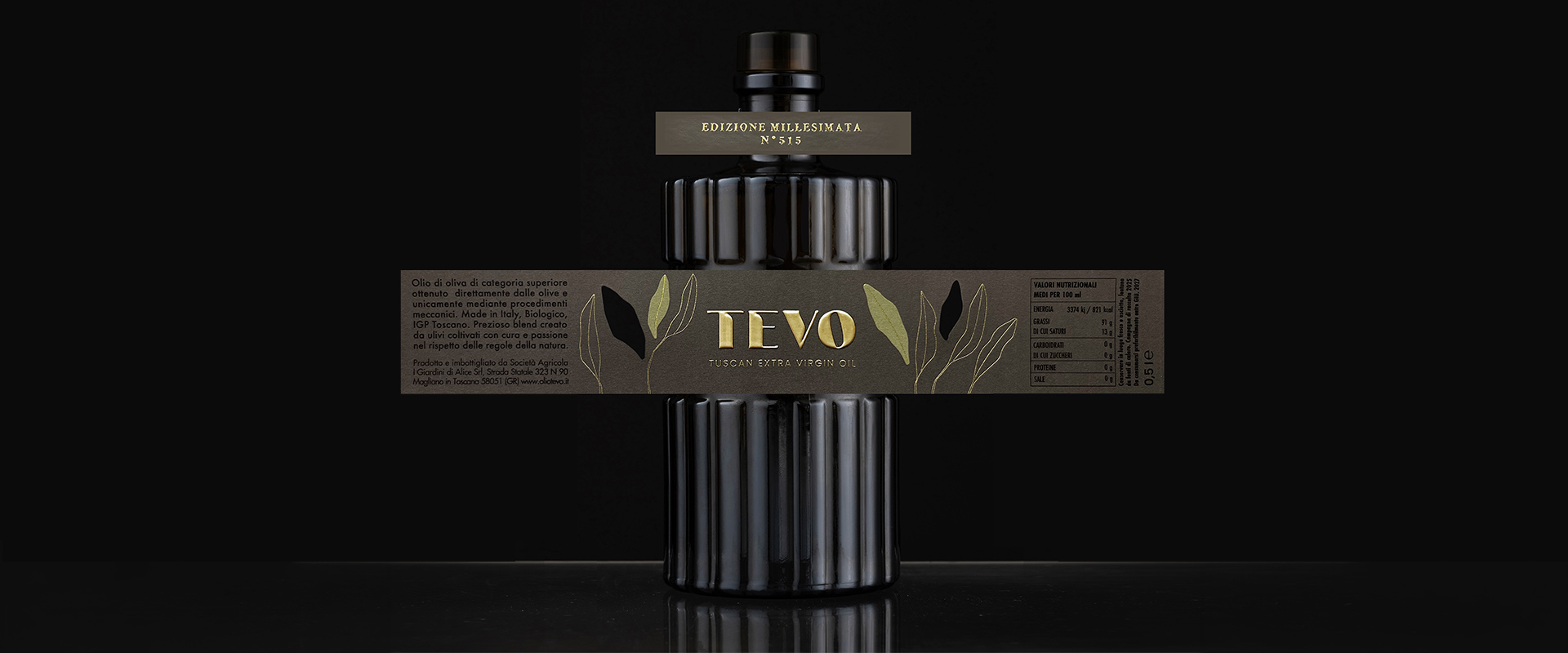
Tevo is a limited-edition extra virgin olive oil positioned within the super-premium segment. Each numbered bottle is the result of a fully controlled supply chain, rigorous selection and a clear vision: to transform what is already an Italian excellence, the production of extra virgin olive oil, into a refined tasting experience, a ritual to be savoured. When ATC was brought on board, the challenge was not simply to “dress” a high-end oil, but to build an identity system capable of making its positioning both visible and tangible.
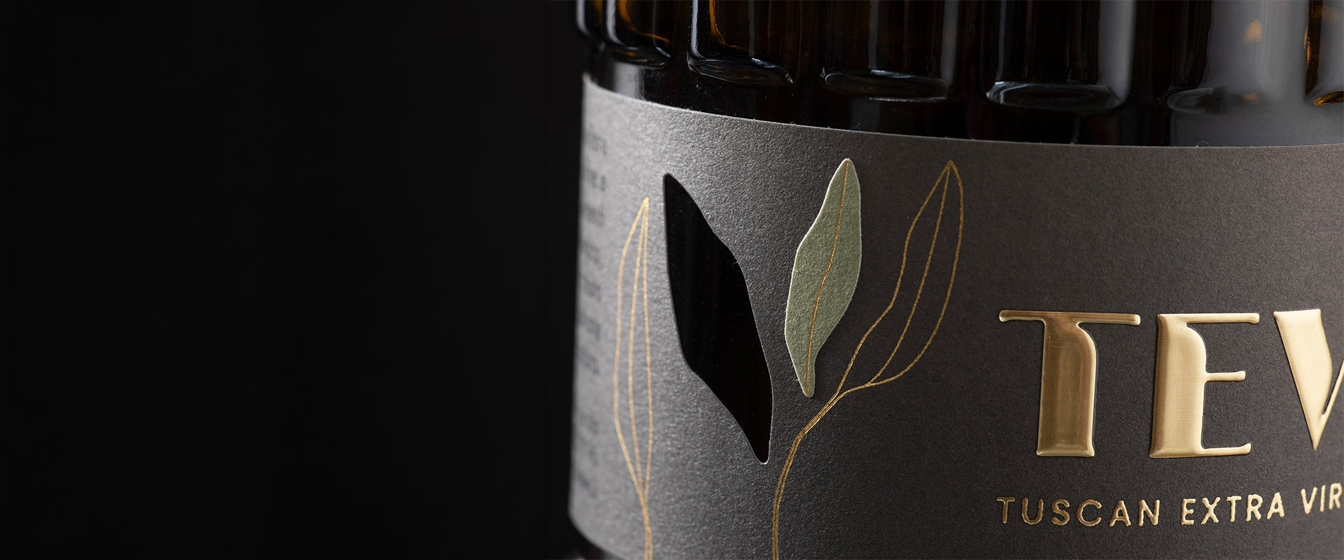
The mark was designed to convey authority, elegance and restraint, avoiding any decorative excess. The choice of hot foil stamping in gold transforms an aesthetic flourish into a precise signifier of enduring value. Gold also captures the light, immediately communicating the product’s precious nature. Prominent on the label, the logo is not only seen but felt beneath the fingertips, constructing Tevo’s identity across multiple sensory levels.
For the label, the agency worked with layering and materiality. The olive leaf, central to the concept, is enhanced with textured gold paste woven into the surface, a detail that interacts with the light and echoes the bottle’s super-premium content. A bespoke die-cut introduces an interplay between two overlapping paper stocks, deliberately revealing the glass beneath. The colour of the oil thus becomes an integral part of the graphic project: not something to conceal, but to enhance. The final effect is a label that expresses itself with elegance and a carefully calibrated balance between solids and voids.
The packaging project for Olio Tevo was honoured at the 30th edition of the Award, which acknowledged the strategic role of ackaging. A piece of work that demonstrated how design today is not only about aesthetics, but also a concrete tool for positioning.
As Mirco Onesti the agency’s Packaging Design Director, explains: “The projects that excite me most? Those where the client arrives with a clear vision and the desire to push further. New materials, unusual production techniques, details that are felt even before they are seen: this is the direction that transforms packaging into an experience.”
In the words of ATC’s General Manager, Donatello Occhibianco: “This recognition represents an important confirmation for us: packaging is not just an aesthetic element, but a strategic tool capable of conveying identity, values and vision. The Olio Tevo project shows how the synergy between different areas of expertise, combined with ongoing research into materials and perception, can generate distinctive experiences capable of creating tangible value for the brand. This is the direction in which we intend to continue innovating.”
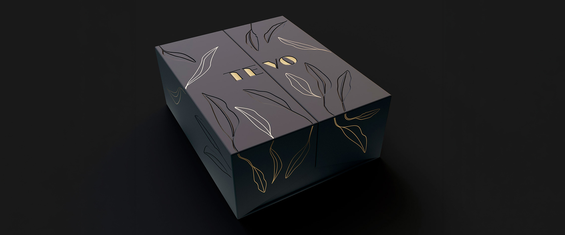
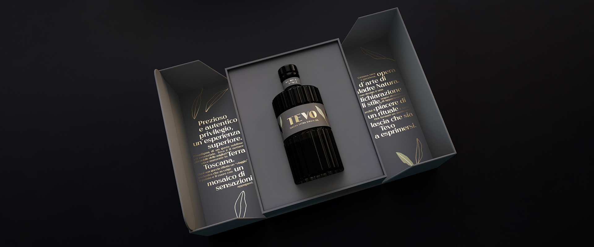
For a product of this calibre, the unboxing, too, had to become an experience. The result is a cuvette conceived as a casket, with mirrored double doors and a blind-embossed texture that adds a tactile dimension, recalling olive leaves. The opening is slow, almost theatrical, guiding the discovery of the bottle and inviting a moment of pause.
Inside, alongside the object of desire, a copy-driven narrative tells the story of the Tuscan land from which Tevo is born and of the ritual of tasting such a precious oil. The packaging, in turn, becomes an integral part of the storytelling, extending the product’s value.