The inclusive kitchen of TesoroBio®
A project that tells the story of innovation, quality and a new Food and drink.
- Brand identity
- Visual system
- Web site
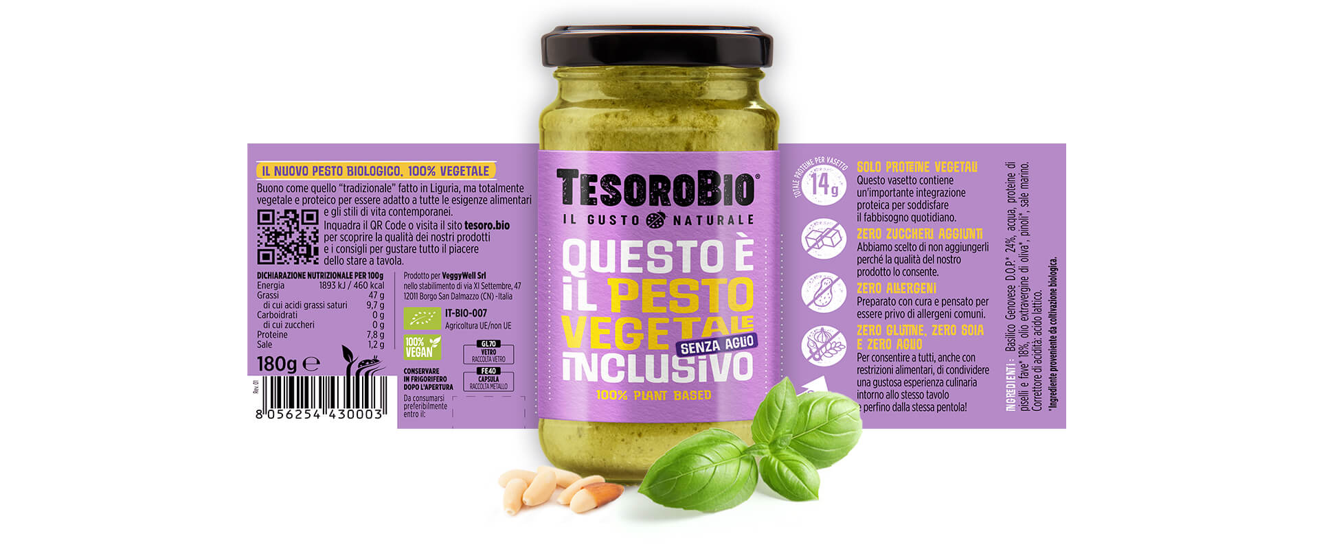
- Label

TesoroBio®, the brand dedicated to 100% plant-based, healthy and inclusive nutrition, chooses Reverse to launch its new brand identity. An image capable of telling clearly and consistently the brand’s values: transparency, simplicity and accessibility.
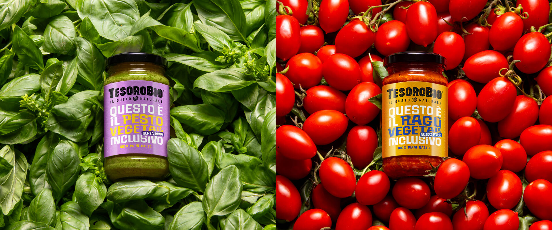
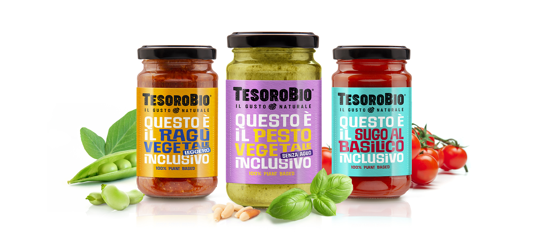
The objective was to build a visual language that could clearly tell the positioning centered on inclusiveness. Reverse has translated this vision into an essential, direct and clean design, where every element has been designed to communicate the quality and genuineness of the ingredients.
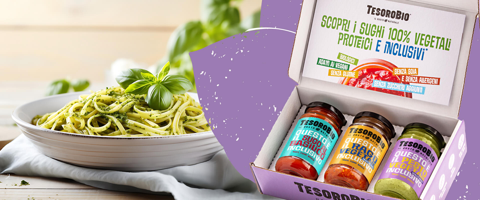
The packaging plays a key role: minimal but immediate, it is noticed on the shelf thanks to a recognizable visual system. The graphic simplicity is not only an aesthetic choice, but a way to reflect the selling proposition of TesoroBio®, that is the opportunity to offer foods suitable for all different nutritional needs, allergies and intolerances included.
To support the launch, TesoroBio® digital presence was also defined: an immersive site that tells about the products, the philosophy of the brand and its vision of healthy eating for everyone. The content layout is designed to highlight the core values of the brand, with a direct voice tone.
The result? A strong and contemporary brand identity in every touchpoint, able to position TesoroBio® as a new benchmark in the panorama of plant-based nutrition.

