Segafredo revolutionises the packaging of its blends for Ho.Re.Ca. with ATC - All Things Communicate
An ambitious relaunch for the historic Italian brand, presented worldwide with a video dedicated to coffee professionals.
- Packaging
- Video
- BTL toolkit
- Events & exhibition
- Ho.Re.Ca. packaging
- Trade video
- Folder & brochures
- Stand design
At the heart of this revolution is the complete redesign of the two product lines, Classici and Premium, in which the desire to create a strong internal consistency has been balanced by the equally important need to give each blend a specific, individual identity.
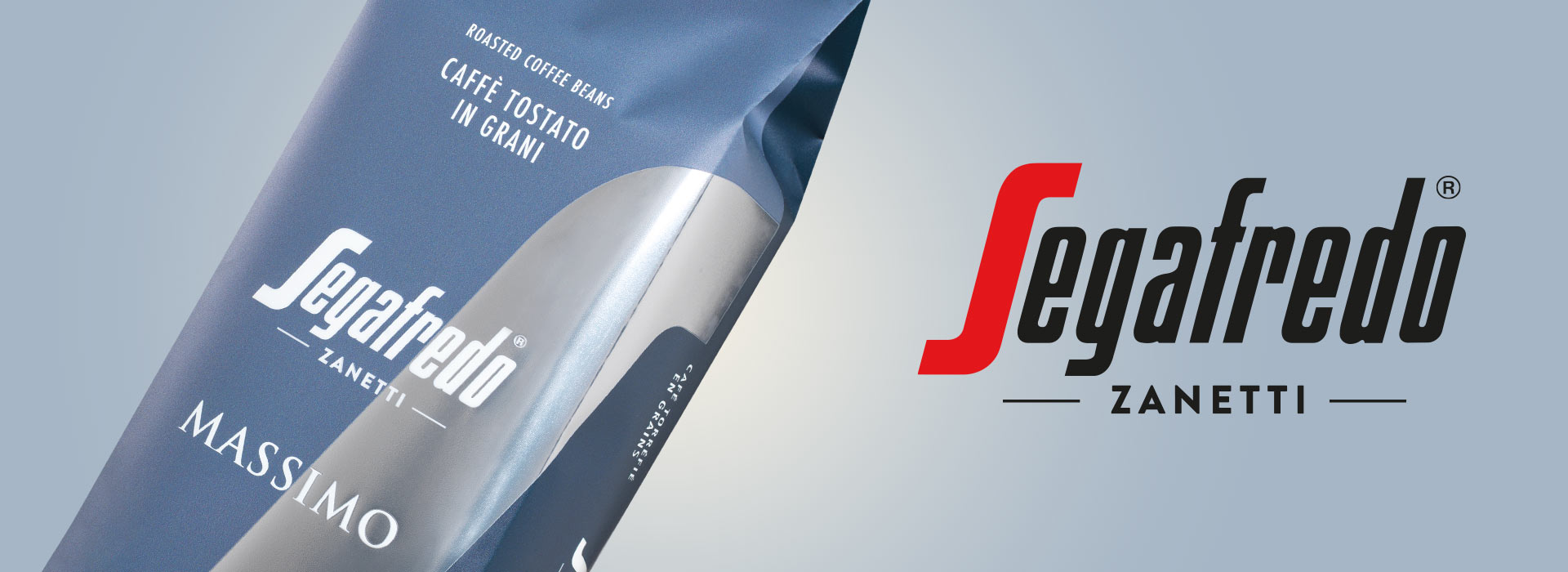
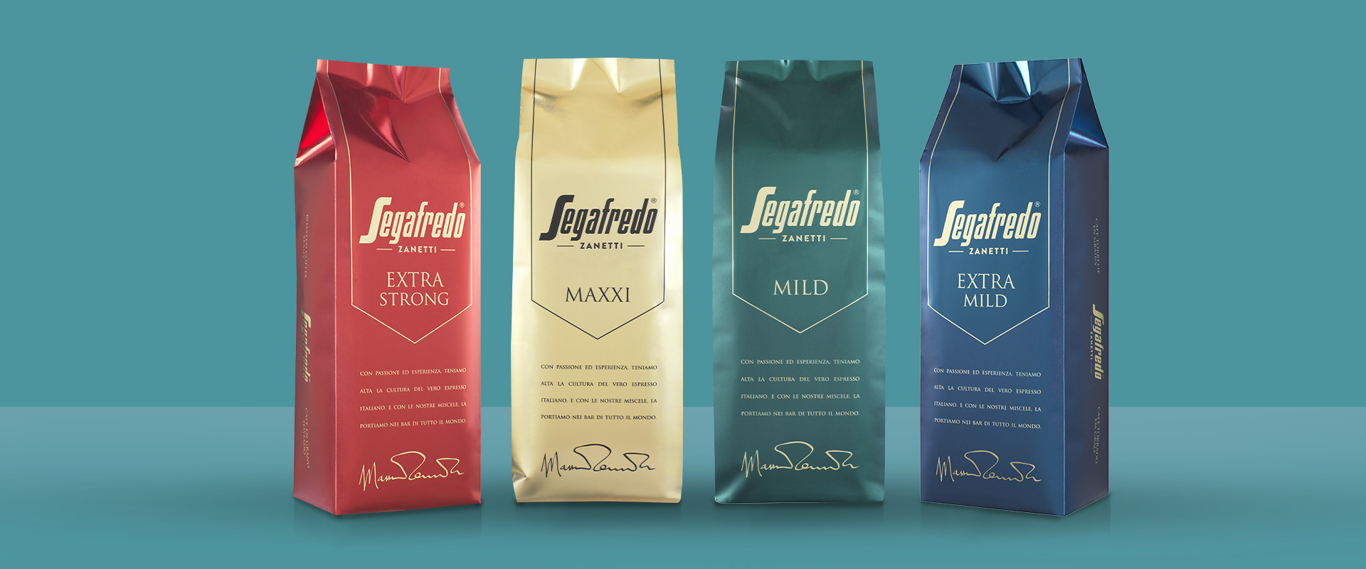
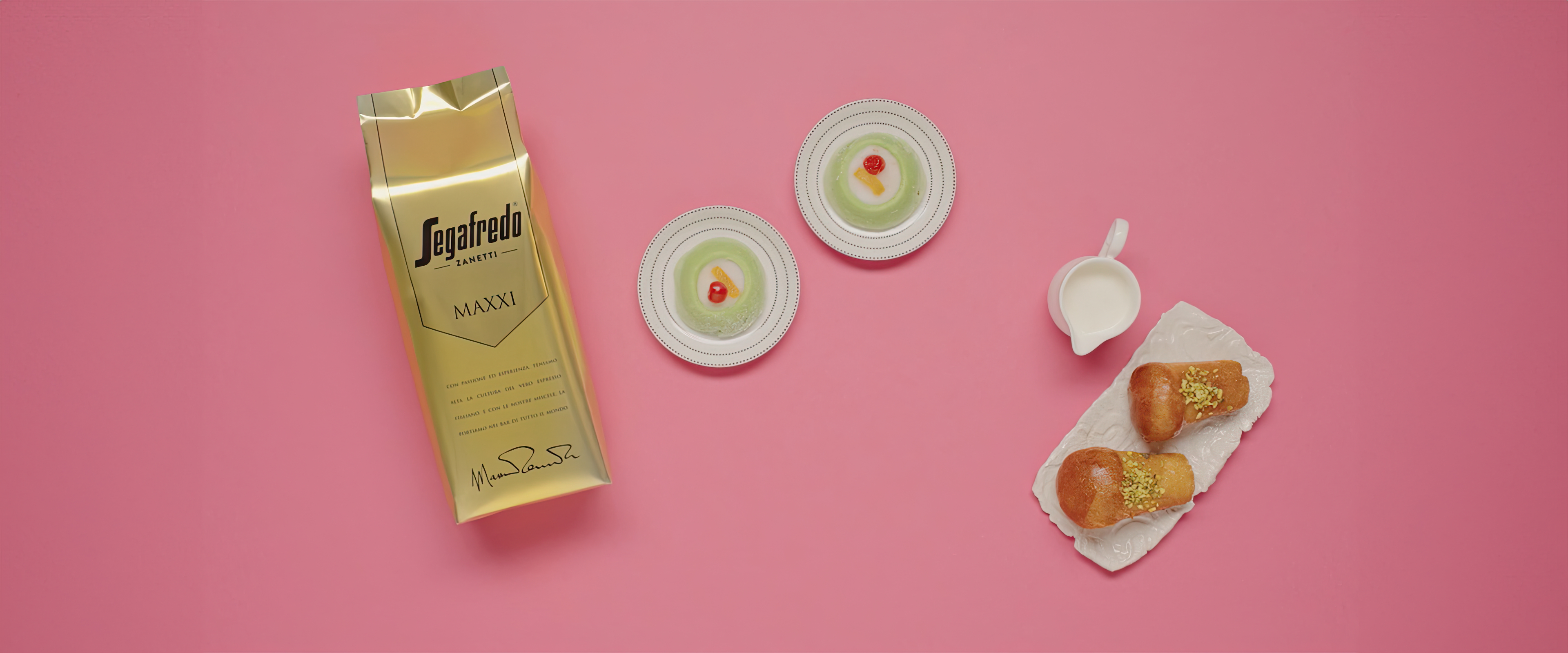
For the Premium line, the result is an architecture based on a seductive mix of precious finishes and rigorous graphics, a true "evening gown" that gives each reference a refined and unmistakable colour, finding in Massimo Zanetti's signature the "gesture" that seals the image of Segafredo's finest coffees.
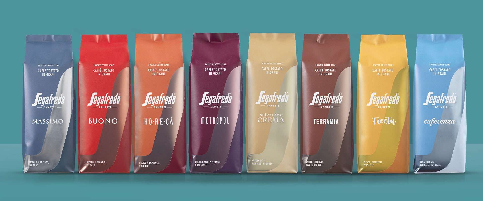
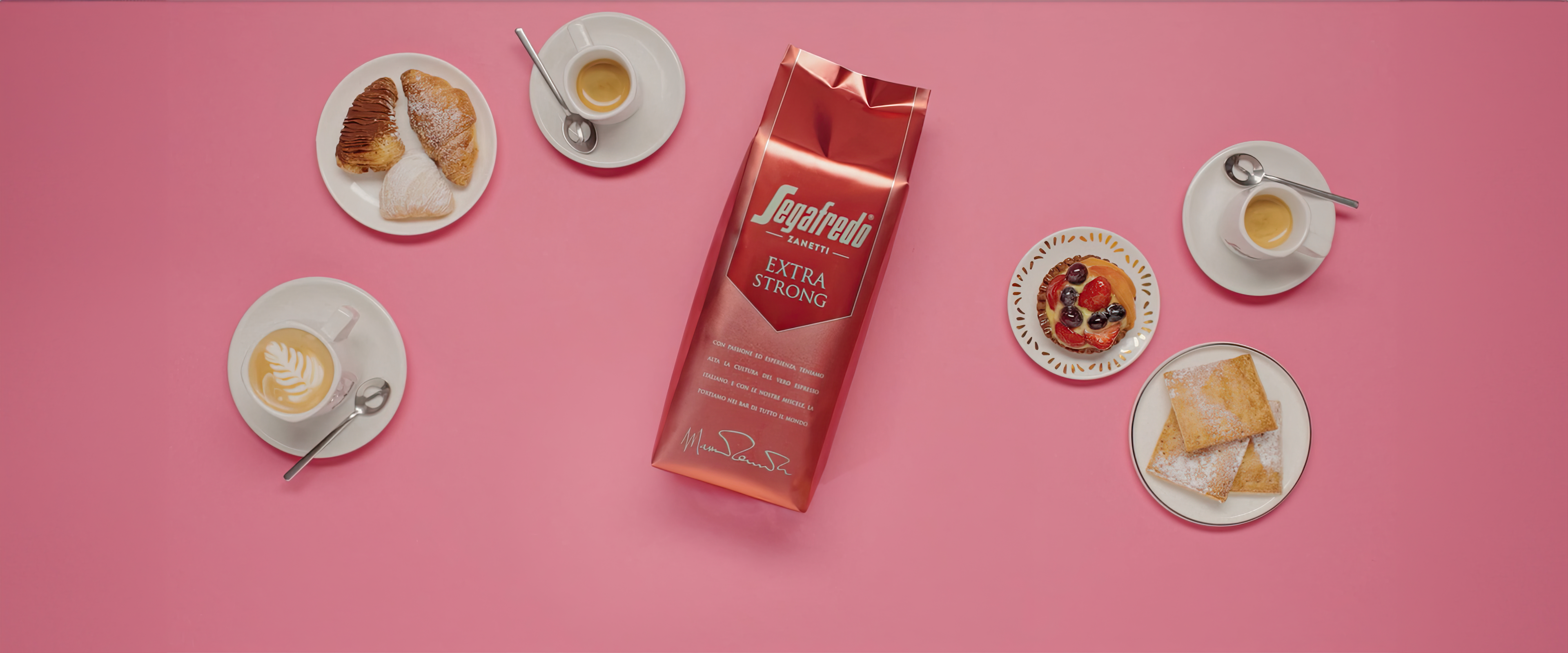
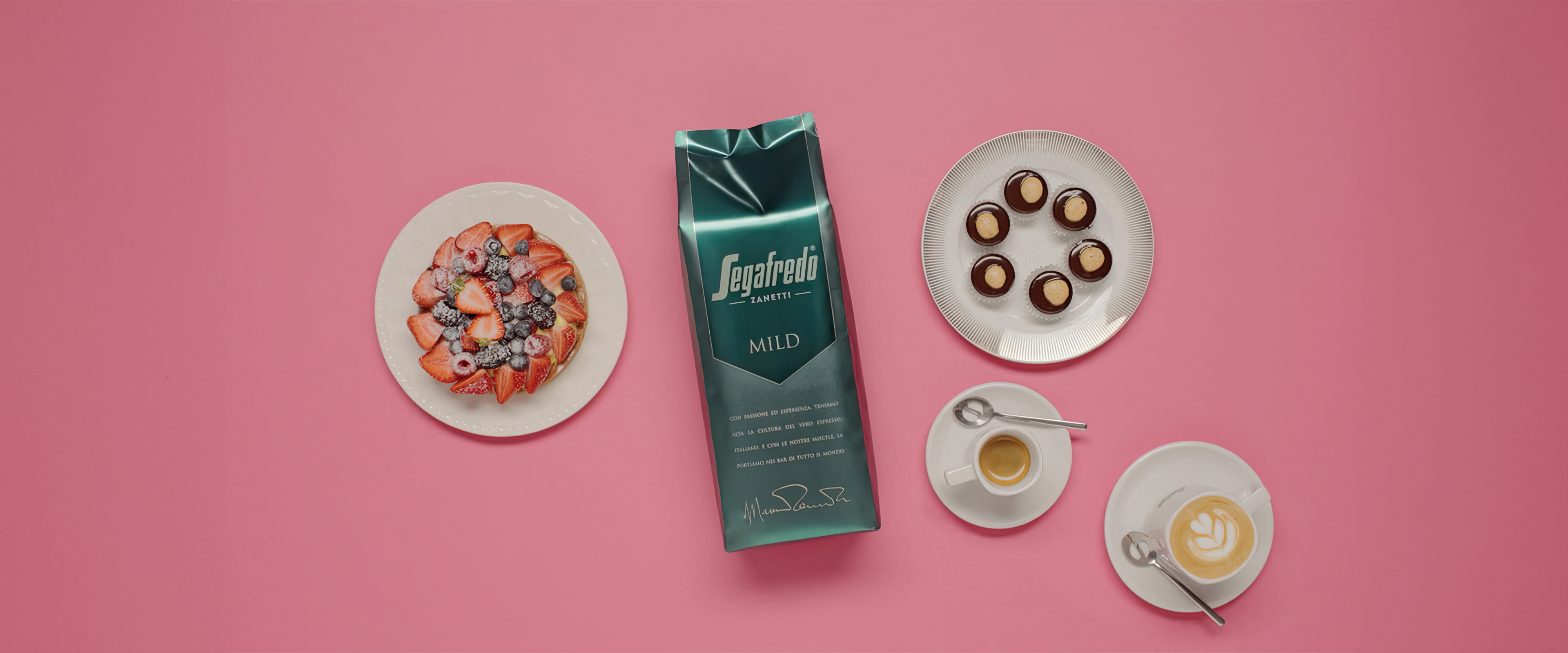
The design of the Classici line, on the other hand, is based on the central and distinctive role of the iconic letter S in the Segafredo logo: a graphic and communication choice that reflects the desire to enhance the brand's recognisability, history and prestige. In this case too, it is the colours that determine the identity of the various references within the range.
The decision to reward graphic continuity within the ranges reflects the determination to strongly position Segafredo as a brand capable of offering professionals in the Ho.Re.Ca channel a wide and differentiated portfolio of products, but always guaranteed by the history and competence of a historic brand in Italy. This approach, expressed through refined colours and finishes, also makes it possible to transform the Classici and Premium lines into real decorative elements to be displayed on the shelves of a bar or pastry shop, in a relationship of mutual reinforcement between Segafredo and its customers.
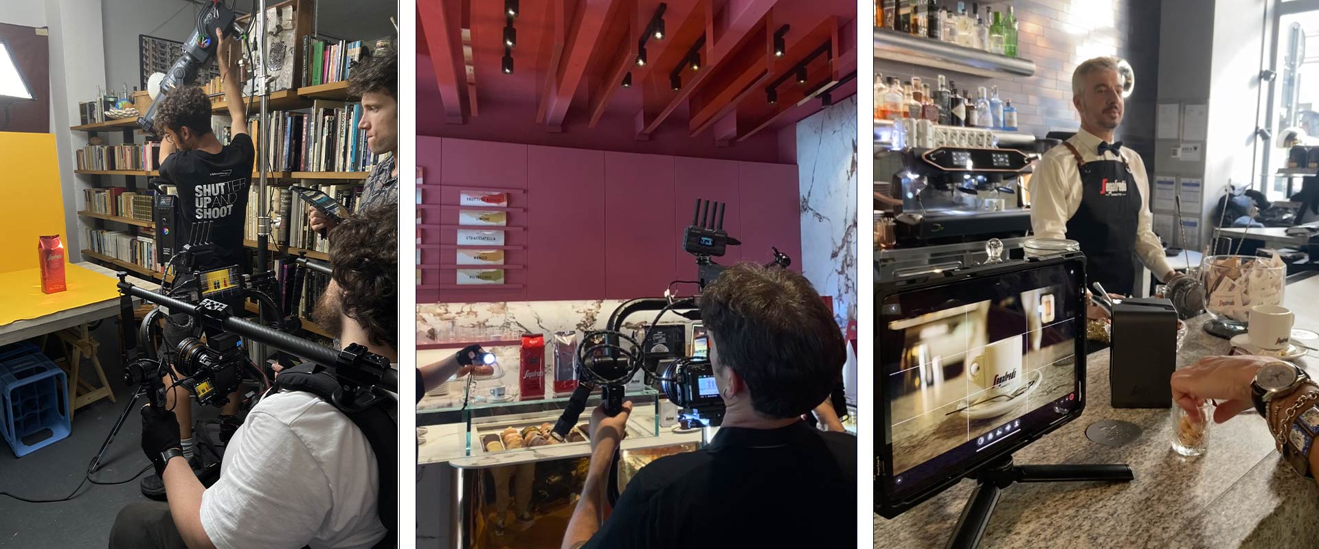
In the video conceived and realised by ATC for the Ho.Re.Ca. global scenario, the repackaging was placed in a wider context and experienced as an important new chapter in a great story: the story of Segafredo Zanetti.
The evolution of the brand is told through its values, iconic objects, key figures and distribution channels, where the Segafredo name has made a difference in the past and today, with a powerful storytelling supported by Francesca Moscheni’s dynamic direction combined with emotional supertitles and voice-over. A narrative crescendo that culminates in the spectacular presentation of the new packaging, which is truly "revolutionary" in terms of capitalising on the brand's recognition.
In the clip, shot in 3 different versions in Italian and English and mostly in historic Milanese locations, the lives of Segafredo's customers and professionals are intertwined in different contexts: from bars to restaurants, from patisseries to hotels. The choice and processing of the best coffee and Segafredo's ability to be the ideal partner for the trade in every situation are always strongly emphasised, as underlined by the final claim: "Always closer to you".
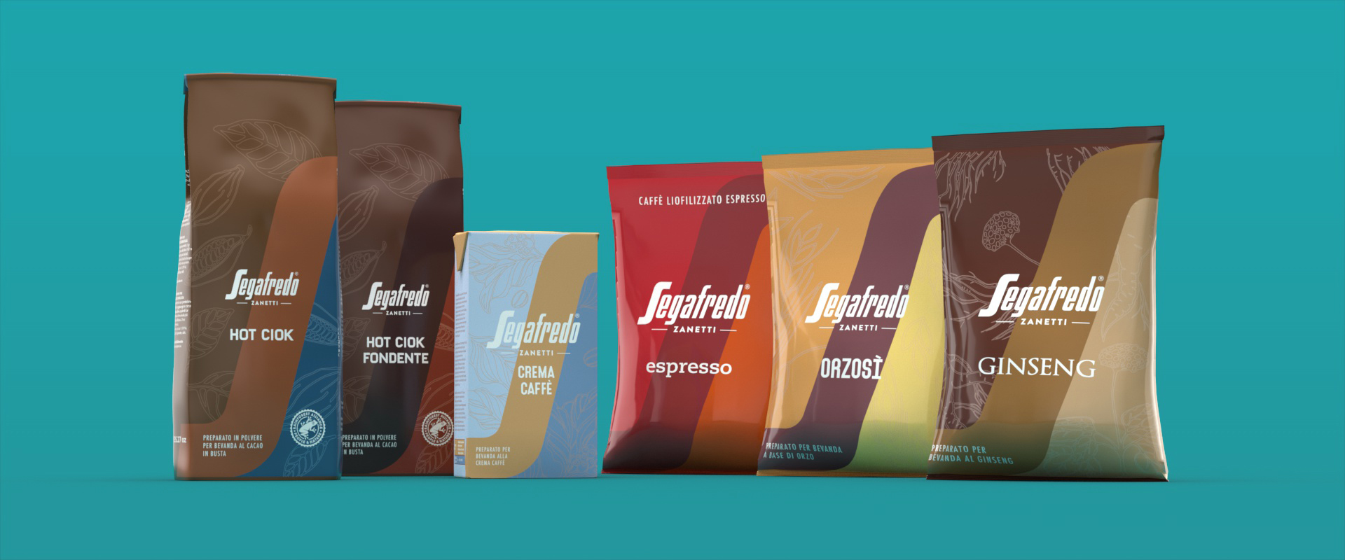
On the occasion of the updating of the reference park, ATC was asked to study the repackaging of the Segafredo Complementary lines, that is the products for an extended cafeteria offer.
An excellent example of design consistency: the packaging for teas, infusions and other beverages was graphically redesigned by ATC, fully respecting the logic of premiumness, history and distinctiveness
that inspired the entire 2023 relaunch. br>
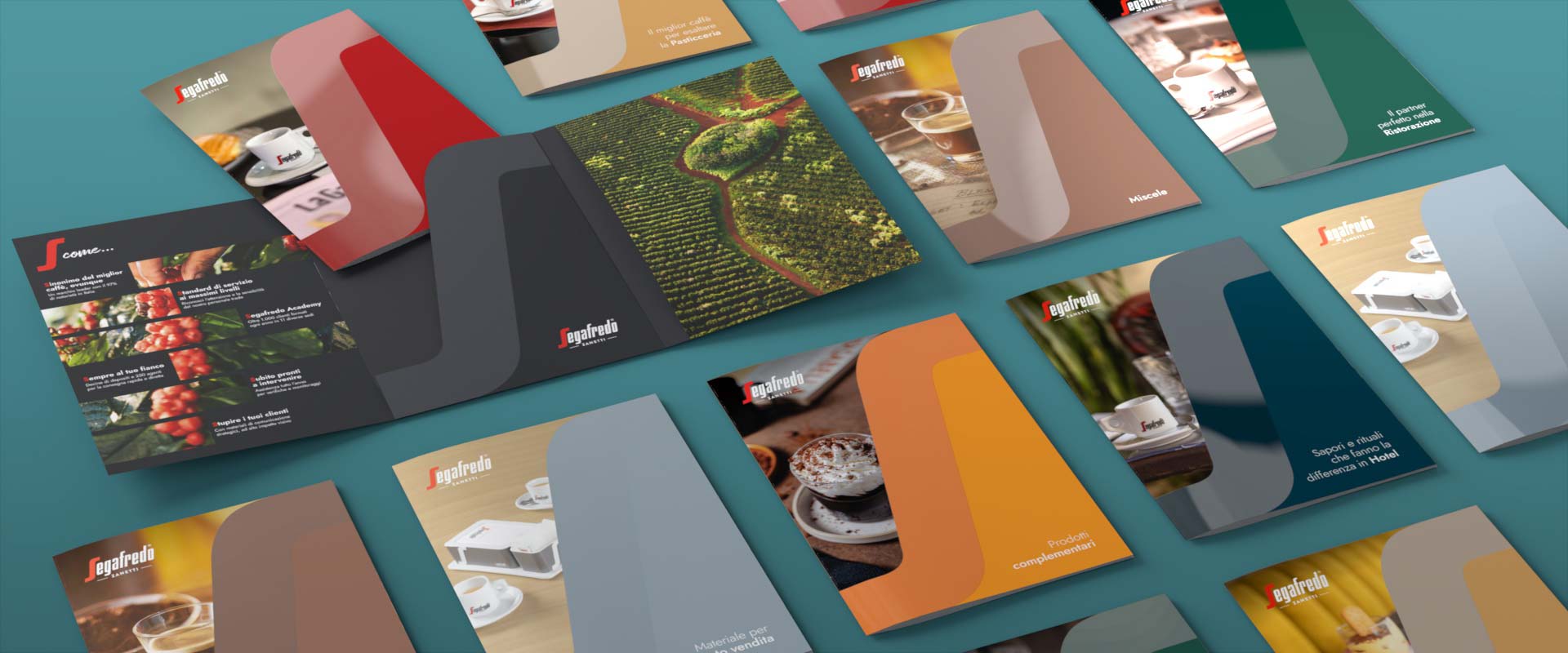
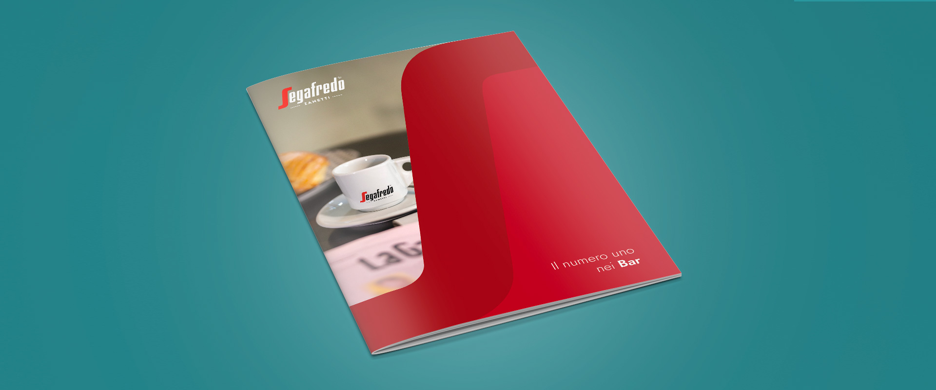
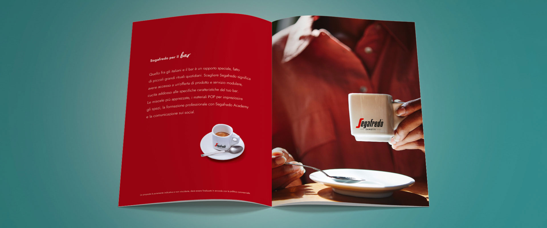
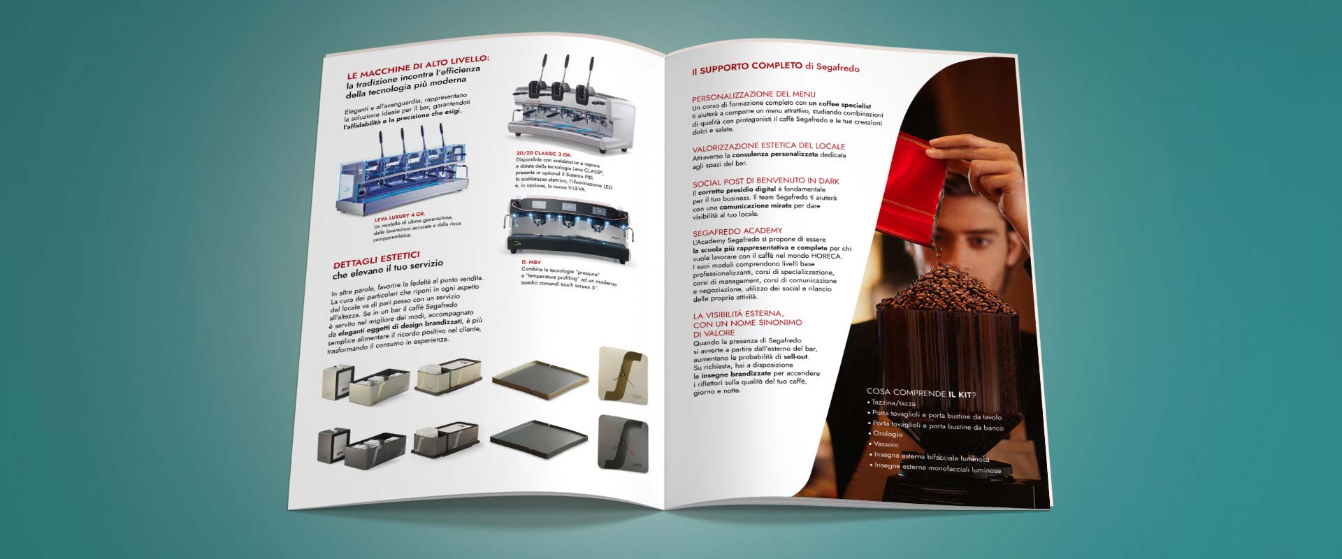
For the trade, the agency created a complete physical toolkit, the main part of which consists of Segafredo catalogues dedicated to the various distribution channels: bars, patisseries, restaurants and hotels,
accompanied by the Blends, Complementary and POP Materials catalogues, in order to provide Ho.Re.Ca. players with a complete overview of the historic brand's offer. The seven brochures were combined into one elegant booklet.
On the cover, ATC exploded the key B2B concept "Always closer to you"; inside, space was given to an impressive storytelling on the brand values, punctuated by the iconic S of Segafredo.
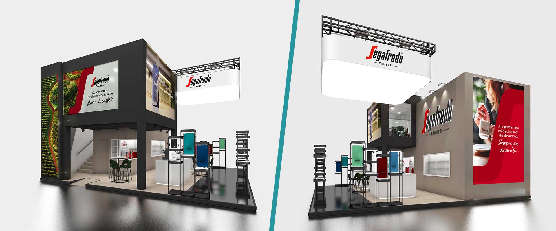
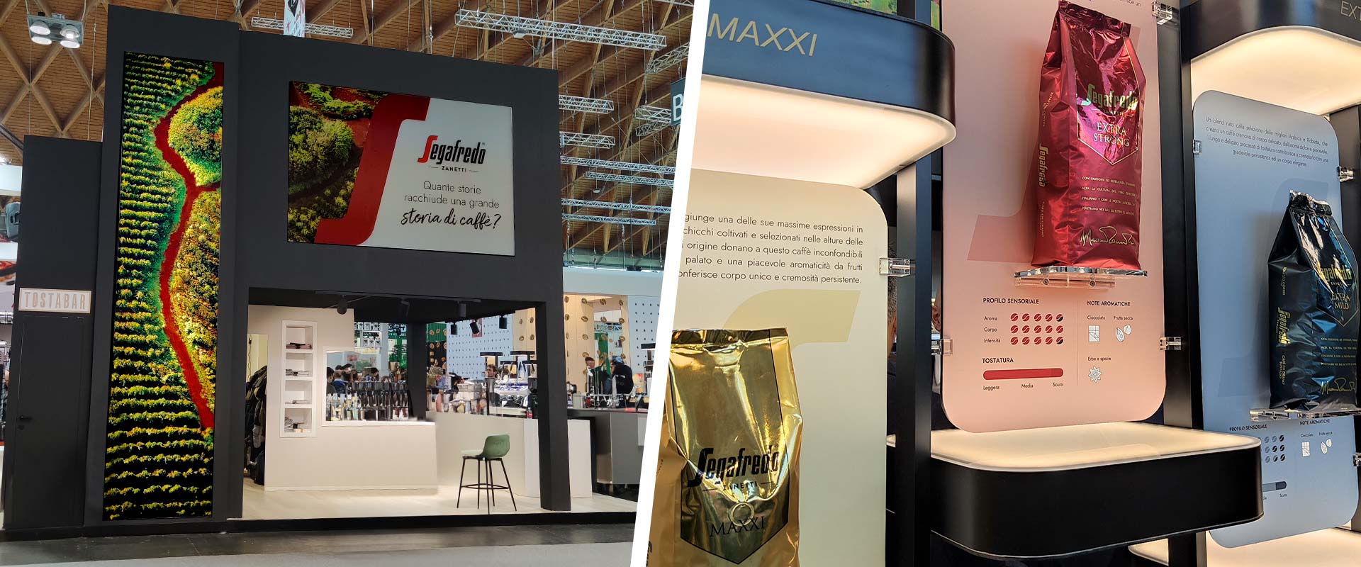
For Segafredo's participation in the prestigious Rimini trade showcase, ATC's expertise and creativity left their mark on two consecutive editions.
In 2023, contributing to the structural design of the booth and taking care of the aesthetic-conceptual development from the outside to the inside of the physical space. The challenge was to link the 'Always closer to you' concept to the central role of the baristas who choose the brand, made protagonists on an entire wall with real testimonials and ad hoc shots.
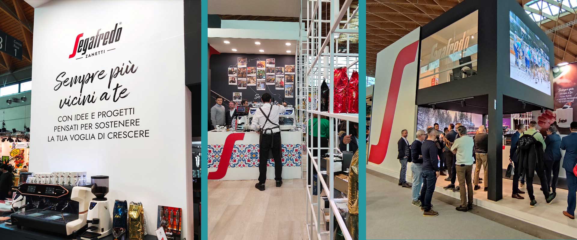
In 2024, by means of a booth dressing designed to enhance the global re-launch on air, inspired by Segafredo's historicity and expertise, but also by the brand's present and future commitment to quality and sustainability. A story distributed in a complementary way along the different exhibition fronts, the first experiential mile for the visitor, who among the attractive elements in the stand discovered the emotional video and the B2B toolkit in digital version created by ATC.
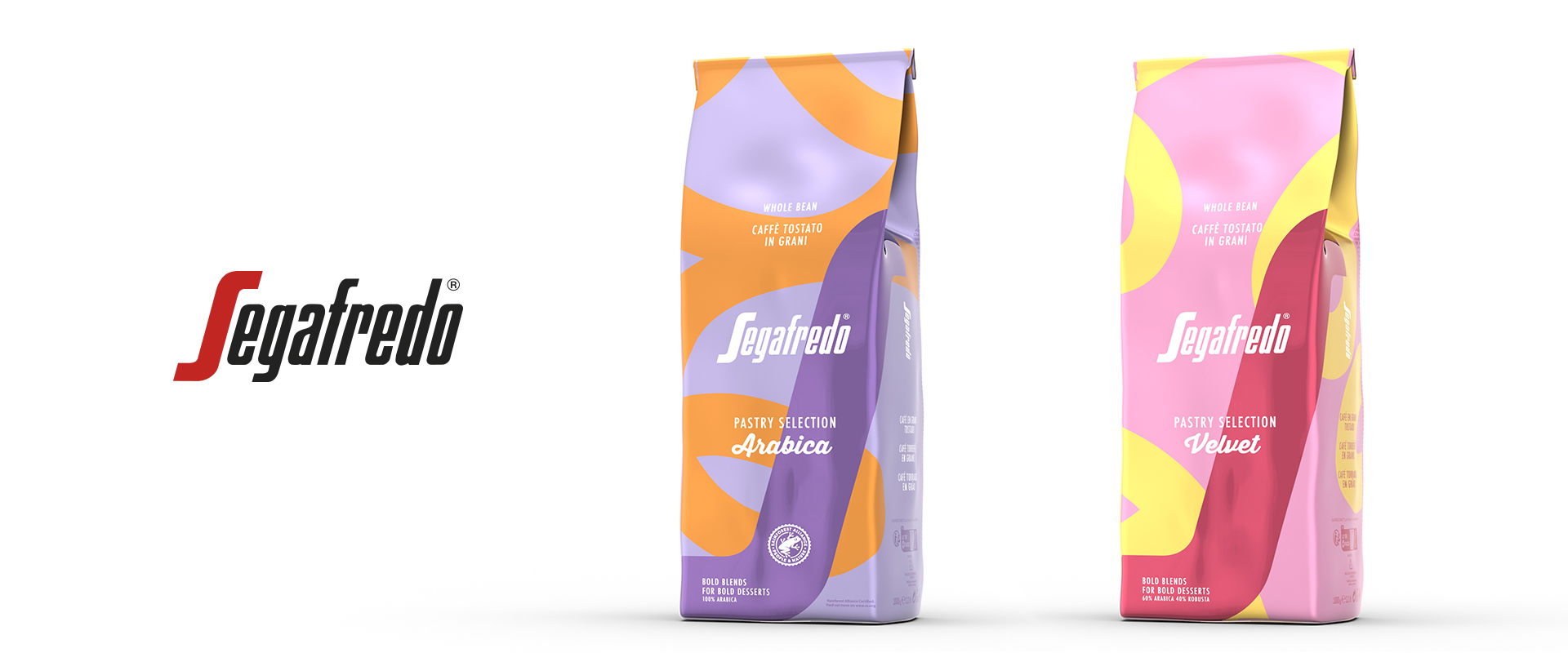
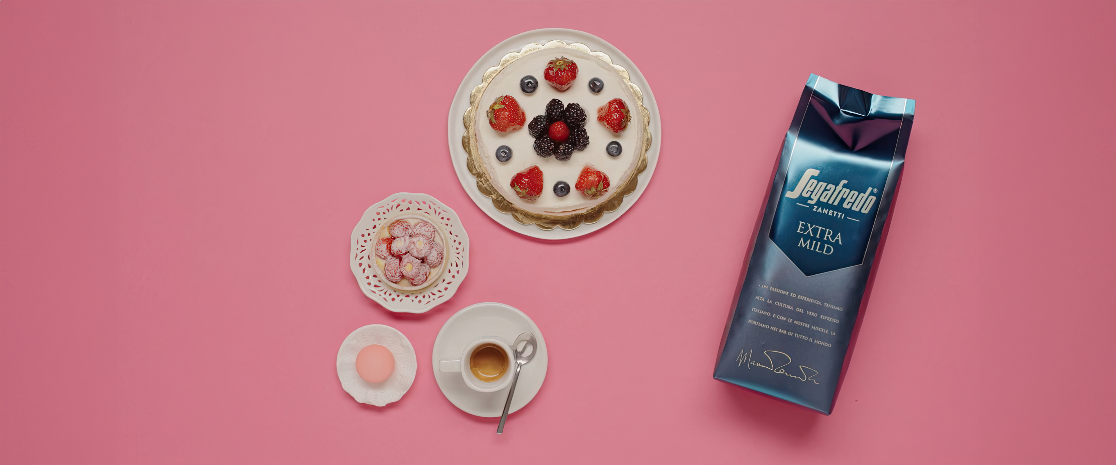
A niche segment with clearly defined codes and high expectations: with Pastry Selection, Segafredo introduces a B2B proposition designed
for Italy’s premium pastry shops. Two exclusive blends, a coordinated system of POP materials and a clear objective: bringing
the coffee experience into the world of fine pastry, enhancing its aesthetics, ritual and service.
For the official launch at Sigep 2026, the leading trade fair for the foodservice industry, ATC - All Things Communicate
supported the brand from the earliest stages, translating the strategic vision into a distinctive concept and a dedicated visual identity,
applied to the packaging of the two new blends and designed to extend seamlessly across every touchpoint of the experience.
The visual language developed for Pastry Selection combines vibrant tones, pop art references, and soft, flowing lines:
an immediate visual cue inspired by icing and piping-bag decorations. The result is a contemporary and recognisable system,
capable of standing out even in refined design-led environments while retaining a sense of elegance and attention to detail.
On-pack, the names Velvet and Arabica reflect both the sensory profiles of the two blends and the personality of the project,
further reinforced by the claim “Bold blends for bold desserts”.
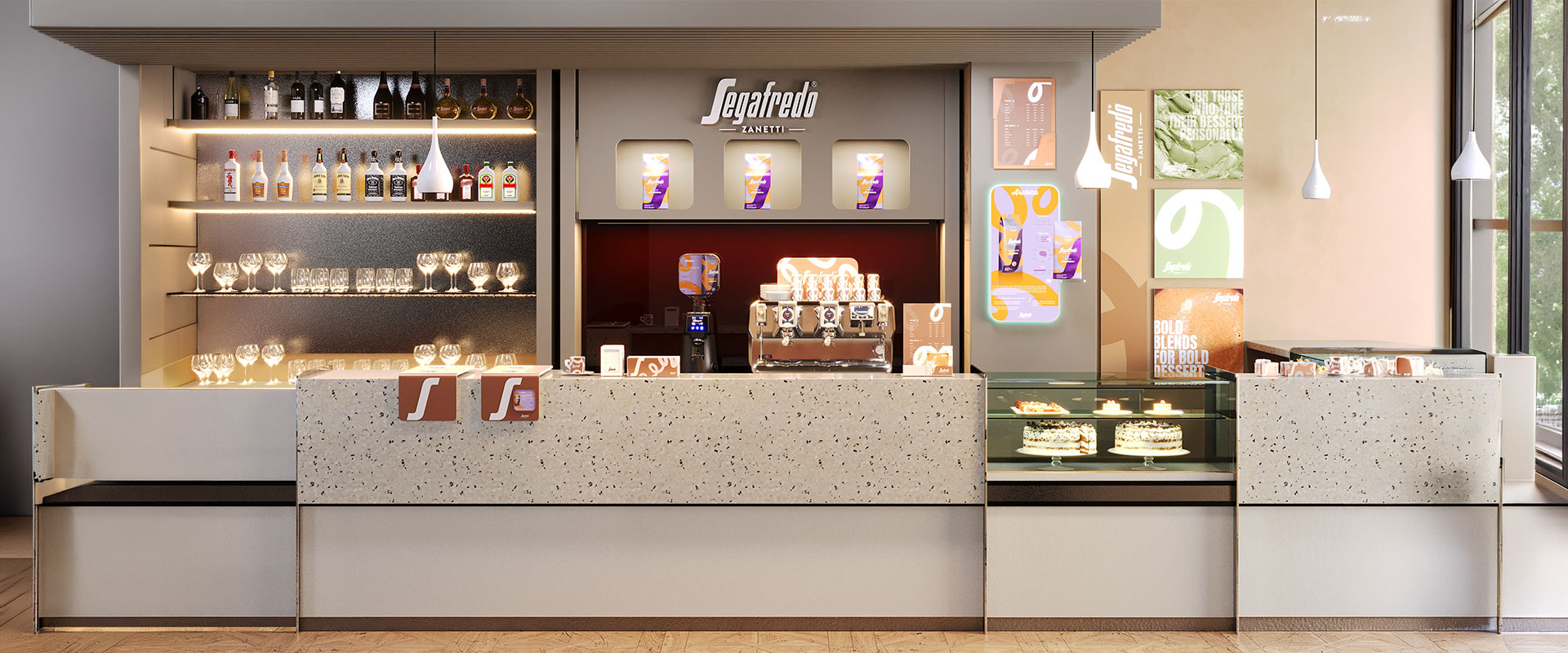
Once the range codes had been defined, the agency extended the graphic devices across a series of materials and accessories
designed to create a cohesive system accompanying the customer journey at multiple stages: from the bespoke Segafredo espresso
cup featuring Pastry Selection’s distinctive visual elements, to the presentation of the blends behind the counter and the table
materials, where the flowing lines of the packaging stand out against a satin-finish background, creating continuity between product, service and setting.
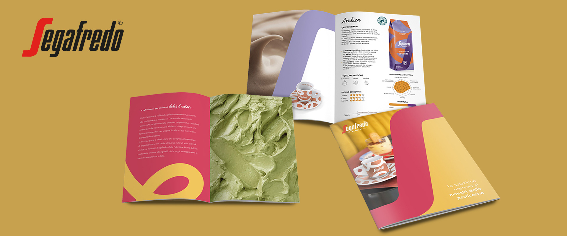
Completing the project is a trade catalogue developed in full continuity with the B2B catalogues already created for the brand’s
other distribution channels, ensuring consistency and strong range recognition. Evocative imagery and concise storytelling,
guided by the iconic letter S and the distinctive visual codes of Pastry Selection, transform the catalogue into a practical sales support tool,
designed to present the new launch to key figures in the world of fine pastry in a clear and authoritative way.