My Kai: branding design for sun protection that also defends the sea
Naming, packaging and identity, between marine symbols and transparency
- Brand Naming
- Brand Identity
- Packaging Design
- Naming
- Logo design
- Packaging
- Key Visuals

My Kai was created with a clear purpose: to offer effective sun protection without compromising the environment. In a world increasingly aware of the harm caused by microplastics, the brand is committed to promoting a message of
respect for nature, with products designed to protect not only the skin but also the sea and its ecosystems. For My Kai, we developed a brand identity fully aligned with the values of sustainability and protection the cornerstones of the project.
To achieve this, we built a comprehensive brand identity from the ground up from
naming to packaging and key visuals with the aim of forging a strong connection between the brand and its audience.
The name My Kai is inspired by the fusion of two Hawaiian words: Kai, meaning “sea,” and Makai, meaning “towards the ocean.”
The packaging was designed to reflect the brand’s commitment to naturalness and
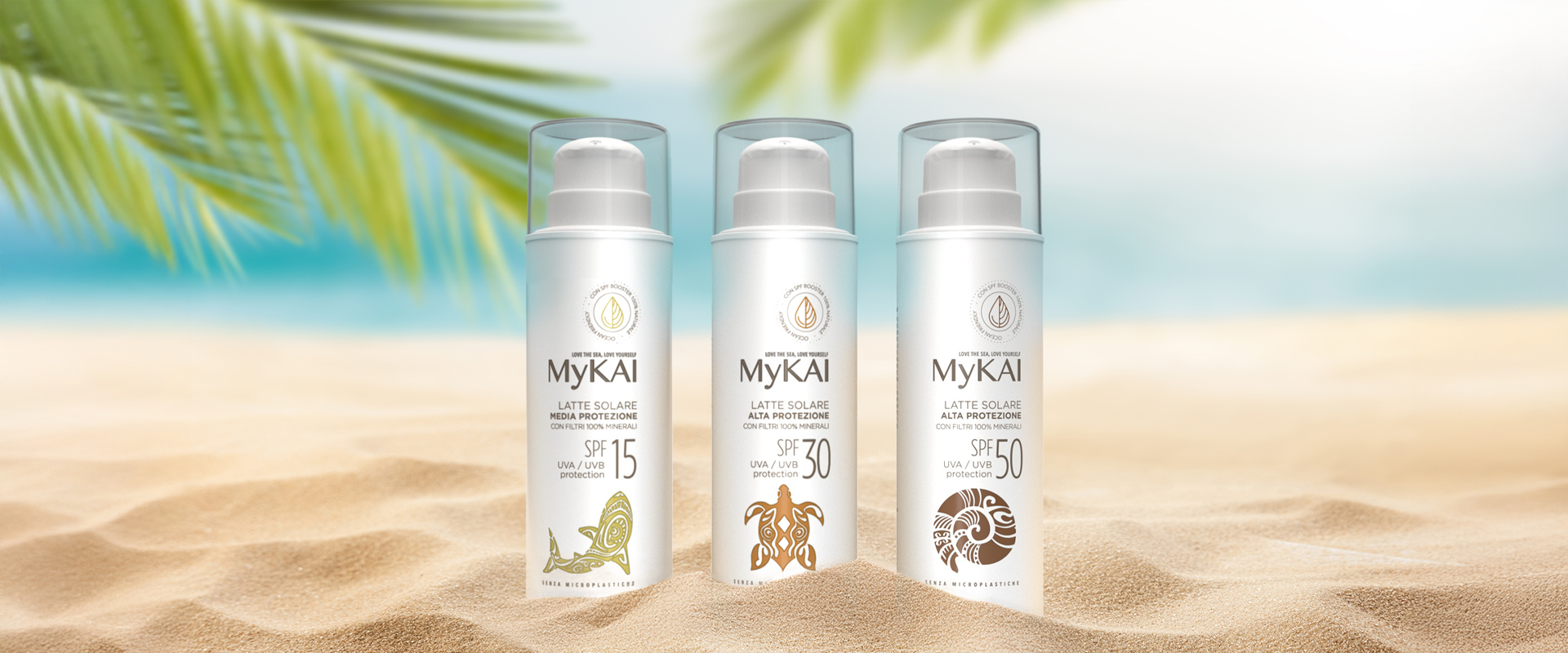
sustainability. The total white finish is elegant and contemporary, with a minimalist design enriched by illustrations of marine animals, reimagined in a style inspired by tropical tattoo culture. Each creature symbolises protection: the dolphin, turtle, and crab represent the three SPF levels (15, 30, 50), each with its own unique personality.
Another distinctive feature is the transparent cap, designed to accommodate a pump dispenser a practical choice that enhances usability, but also a symbolic one, evoking transparency and trust in the eyes of the consumer.
In this way, My Kai aims to build a direct connection with those who identify not only with the product itself, but also with the values it represents: the importance of a cleaner, safer world.


