Paglieri continues to write its history, with ATC - All Things Communicate
From cosmetics to laundry care, we tell you about the projects developed for the Alessandria-based brand.
- Packaging
- Naming
- New packaging
- Packaging restyling
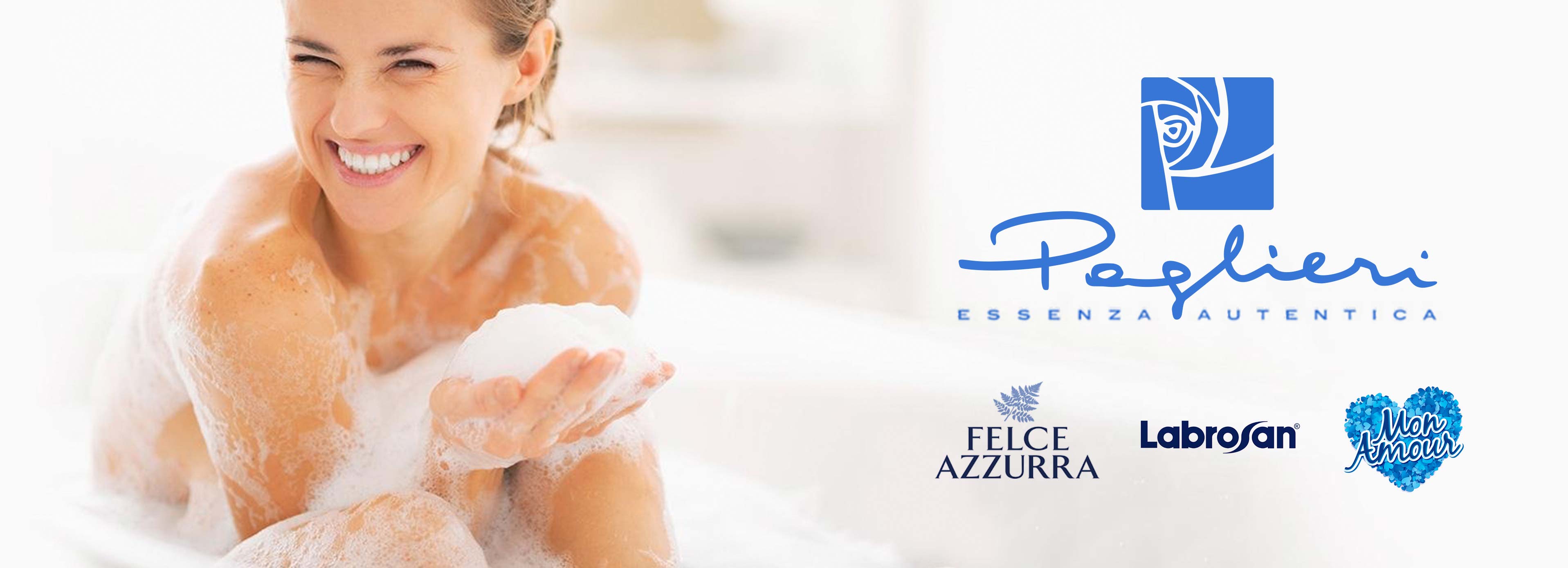
Paglieri was founded in the second half of the 19th century in Piedmont by a family of master perfumers. Over time, the company has become one of the great Italian brands and is now present in over 50 countries, maintaining its expertise in the olfactory world of fragrances. ATC - All Things Communicate joins the those who have followed the group's communications over the decades, with an assignment that touches on several areas.
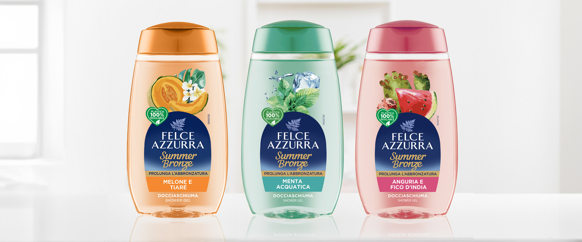
Within the Summer Bronze line of shower gels, ATC added soul and an aesthetic look to three "special" fragrance-references: Melon and Tiaré, Watermelon and Prickly Pear and Aquatic Mint. In developing a strategic packaging solution, with a separate format from the other Felce Azzurra shower gels, the agency interpreted the summer freshness of the products by focusing on the transparency of the design. On the label, where soft shapes and colours are based on a precise logic of correspondence, illustrations with a pictorial mood enhance the naturalness of the formulations.
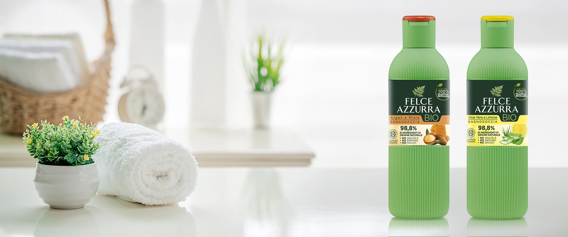
For the line of certified-organic bath and shower gel, the agency handled the packaging of the two items Aloe Vera and Lemon and Argan and Honey. On the labels, rationalist graphic divisions combined with a modern, green treatment give great prominence to the natural ingredients, which stand out against their respective backgrounds and colour codes with a 3D effect.
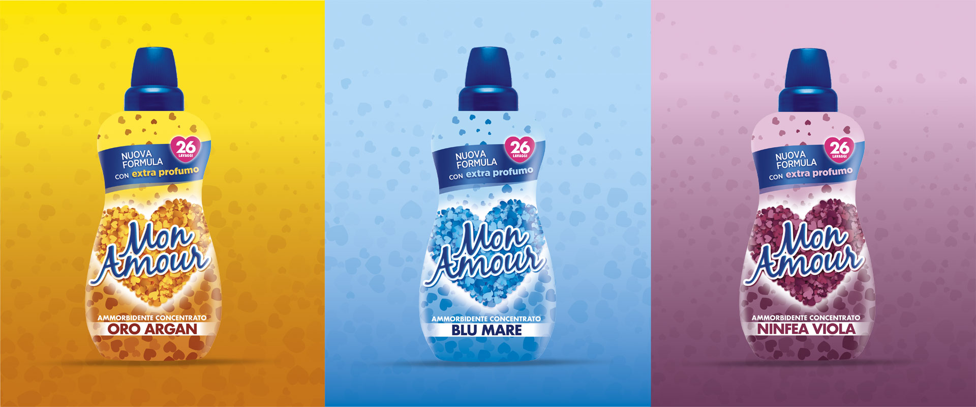
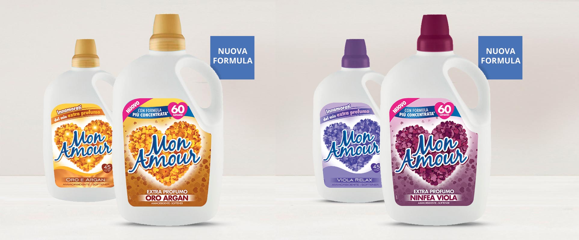
The name Mon Amour is primarily associated with a well-known line of Paglieri fabric softeners. ATC has overseen the complete restyling of the range, with a more concentrated formula, which has seen the introduction of a fourth fragrance-reference, Violet Water-lily. While maintaining clear elements of recognisability in the format, the agency rethought the graphics, giving a new impulse to the products' own fragrances. Thus, the "heart-multi-heart" of the Mon Amour logo has taken on a more lively and three-dimensional appearance, while the first and second level information has been dynamically reworked, with a particularly rational scanning of the messages; all while respecting the different colour codes, which have become more intense.
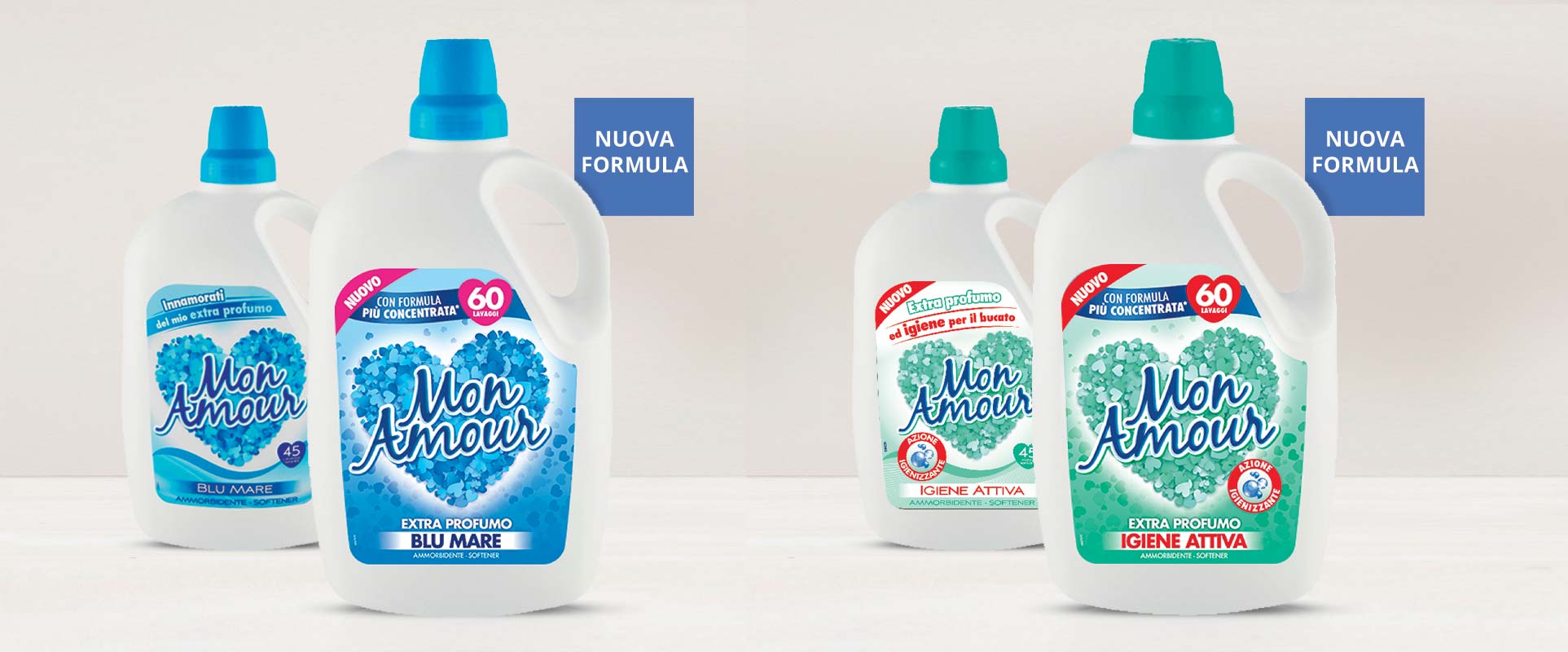
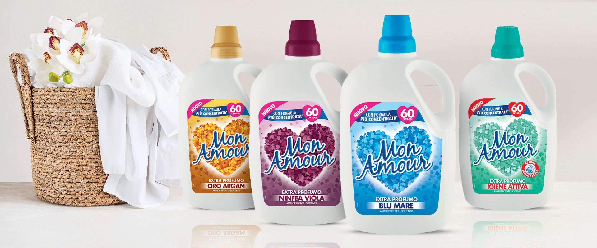
The same design logic was applied by ATC in developing the concentrated fabric softener range - available in the Blu Mare, Oro Argan and Ninfea Viola versions, in 650 and 1,350 ml bottles. Different bottle shape but same focus on enhancing the distinctive features of this graphic concept, with an update of the message on the front of pack. On the back, ATC has graphically reworked the table with the instructions, making it easier for the consumer to decode.
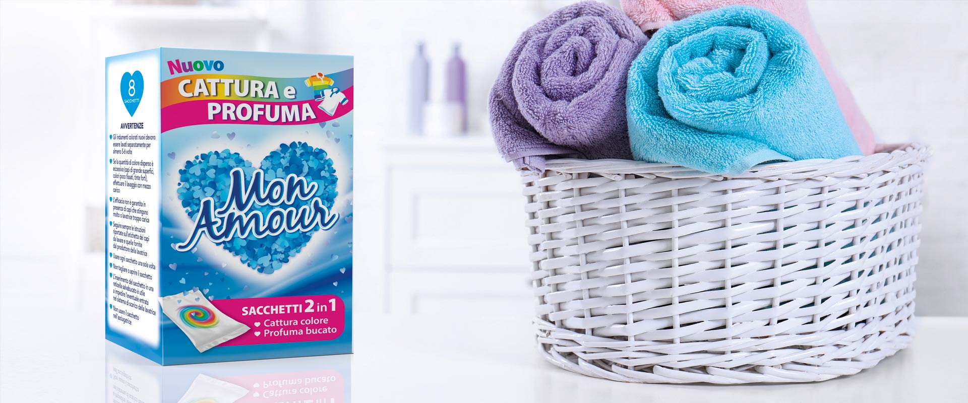
Again for Mon Amour, ATC developed the packaging for the new "Capture and Scent" category of products: bags for washing machines which, on the one hand, capture the colour that tends to disperse in the water and, on the other, release the scent to the laundry. The study, in this case, reflects both the intention to mark this dual utility for the consumer and an approach oriented towards brand consistency with respect to the fabric softener project.
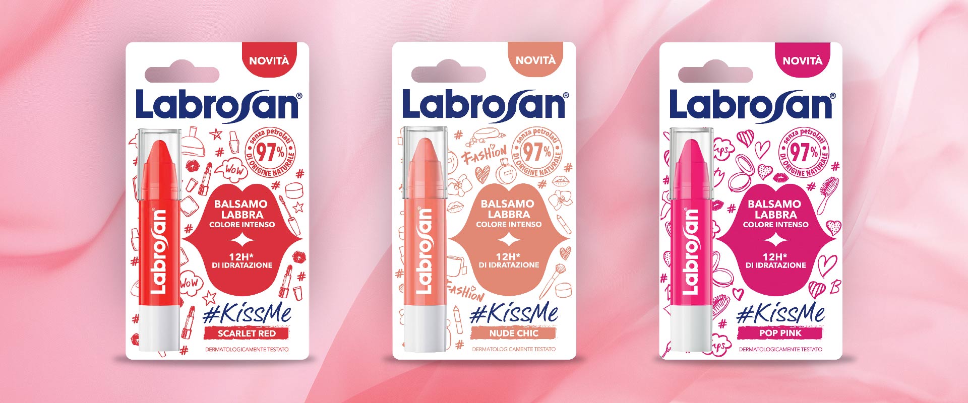
The challenge: to launch on the market a new line of lip balm for girls that stands out from the competition and the rest of the Labrosan range. ATC's first step was to come up with the #KissMe naming, inspired by social sharing and the main promise of the formulations: 12 hours of hydration. The packaging study focused on a texture composed of "beauty oriented" icons and symbols, varying according to the 3 references Nude Chic, Scarlet Red and Pop Pink. Also on the front of pack, to increase the distinctiveness of the range, the integration of a system-mouth presenting the main plus points.