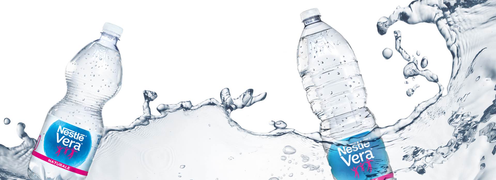
Nestlé Vera waters: a relaunch featuring correct hydration and child-proof packaging
From the standard range to special editions, extensive branding and packaging work for one of the bestselling waters
- Concept & content
- Below the line materials
- Re-packaging
- POS materials
- Promo communication
- On-pack storytelling
A global project for the Nestlé group: naming and logo with a specific and contemporary positioning. Nestlé Vera’s commitment to the value of water for Man and for the Earth is expressed in two ways: firstly, by promoting proper hydration within families and, secondly, limiting environmental impact by avoiding water waste. These factors that determined the objectives of the relaunch at the national level in Italy, informed a cross-range update for children undertaken with extra-special care.
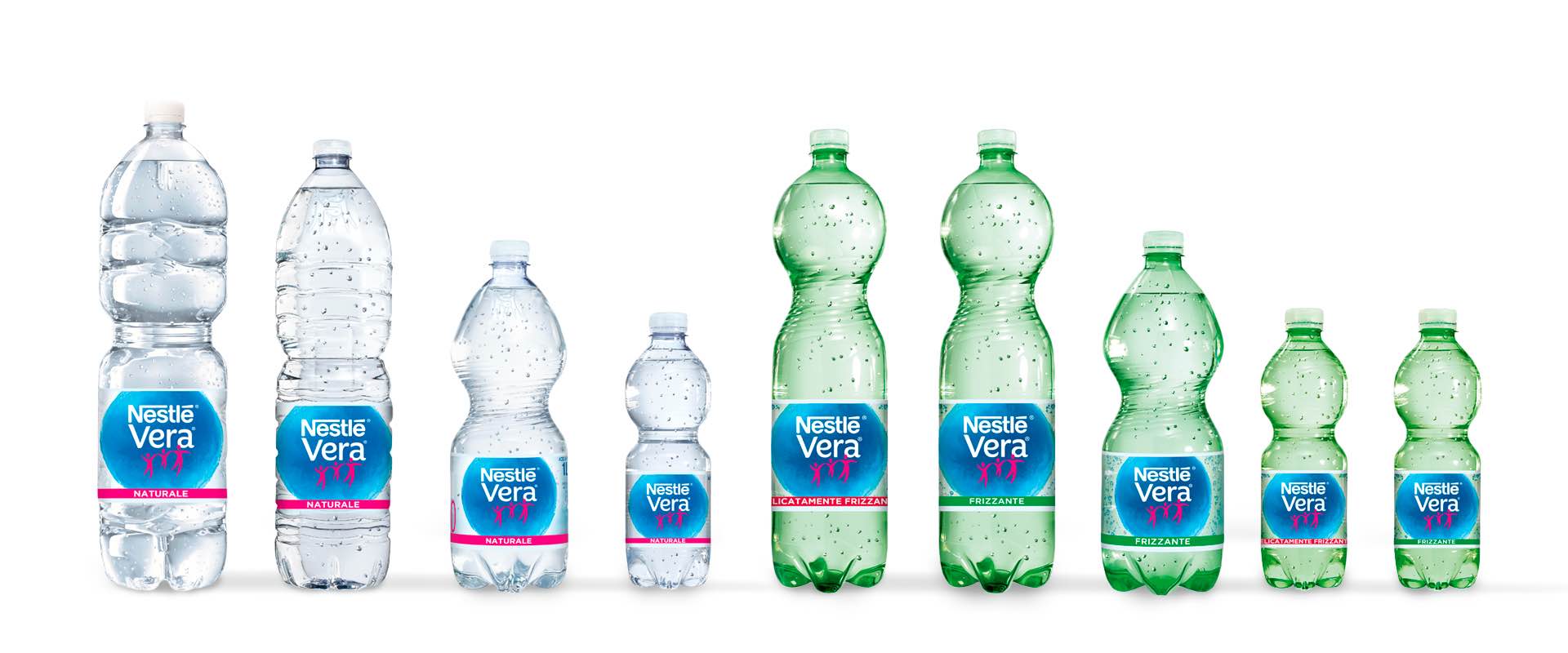
An intervention at the conceptual and design level: our agency worked on packaging and in-store communication materials, bringing the know-how gained over years of partnership with the brand. In the standard range, as regards the labels and multi-packs of Nestlé Vera natural, sparkling and slightly sparkling variants in the 2 L, 1.5 L, 1 L and 50 cl formats, the global concept has been interpreted with clean, minimal graphics, referencing the purity of the three springs where the water is sourced / obtained: in Bosco for the territory of Northern Italy, Naturae for the Centre and Santa Rosalia for the South. Great emphasis was also given to the strategic use of the brand's colour codes and to the centrality of the logo with the new name, Nestlé Vera: supporting a water that strongly declares its positioning while clearly belonging to the mother brand.
The know-how gained over years
of partnership
with the brand
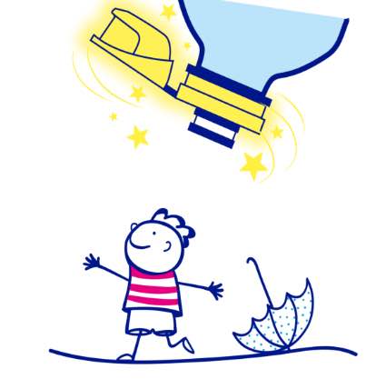
In addition to the standard range, ATC has followed the development of the various Kids lines with an educational & fun flavour, generally linked to collectability. Packaging and point-of-sale materials in which there is a strong call to hydration on-the-go in, and complete safety, thanks to a special drip-proof cap designed for children to get the hydration they need independently. The Nestlé Vera Kids range in the PJ Masks edition - released in the 25 cl format – celebrated, on the shelf, the heroes that children simply love. For this edition, the agency devised educational storytelling linked to the cap technology, printed on labels and bundles / multi-packs: the protagonist is a child-character, specially designed for the occasion, who illustrates step-by-step the benefits of the anti-suffocation closure to both mothers and children.
The Nestlé Vera Kids line associated with the successful cartoon series Hotel Transylvania, used the same communication tools to emphasise the novelty of a photochromatic cap, which lights up in the dark. The "Wild About Water" project, in partnership with National Geographic, included useful information on the hydration of endangered species using photochromic technology for the first time, which reveals additional elements on the label in sunlight. Despite the variety of the special editions, ATC has managed to preserve a cross-range consistency among the projects, immediately making Nestlé Vera stand out on the shelf.