

Cornetto Summer Emotions. A project that innovates the language of on-pack communication in the ice-cream segment.
Reverse Innovation and Cornetto have a long history of collaboration. Deploying strategy, creativity and passion at all times, we developed the “chef limited edition” project of Cornetto, one of the most famous and best-loved ice-creams in Italy and around the world.3
- Branding
- Packaging design
- Packaging design

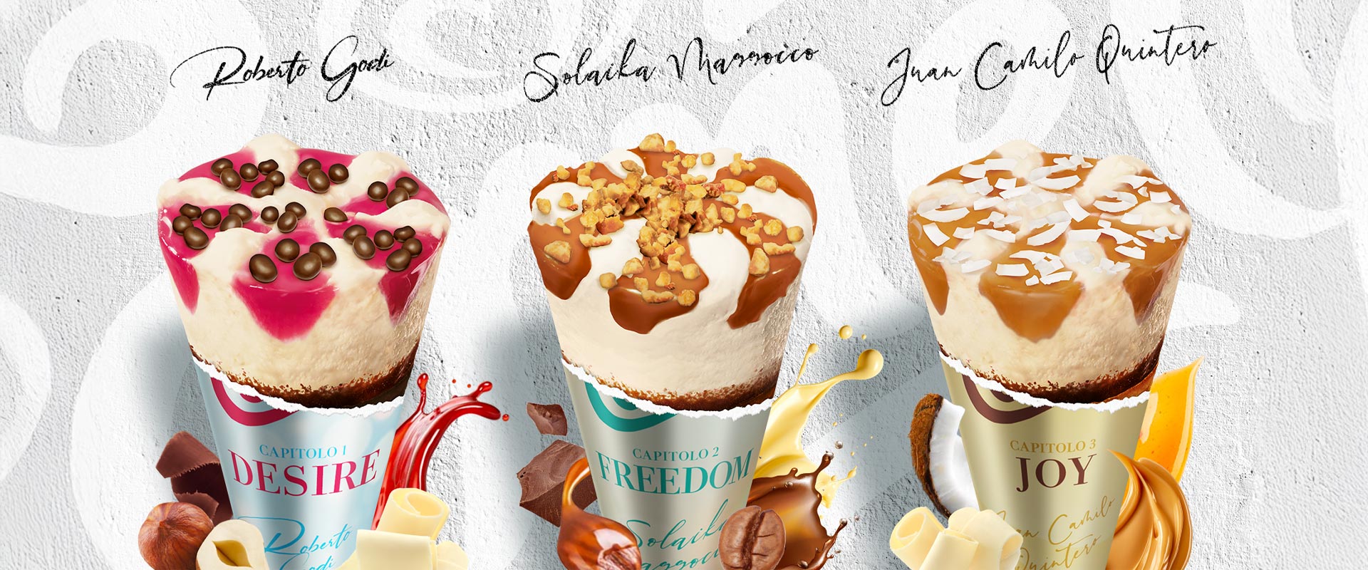
Three words to represent the emotions related to summer. Three new taste experiences designed by a trio of young, award-winning chefs that Cornetto, the historic and iconic Algida ice-cream brand of the Unilever Group, has served up for the 2023 summer season.
Cornetto Summer Emotions is the name of this new trilogy of very special and tasty limited editions.
The graphic design borrows the “language” of the fashion world to convey an iconic and premium image. The brand marks are minimal and clean and the Cornetto brand itself is scaled down, helping to achieve a perfect balance. On the border of the packaging, a frame sets the product apart to create stand-out on the shelf.
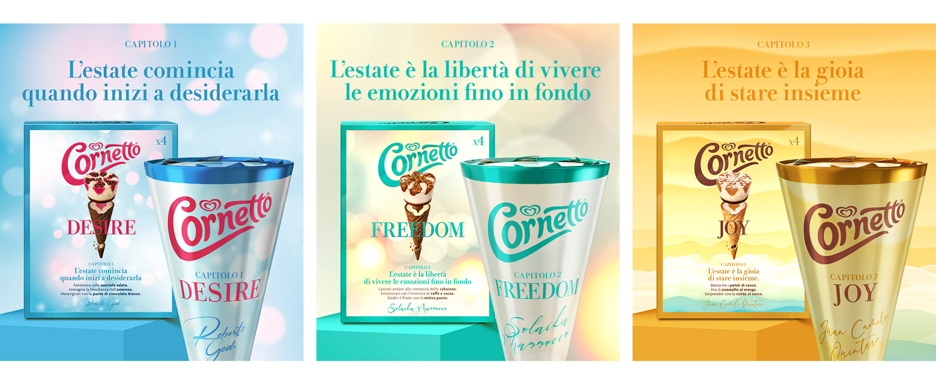
Roberto Godi, chef at Milan’s Desco restaurant, puts his name to Cornetto Desire, a proposal that combines salted hazelnut ice-cream, black cherry sauce, chocolate cookies, cocoa wafer and a surprising white chocolate tip. The packaging of “Chapter 1” of the delicious trilogy reflects the beginning of the season: a clear, bright, dreamy background expressing the longing for summer, typical associations of the period chosen for the launch. The textual details are in an inviting cherry red. Because, as the claim on the pack says,“summer begins when you start longing for it!”
Conceived by Solaika Marrocco, chef at Primo Restaurant in Lecce, Italy, Cornetto Freedom is “Chapter 2” and evokes “the freedom to live emotions to the fullest.” The recipe was created in this spirit, combining zabaglione ice-cream with coffee and cocoa sauce, caramelized hazelnuts, coffee wafer and the legendary chocolate tip. The pack depicts the brightness of midsummer, with a warm and enveloping pearl tone. Elegant Persian green is the color used for the most important details: from the logo to the frame and the variant name.
With the arrival of the season’s highlight, we move from the warmer holiday time of summer to a concluding moment when emotions and experiences are still alive in our thoughts, since “summer is the joy of being together.” Thus Juan Camilo Quintero, chef at Hotel Borgo San Felice, in the province of Siena, uses his imagination to create Cornetto Joy, “Chapter 3.” Lying on top of the ice-cream with “dulce de leche” and spiced white chocolate there are coconut petals accompanied by a caramel and mango sauce; the wafer is coconut and the traditional chocolate tip has not been forgotten either. The packaging design, featuring a dominant ochre hue, stands out against a background that enhances a scale of colours: from light brown, through creamy tones, finally ending with green. All in all, it forms a symbolic representation of the evolution of the days at the end of summer, to be lived with pleasure right up to the last minute of the season.