
Carte d'Or: the iconic Classics renew the pack.
New look, same love for taste.
- Visual system
- Packaging design
- Shooting
- Packaging design

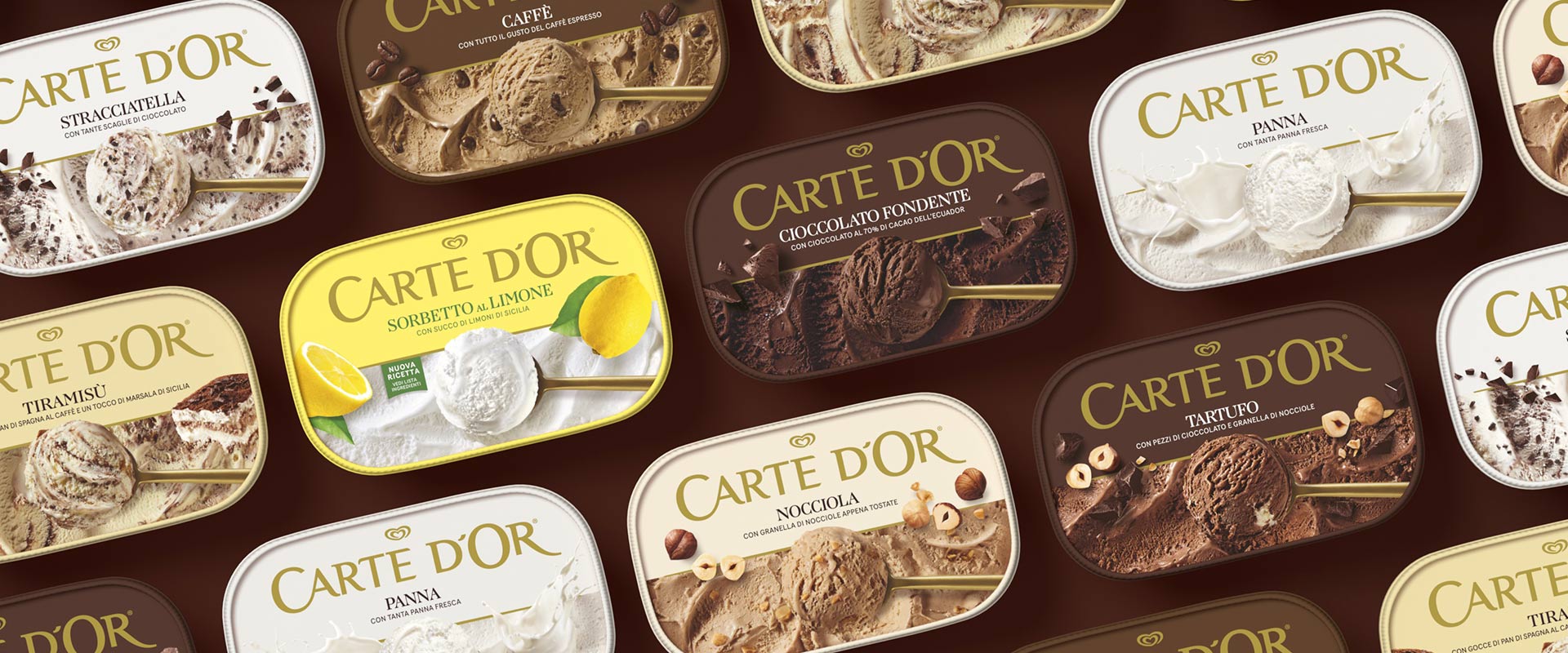
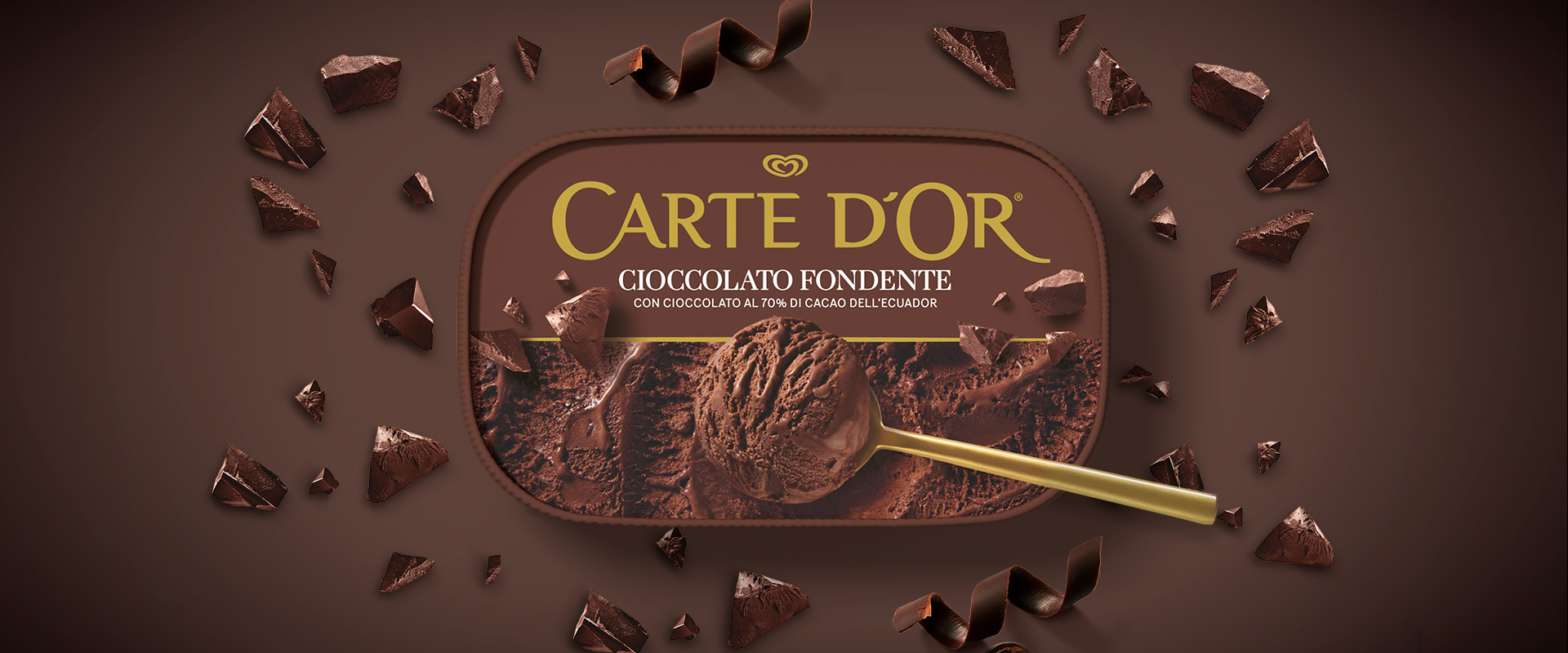
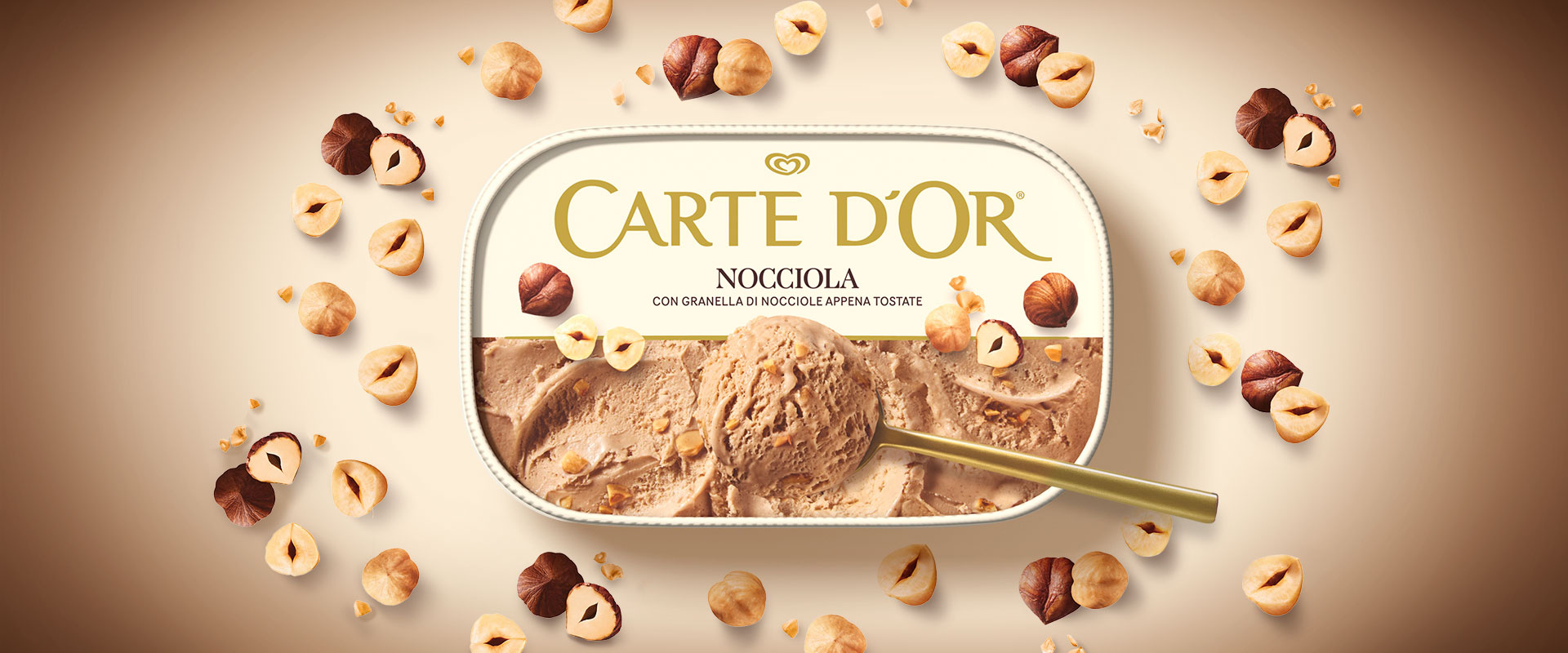
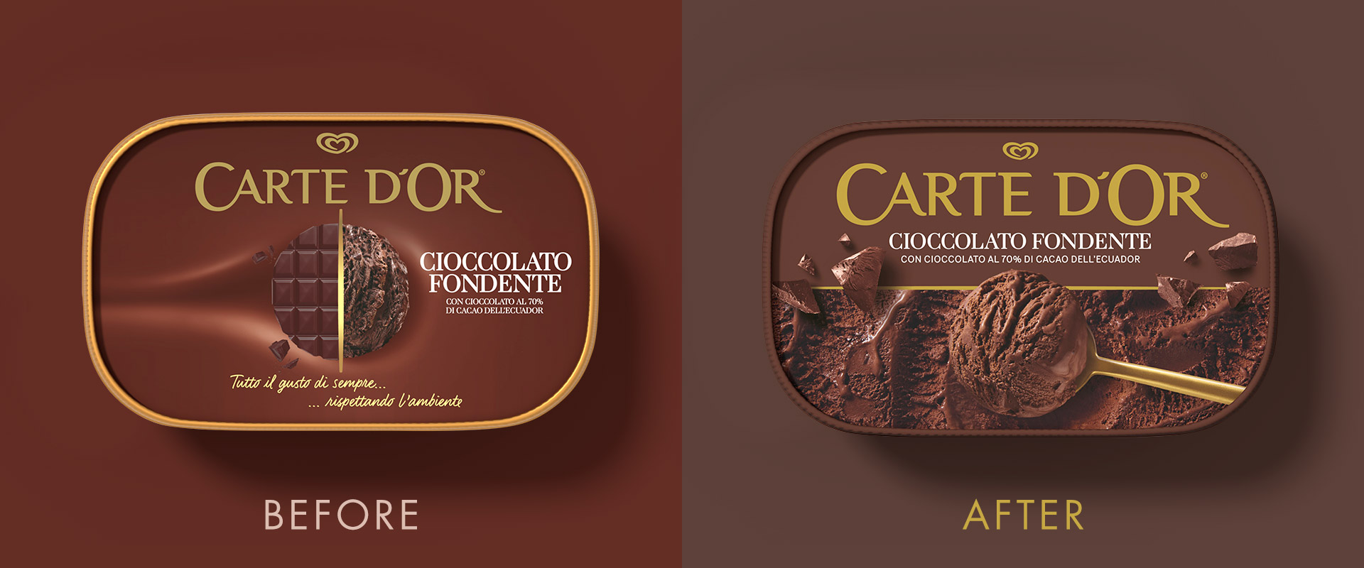
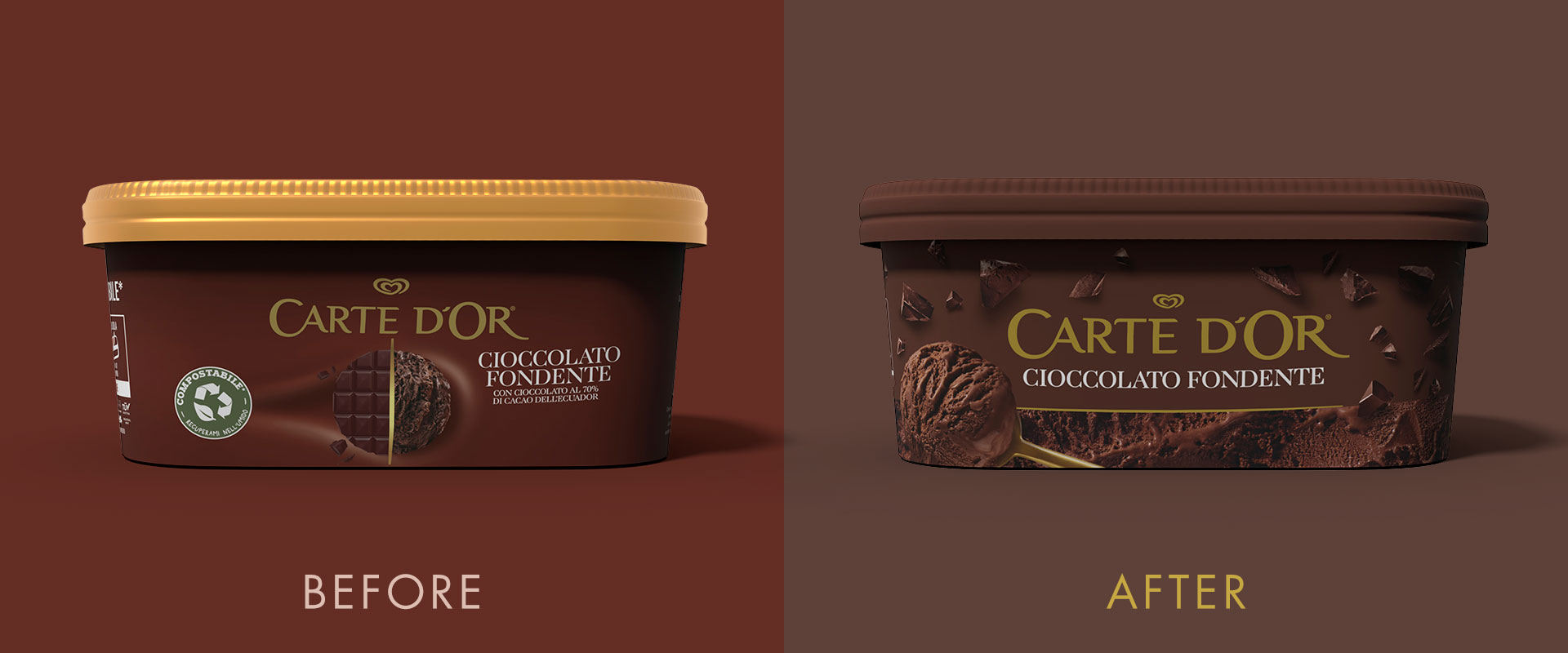
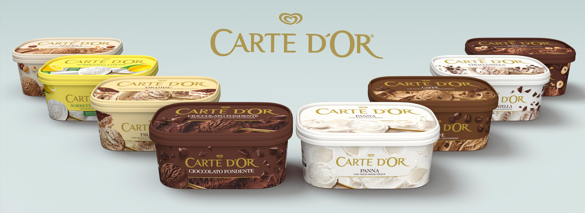
Carte d’Or renews the identity of its "Classics" line without forgetting its roots. A line with a long history of success, which has accompanied generations with its timeless tastes, returns to the shelves with a more current and tasty image, designed to conquer even the youngest audience.
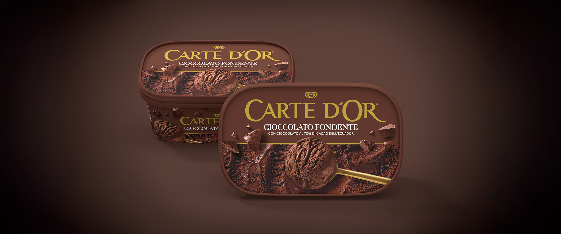
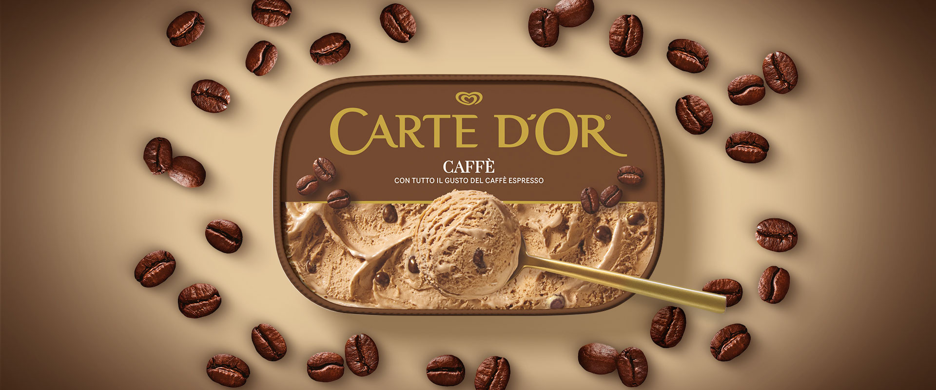
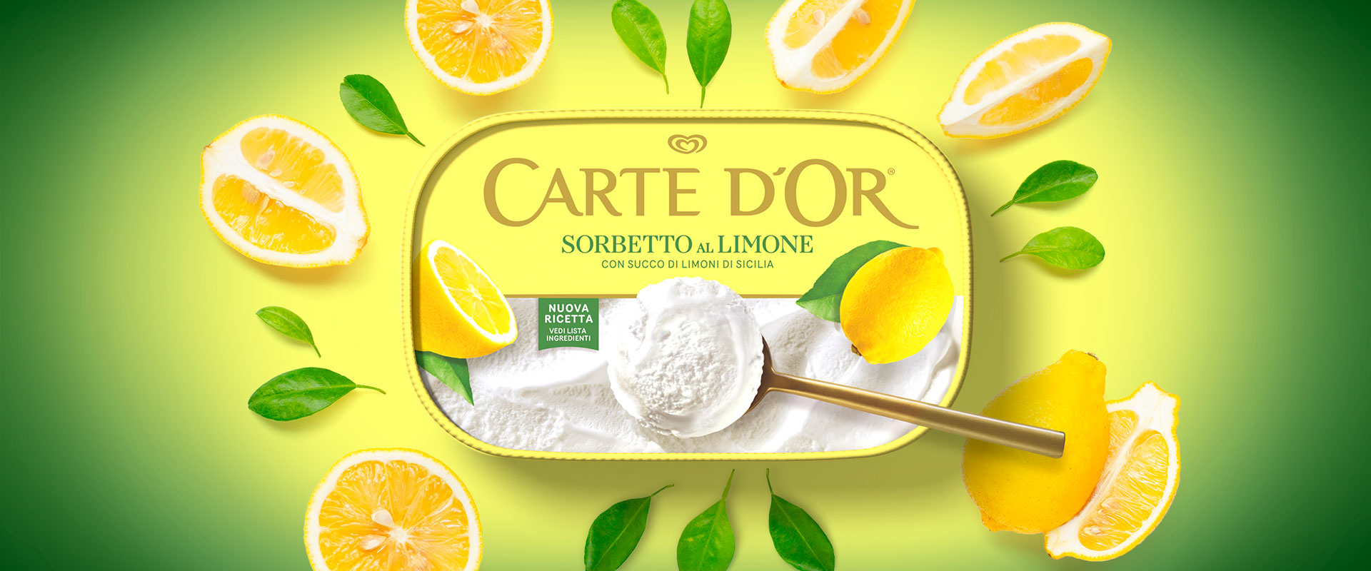
The new pack is born from the need to communicate with the "Classics" a more direct language, sensory and contemporary. The result is an orderly but impactful design, where each product takes the scene and "invades" the graphic system with greedy details.
The structure is clear, between top and front view, for a strong identity and recognizable from every angle: logo and taste are put in relation by a system that makes immediate recognition. The lower part is all dedicated to the product’s sweet taste: the photo shoot involved both the ice cream and the ingredients, with shots that enhance its texture and creaminess.
The gold, a distinctive historical element of the brand, remains present but finds a new balance, leaving room for the real protagonist: the ice cream.
The new packaging is not only refined and functional, but also responsible: made of recyclable paper, it testifies to the concrete commitment of the brand towards a more sustainable future.
A pack that tastes good just by looking at it.