Beltè: a re-launch of the range that started from a distant point
Years of projects for the well-known cold tea brand have led to the global redesign of the entire range
- Concept & content
- Below the line materials
- Mechanical promo development
- Packaging
- POS materials
- Promo communication
- Contest consumer
- In-store activation
A long-lasting collaboration, built from project to project on mutual trust.
Over the years, ATC has been able to work alongside this beverage sector brand
of the Nestlé group, imprinting its strategic value on every communication activity
with an authoritative voice and a multilateral approach. We have provided support
in meeting a great number of in-store challenges: from the development of the packaging
to promotional activities / contests, sometimes associated with events at the point of sale.
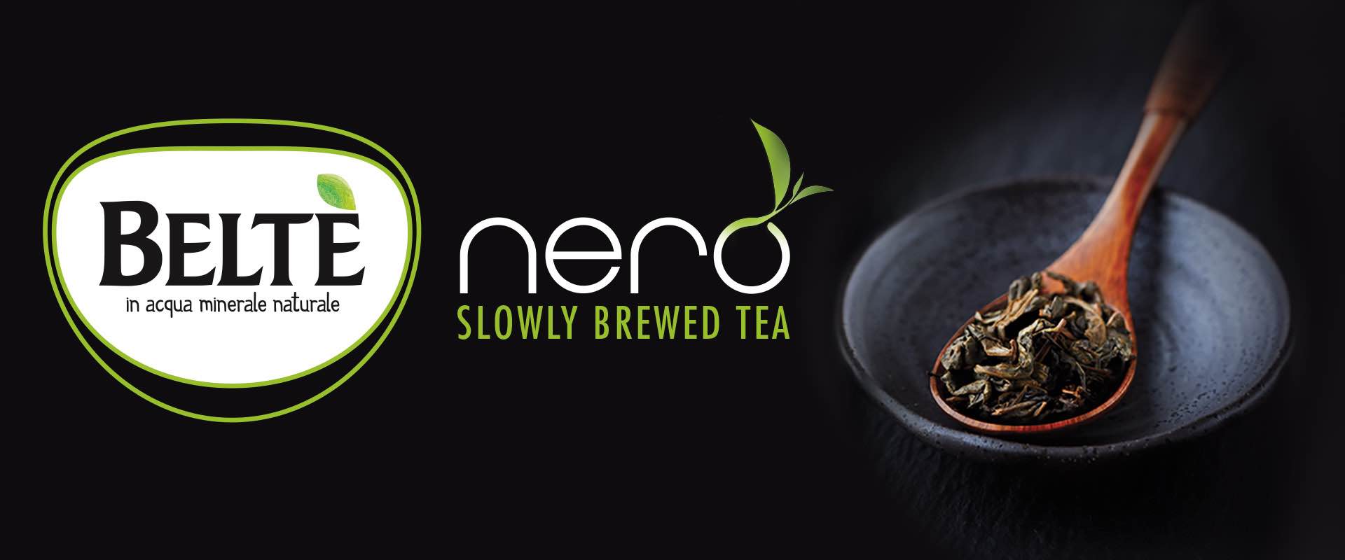
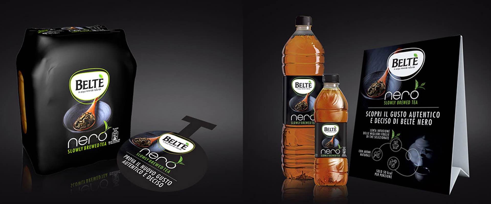
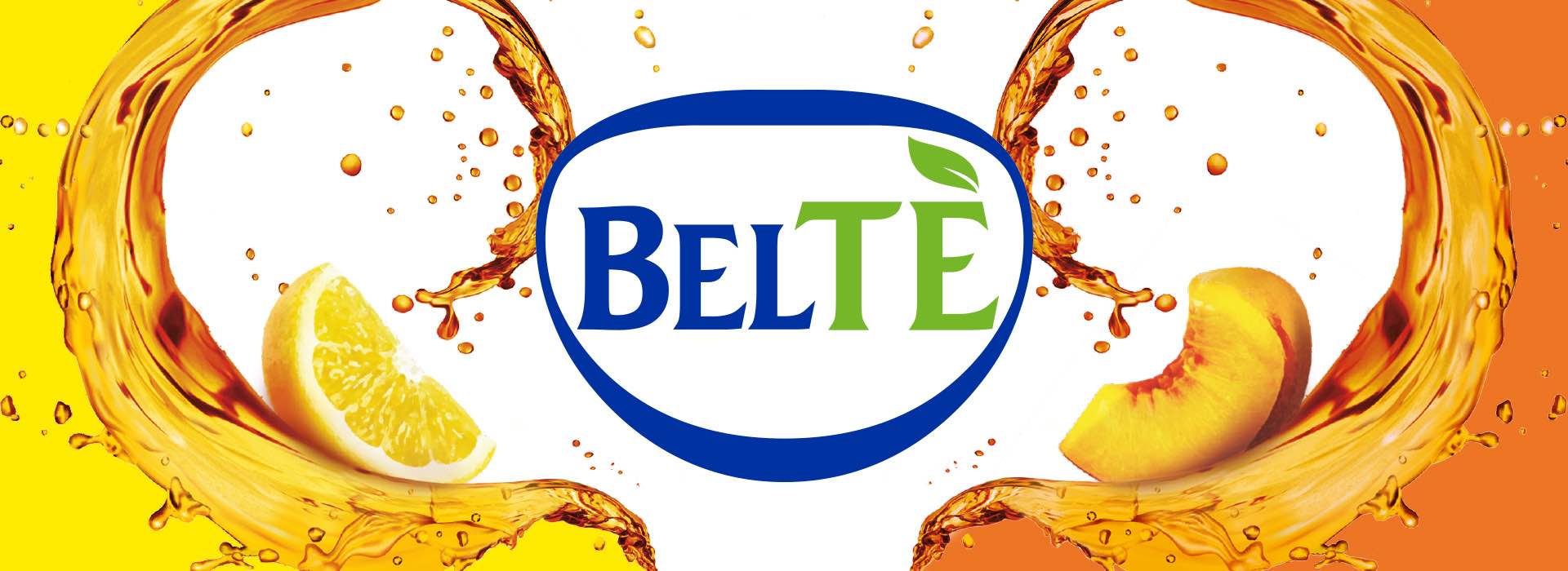
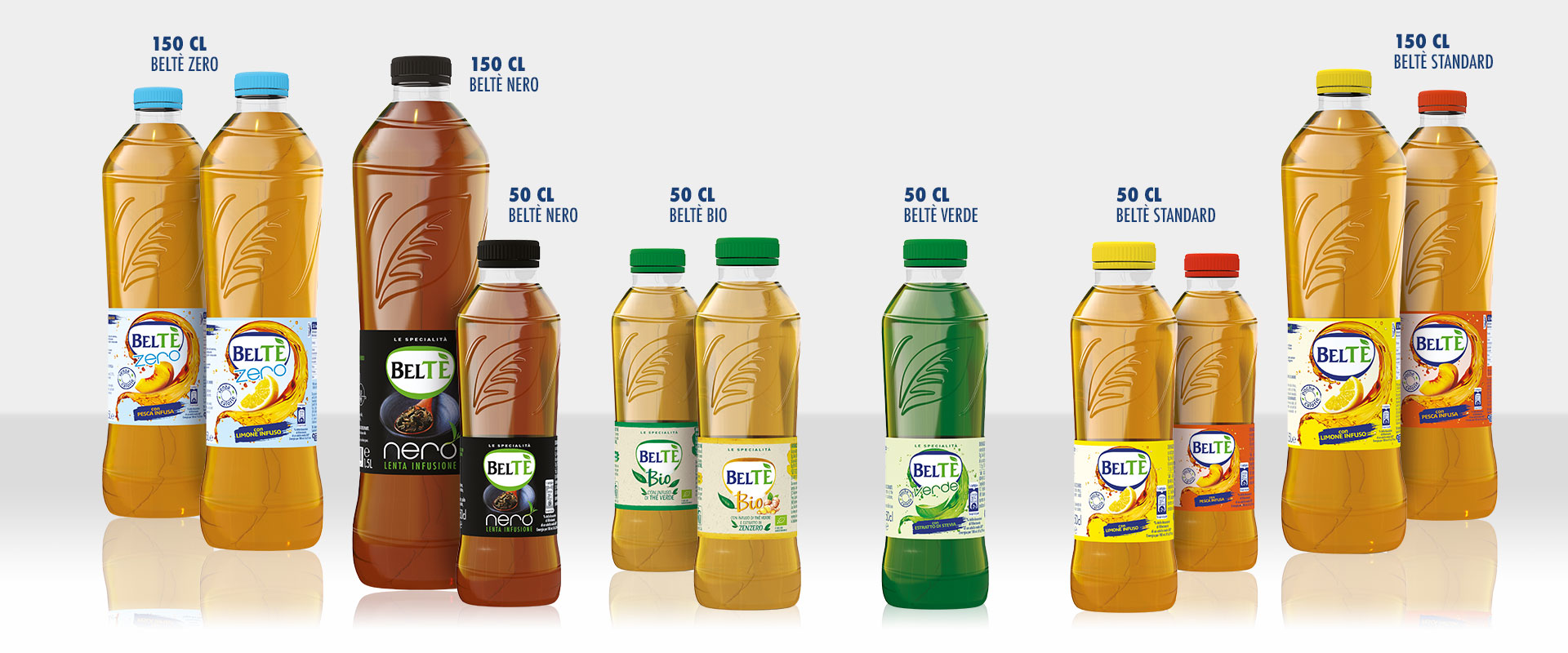
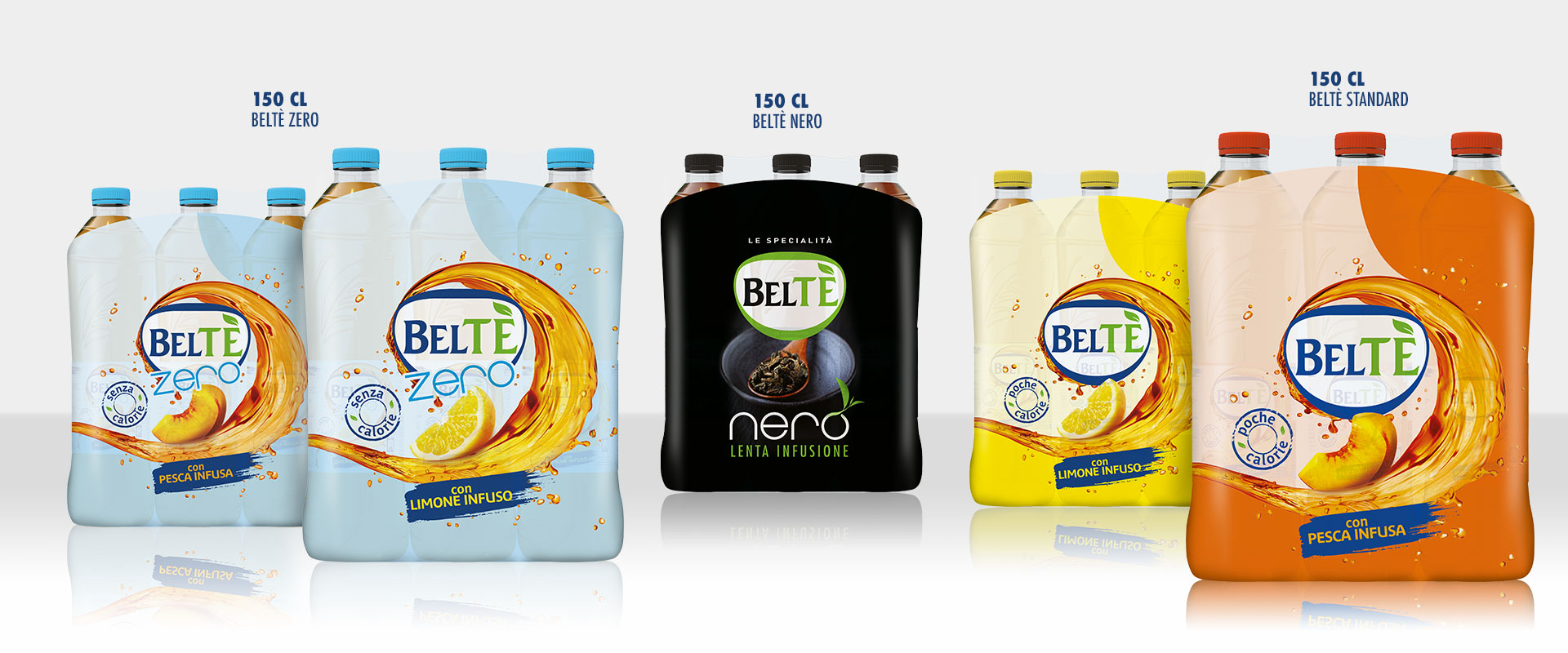
An ambitious branding job, both in terms of objectives and output: rethinking the range at the graphic-conceptual level, unifying the image to convey the brand personality on the shelf. Starting with the key element, the Beltè logo, which has been revised to capitalize on the positioning with even clearer references to the thirst-quenching freshness of the drinks, represented by a dynamic wave of tea that envelops the central system. The major Beltè repackaging project involved the 50cl and 150cl formats as well as Beltè Verde, Beltè Nero, Beltè Bio and Beltè Zero. Throughout the project, ATC adopted a strategy firmly anchored to the brand’s key values, harmonizing and integrating them in a modular communication format according to the different lines, but remaining 100% recognizable.
To convey the brand personality on the shelf
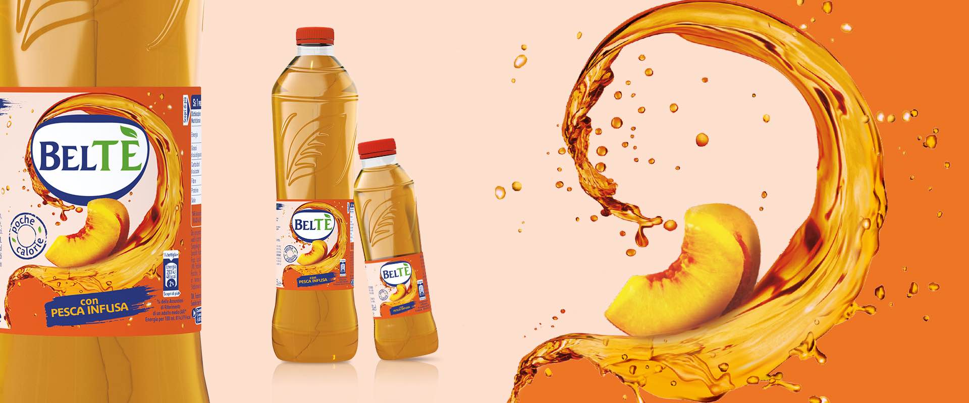
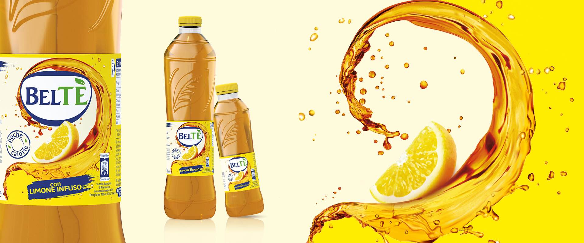
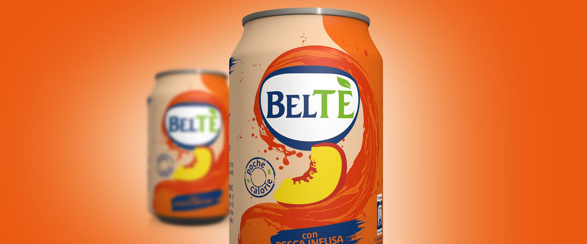
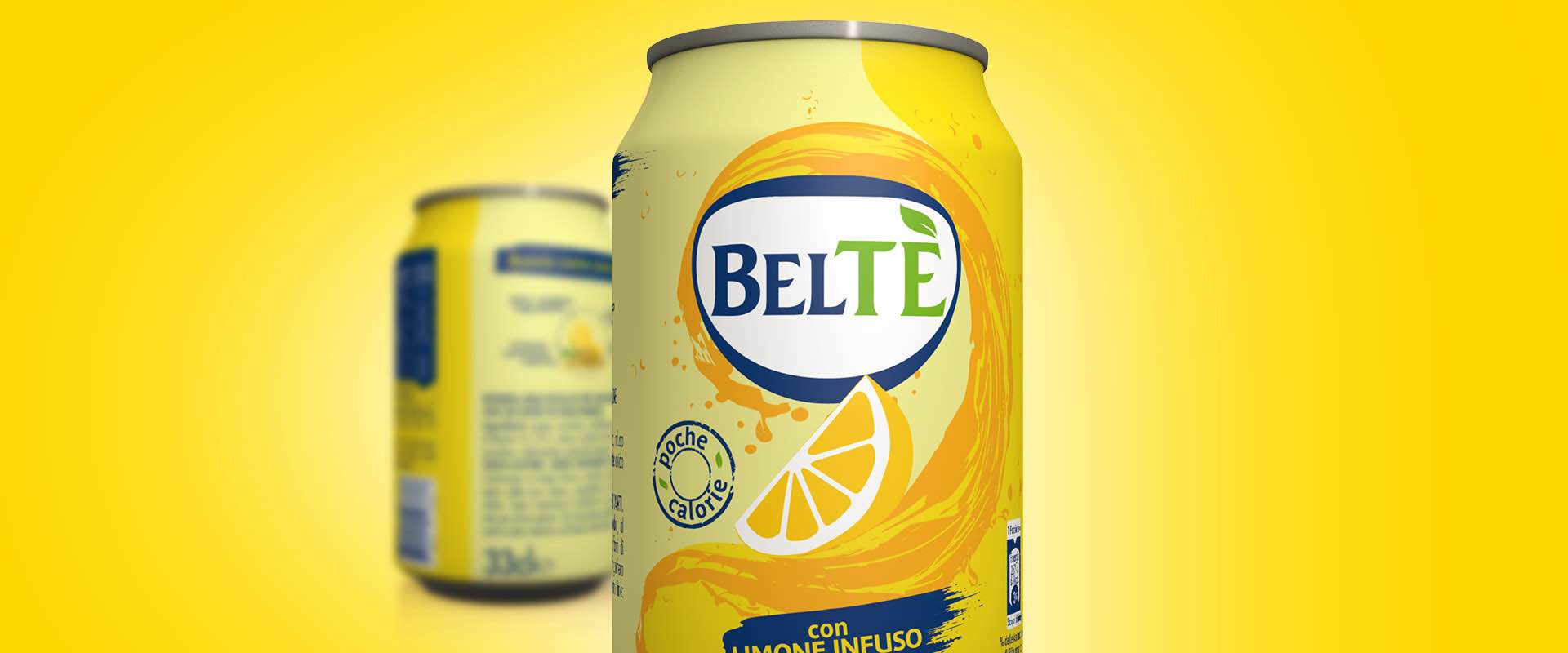
Mastering the values of the brand in detail, it was possible to manage the work with a deep analytical capacity, evaluating balances that are as fragile as they are crucial for the purposes of the execution. Today, the range effectively conveys the essence of the brand in every single line and reference, but at the same time each pack enhances the awareness of the mother brand through very specific codes. On the front of packs, the graphic references to light goodness and thirst-quenching freshness, which have always been part of the brand’s heritage, are clear: in close relationship with the main pluses, the image of a thirst-quenching wave was integrated with the refreshed Beltè logo, which it wraps dynamically. Back of packs have also been strategically exploited, with storytelling linked to a different ingredient-hero that conveys specific benefits. A complementary narrative essential for today’s consumers and prospects.
A storytelling linked to a different ingredient-hero that conveys specific benefits