
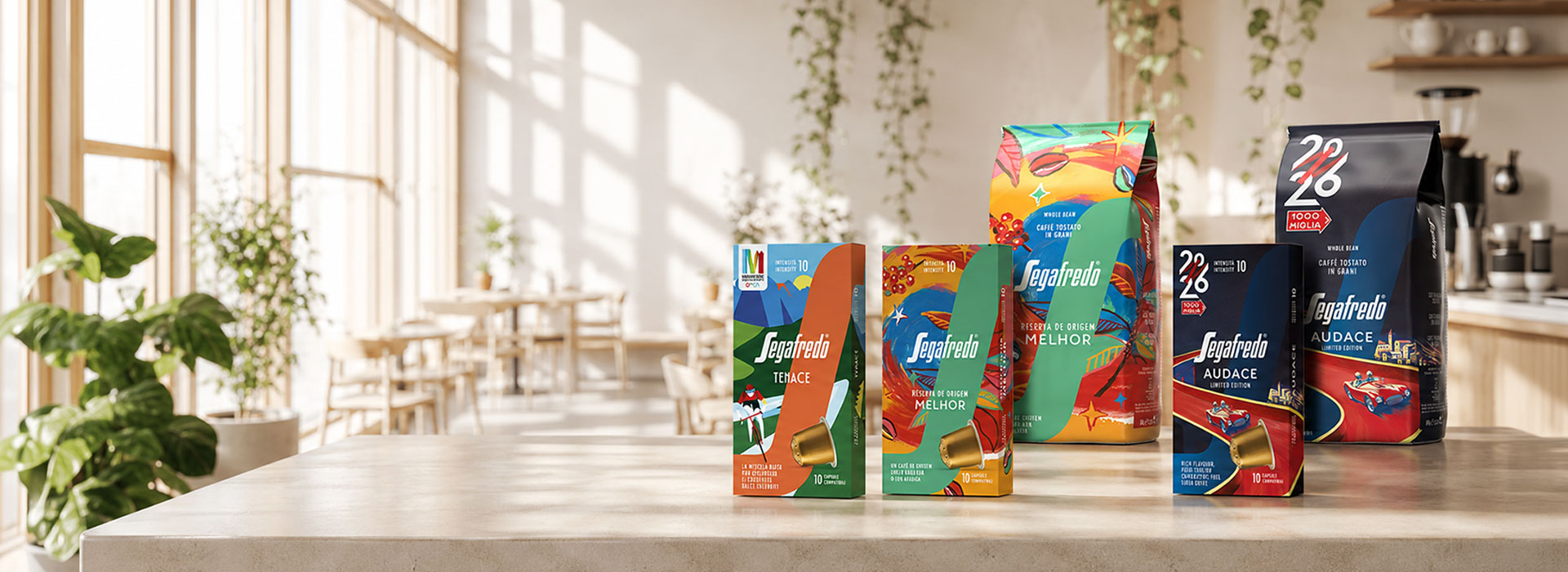
Segafredo presents three exclusive limited editions: Melhor, Audace, and Tenace, developed by ATC – All Things Communicate
A single-origin Brazil and two bespoke blends for the 1000 Miglia and Maratona delle Dolomiti, featuring packaging developed by ATC
- Branding
- Packaging design
- Visual system
- Packaging
Three distinct graphic executions, two formats, and one core directive: maintain absolute brand consistency. ATC continues its successful partnership with Segafredo, driving the creative direction for the 2026 special editions, three projects designed to accompany high-profile national and international cultural and sporting events.
The creation and launch of these three new products arrive at a crucial moment for Segafredo: the progressive rollout of its new brand positioning, “Take your shot,” across all channels and touchpoints.
Consequently, the brief acted as a rigorous stress test for the packaging system previously designed by ATC. Originally engineered for the Ho.Re.Ca. channel, it now had to adapt to new industrial and commercial variables:
different cutter guides, new SKUs, and formats destined for retail and mass market..
Specifically, to maximise the visual richness of the original illustrations, created in collaboration with artists selected by Segafredo for the three lines, the agency carried out a meticulous layout adaptation process.
This preserved the expressive power of the artwork without compromising on-pack readability or technical printing constraints
Simultaneously, the front-of-pack information architecture integrated the typographic codes and visual hierarchies of the core ranges.
Alongside the structural design, the naming for each product variant was developed to build a coherent product narrative, aligning Segafredo's global identity with the unique imagery of each event..
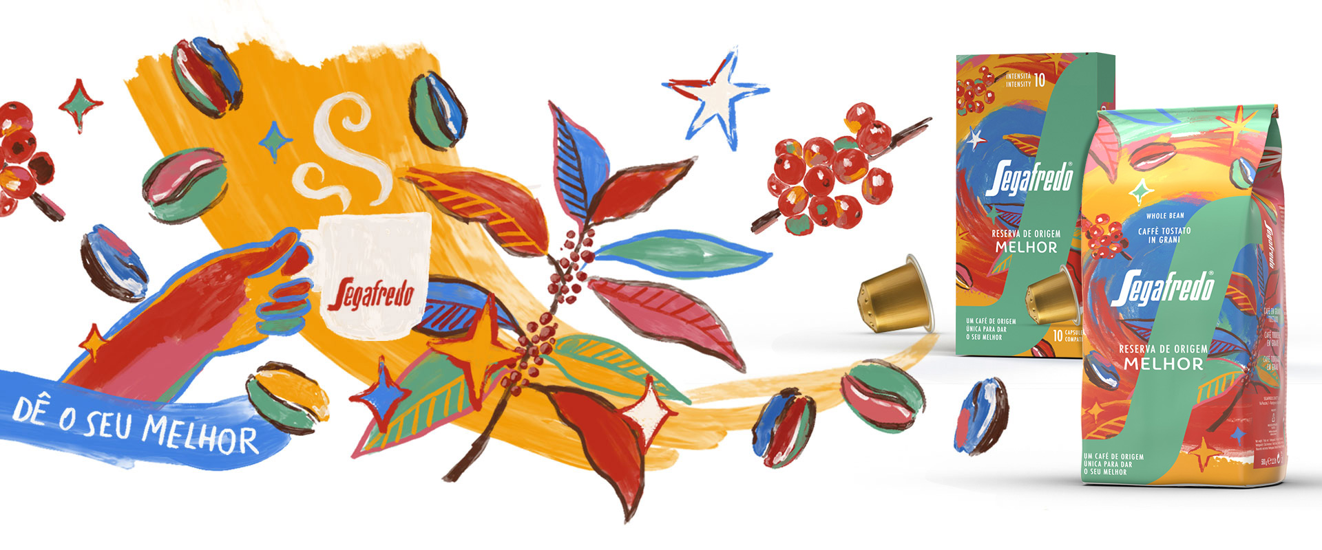
The concept for Melhor, a single-origin coffee unveiled during Milan Design Week, translates the vibrant, distinctive spirit of Brazil into packaging that marries emotional impact with functional rigour. The illustration unfolds across a palette of vivid colours and visual nods to the coffee plant. At its centre, the system's iconic "S" serves as a high-contrast visual anchor, ensuring instant on-shelf recognition and readability. The Portuguese name “Melhor” aligns perfectly with the brand's new international guidelines, while the “Reserva de Origem” line premiumises the origin of the beans, elevating the product’s market positioning and perceived value.
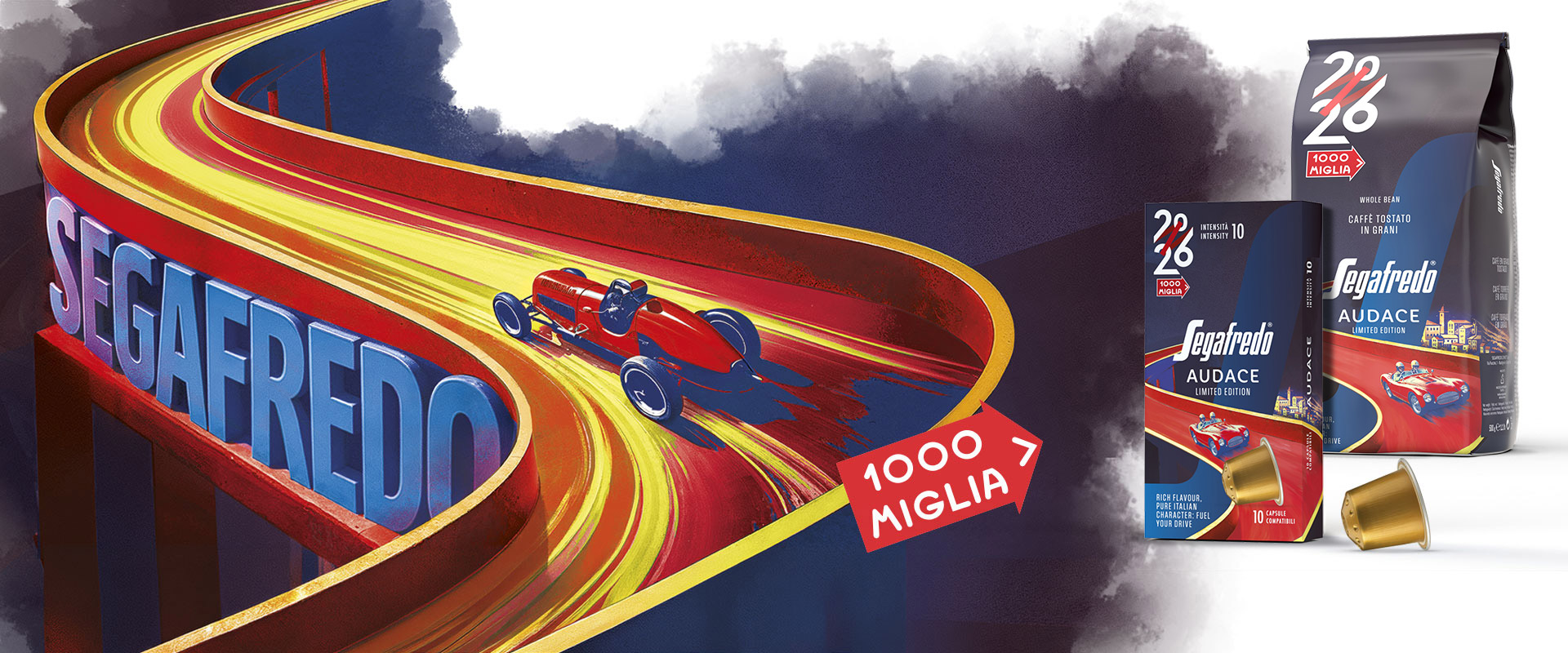
For Audace, the limited edition dedicated to the legendary 1000 Miglia, ATC’s work balanced automotive heritage with modernity. The tones evoke the spirit and history that define the race.
Here, the agency's intervention focused heavily on element placement and crop-area management to safeguard every detail, creating a fluid visual narrative between the front "S" and the lines and shapes of the illustration.
The name “Audace” and its typography were designed to reflect the core traits of the event: a mix of split-second precision, dynamism, and elegance, seamlessly tapping into the aspirational core of Segafredo’s new positioning
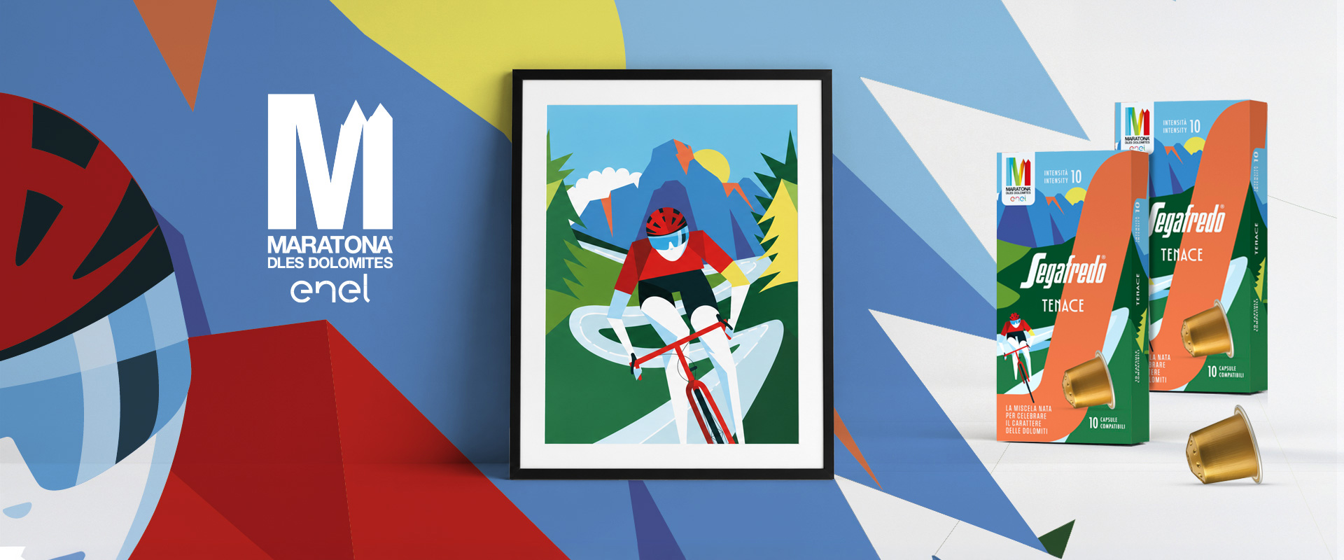
Engineered with an aesthetic optimized for multi-channel environments (from brick-and-mortar retail to e-commerce and on-site event activation), Tenace is the blend celebrating the Maratona delle Dolomiti 2026, Italy's renowned granfondo cycling race. The visual concept embodies the performance-driven attitude and endurance demanded by the mountains. The agency focused on enhancing the geometric rhythm, linearity, and colour contrasts of the bespoke illustration to guarantee maximum readability on the front of pack. The naming and copy unite inspiration with technical functionality, translating the energy of the event and bridging the intensity of the blend with that of the marathon itself.