


ATC - All Things Communicate and Sanofi together for two major projects
Sanofi chooses ATC for the restyling of Novanight and to activate customers on retail top products
- Branding
- Packaging design
- Packaging design
- Key concept
- Point of sale materials
- Video pharmacy
- Tv commercial end bumper
- Web banners
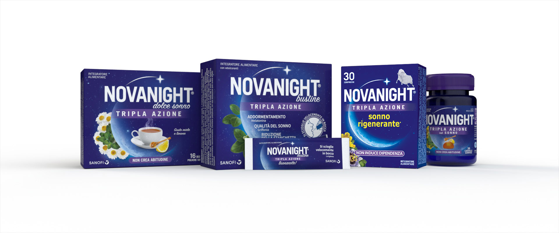
The collaboration between Sanofi and ATC takes shape with the packaging revision of Novanight, for which a conservative restyling has been carried out, aimed at positioning the product with respect to the values of naturalness and effectiveness in falling asleep fast. For this project, ATC's design initially built on the strengths and recognisability of the existing pack, enhancing the claims’ standout and especially the iconographic representation of the formulation's plant components. The result aimed at an overall harmonisation of the front of pack, in order to facilitate both the ease of understanding of the product features and benefits, and the immediate perception of a product which is naturally effective against insomnia. Following the restyling, the collaboration on Novanight continued, again in the area of pack design, with the two launches of the chewable sweets and herbal teas extension lines.
In a second phase, the efficacy of the product was emphasised by shifting the ingredients to second place compared to the importance of the benefits, giving even more value in the visual and in the claim to the promise of “rejuvenating sleep”, depicted iconographically by a small sheep, a recognised symbol of the guarantee of “getting to sleep”.
Sanofi has also chosen the expertise of ATC - All Things Communicate for the launch of the cash-back initiative involving the brands Enterogermina, Dulco Soft, Mag and Novanight. Activation includes an in-store campaign, designed by ATC, starting with the development of the key concept “Star bene ti conviene”, using various materials throughout the path-to-purchase in the pharmacy, from window to shelf.
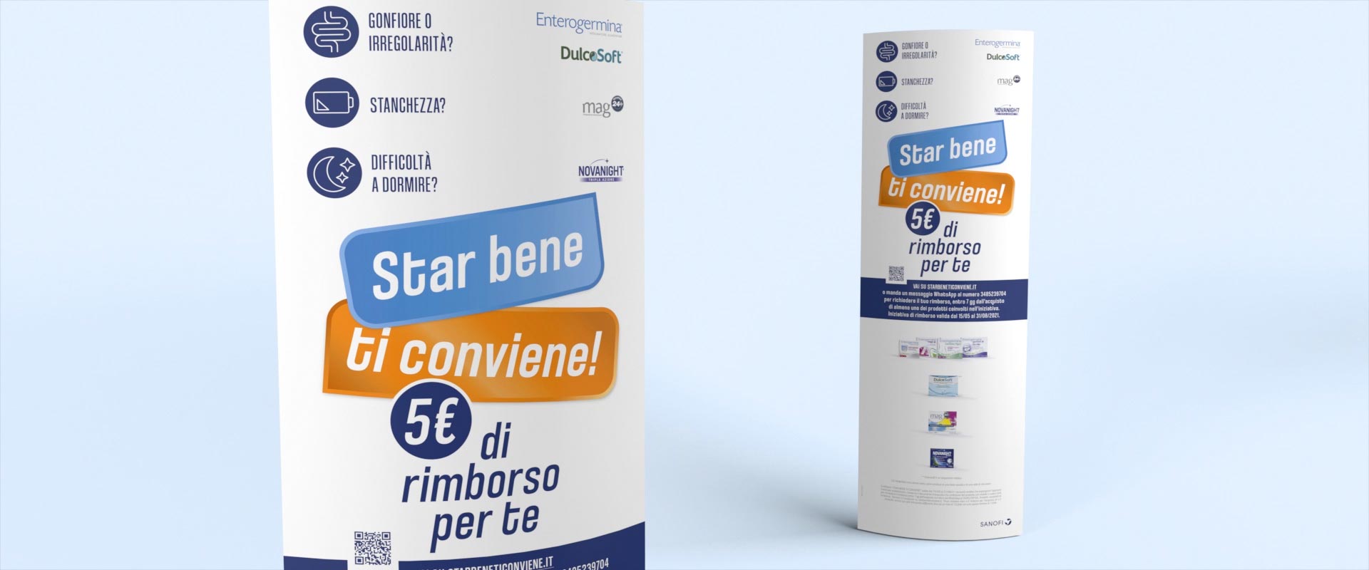
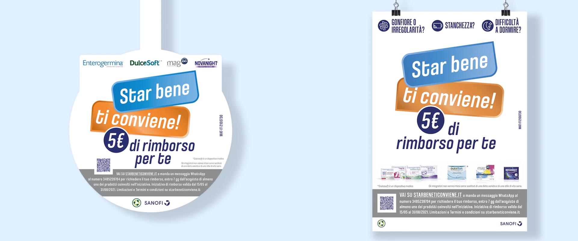
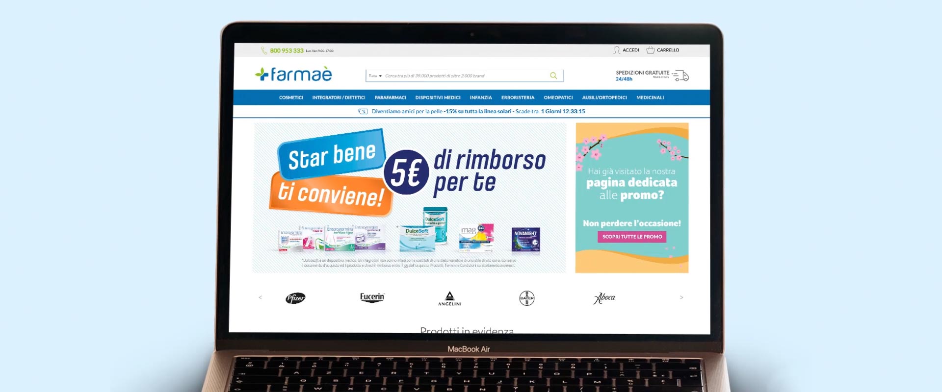
The creative focused on the balance between promotional impact and brand authority, with a particular emphasis on making the economic advantage immediately understandable and giving visibility to the needs that trigger interest in the products. Point-of-sale activity is amplified by a 5" TV flight for the spots of the brands involved in the promotion, and by a display campaign on the websites of the main online pharmacies.