


Cutting through noise: designing content to elicit users’ actions
Content relevance is one of UX experts’ main concerns: good content design must ensure users are provided all the information they need, without all the distractions which may come from unnecessary elements, such as decorative images, long, undifferentiated and dull texts, animations.
To maximize efficiency and conversions on a web page, our design should chase a high signal-to-noise ratio(*1): the quantity of relevant content should be way above the quantity of “frills” or decorative elements which bear no information at all.
However, as creatives we are also driven by the need to engage emotionally with viewers on a digital interface. Good copywriting and powerful art direction are usually deployed to serve this goal. Plus, who can tell what content is absolutely unnecessary on a webpage? Different users can differently see and evaluate the same components, finding each of them more or less valuable according to their intent.
Using UI elements to engage your audience emotionally
Generally speaking we shouldn’t forget that UI elements may serve different functions, other than information, promotion or task efficiency. Many of them may be used for branding purposes: stressing some values, evoking a tone of voice, putting forward some subtle message.
Minimalism in web design means taking the goal of a high signal–to–noise ratio to the extreme, by removing all unnecessary elements on a page.
Is this what we want to achieve?
Four tips of good content design on web pages
Achieving balance between these two goals - aiming at efficiency vs leveraging on aesthetics and emotions- is not simple. Yet there are some tips to organise content on a webpage efficiently for this purpose. Our new website has represented the ideal testbed for this purpose.
1) Content Hierarchy
In our project pages we applied the inverted-pyramid principle, meaning that basic relevant content stays at the top f the page. Users can go down along the funnel, scrolling to delve into more details.
2) Provide guidance for reading
Bold letters, a better use of typography, nice paragraphs and titles are crucial to give web readers something to focus on above other less important stuff.
It’s all about limiting the adoption of the F-pattern, a common reading behaviour that is usually a user’s reaction to texts that are too long and uniform for them to pay attention to. A consequence of the F-pattern is the loss of relevant information by users, literally gone unnoticed because it’s diluted in too much, disorganised content.
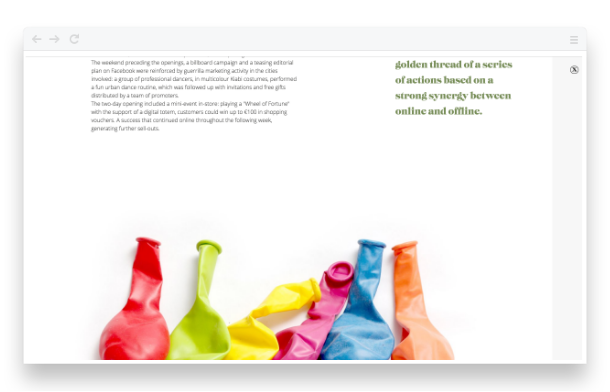
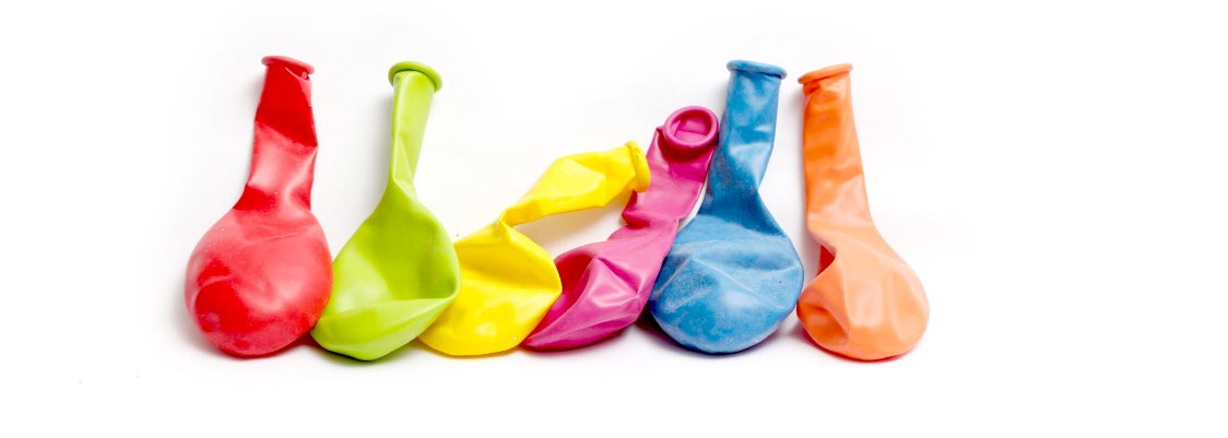
3) Decorative images: we say YES!
As a creative agency, we can’t help praising the value of visual elements…even if they don’t directly communicate important information.
In our portfolio pages, for example, we often sign a case history off with the picture of some objects which are somehow related to the project itself. Is it necessary? No, actually. But it adds a little bit of us-and this is important, as the purpose of these pages is telling you who we are and what we love to do.
4) A good navigation
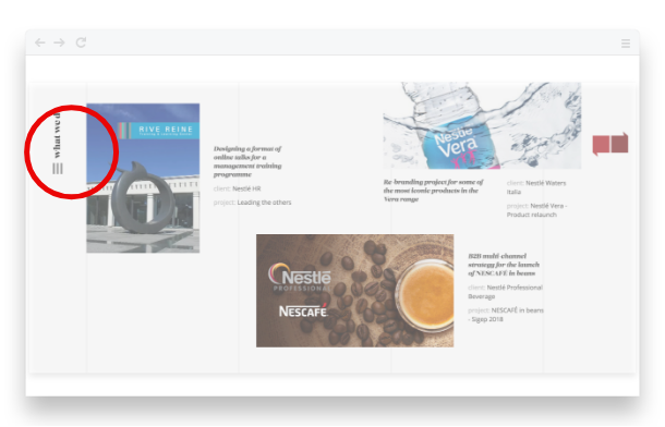
You may not even notice it, but the hamburger menu on our website follows you all along your scrolling and on every main page. That is an example of dynamic noise. The navigation is something you ignore while you are reading, but when you are finished, it becomes important ( a signal), as you look for it to jump on another page. So you expect it to be at your fingertips, wherever on a website!
We chose to make our navigation system small and discrete, in order not to bother users while they are scanning a single page, but always available and consistent everywhere, to be easily found, when it ceases to be “noise” and becomes “signal”.
Wrapping up
As a general advice, plan your content carefully, design with visual hierarchy in mind and try to achieve a good high signal- to - noise ratio by reducing unnecessary content and interaction if they are overwhelming the real information on the page. Think of UX design as a gift box: the decorative colourful wrap is useful, because makes our expectations even more joyful. But in the end, what matters is what we find inside.
References
Steve Krug, Don’t make me think
Xinyi Chen, Signal–to–Noise Ratio
Katie Sherwin, Decorative Images: Delightful or Dreadful?