


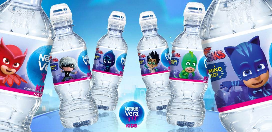


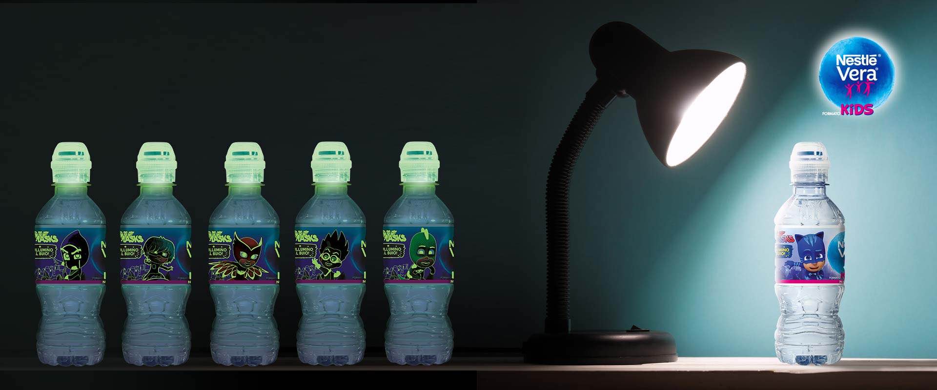
The challenge was not straightforward, because there was a lot of information to be communicated in a limited space: namely, the small 25 cl format of the Nestlé Vera Kids bottles. The main objective was to immediately transmit to purchasers the uniqueness of a super-safe closure, which is exclusive to this range of water for children: anti-suffocation, fluorescent and with an anti-drip valve. When the cap is open, the Vera Kids bottle does not let any water escape, even when it is turned upside-down. Another benefit is that it can be used by children completely independently. The communication designed by ATC focused primarily on the shrink wrap covering the bottles on the shelf, rationalizing the info and remodelling the entire graphic, enhanced by the PJ Masks characters, which children love.
On one side, a circular device clearly summarizes the 3 key-messages in an attention-grabbing manner, stressing the extra “security”; on the opposite side, the end benefits are related in greater detail via storytelling: the main character is a child telling mums in first person why the new cap is his favourite. The work also harmonises with and supports all the other in-store communication materials dedicated to Nestlé Vera Kids, thus communicating safety beyond the pack itself… making it even more Vera.