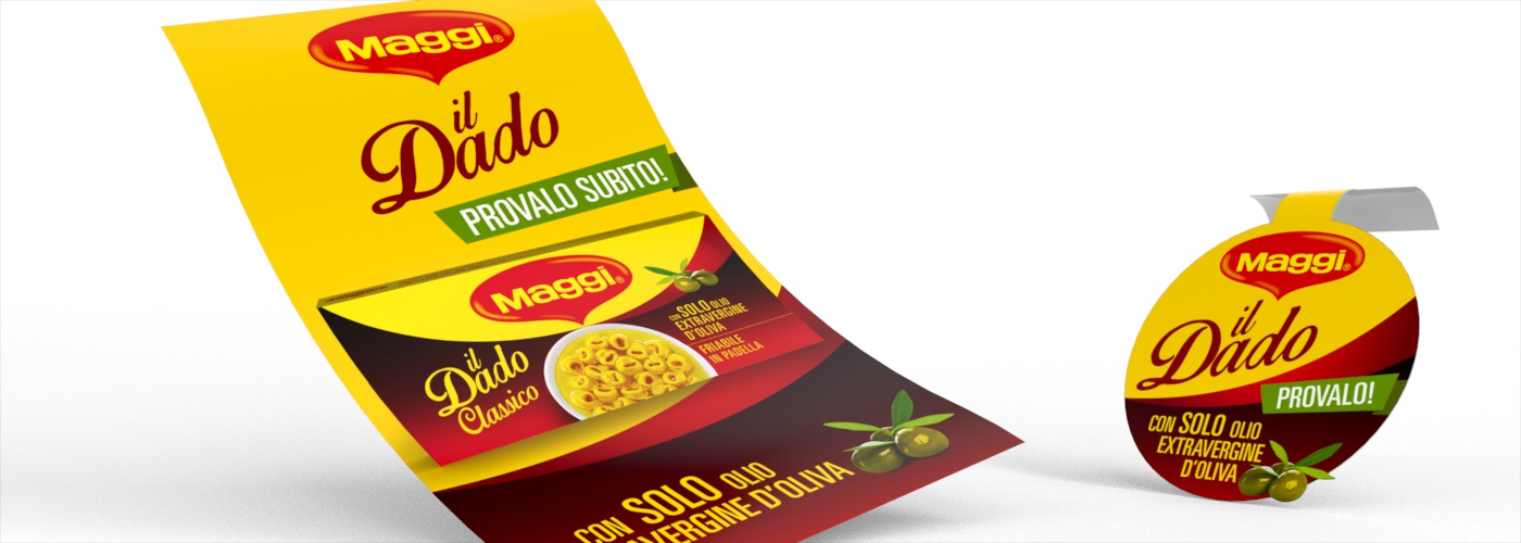

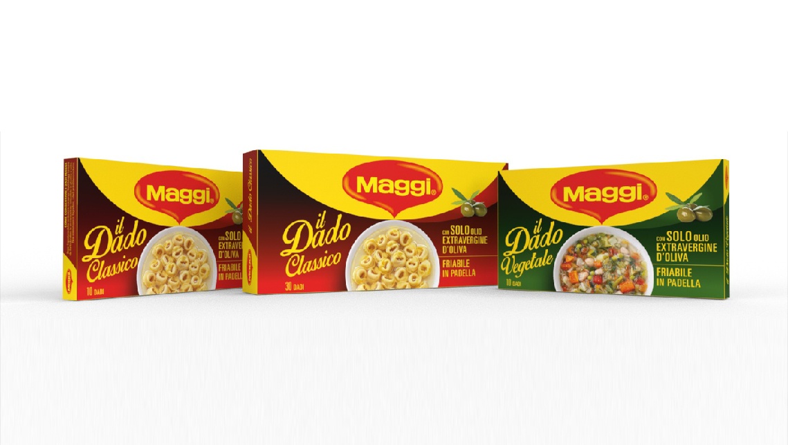


Our primary goal in re-designing the packaging of this iconic brand product, was to create a more contemporary expression of the brand heritage and its values, starting with its essential visual asset, the unmistakable logo on a bold yellow background.
The approach of the design team aimed at maintaining the original product identity, by further highlighting its points of difference from other brands and by redefining the brand descriptor.
The introduction of the word “il” (“the” in Italian) before the product name enables the brand to re-appropriate the product’s hero status, helping to make it even more identifiable.
In the new design, the brand logo stays centre-stage against the corporate yellow backdrop, but with a new, added emphasis, thanks to the introduction of realistic photographs incorporated into a more attractive and eye-catching layout. This results in a stronger shelf impact and strengthens brand recall / and makes it more memorable.
Furthermore, the choice of both hand-written and condensed sans-serif fonts adds to the freshness of the copy, affording the brand, by contrast, a retro feel, stirring associations of family life and home cooking.
A key ingredient used to make the stock cubes, olive oil, gets more relevance on the pack, by means of the visual display of the raw olives placed close to the product pros / key visuals.