


BTO, a company specialising in digital transformation consultancy, has chosen ATC - All Things Communicate to redesign its logo.
The challenge shared by the agency and the client was to pay due tribute to the heritage built up over the years, while revising it in a completely forward-looking way.
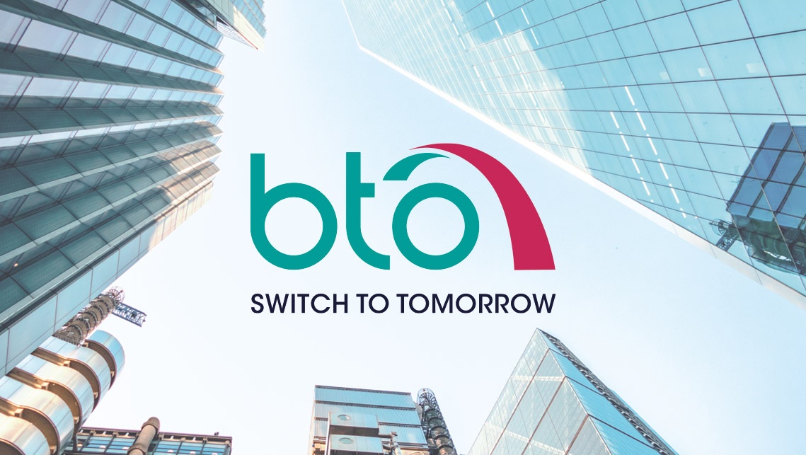
This led to the decision to keep green as the main colour in the logo, leaving the lettering and pictogram free to express the brand's potential for innovation.
As for the logotype, the design moved towards the use of a small typeface with great personality, in order to increase the quality without reducing the "weight" of the company name.
The pictogram represents the stylisation of a bridge, a historical device in the BTO narrative, realised with a stroke that combines projection into the future, dynamism and stability. The addition of the colour magenta merges with these values the instances of innovation, creativity and inclusion.
The logo has been combined with a new claim, Switch to Tomorrow, created by ATC to represent the immediate differential that BTO can guarantee its customers in the transition to digitalisation and new technologies.
